Most of this article just lists semi-advanced features that people don't know about. I think that’s Apple’s intention...
Having every feature and option up in your face can reduce usability and make simple tasks harder for the average user. Apple wants a product that's easy for anyone to use and that often means keeping non-essential features out of the way.
I’d be more interesting in seeing feedback for Apple on how to improve the situation without compromising on ease of use.
(Regarding the WiFi thing...I agree this is a very annoying default setting, but I think a worse outcome is when a user shows up in their friend’s house and has no idea how to connect to the WiFi. Making the user go to Settings -> WiFi to disable this prompt means they’ve demonstrated they’ll be able to go back to that page to manually connect to a network in the future. If you turn this setting off on a friend's phone, be sure they still know how to connect manually.
(Though I do think iOS could be smarter and not prompt you to connect to intermittent networks while you’re driving around a city...))
I get that, but I do think that saying that text size is an advanced feature is just not true.
Loads and loads of people are older than 40. Loads of people just have weaker eyesight. Apple has really good accessibility tools, and it would make a _lot_ of sense for there to be a dedicated part of the onboarding for accessibility.
As much as I'm not a fan of their products, there is very little you can do to help users when they (by proxy in this case) ignore or avoid your attempts to help them.
Making the option easier to find after on-boarding might help, but for the users you describe it would need to be very easy to access and you will fill any list of quick-access options very quickly if you include things they may only want to use one or twice in the life of the phone rendering the "quick access" a big scary list that is neither quick nor easy. Even if you do find a good place for the option: will that class of user even know to look for it never mind find it? They'd just ask the person who on-boarded them instead so the technical level of the target audience has changed back to someone who at least knows how to Google for where to find a more buried option.
Do you know what iOS onboarding even looks like? It literally can't be more basic without removing the exact thing you are trying to make a point to have.
Honestly I don’t think it could be any simpler. The problem is some of the questions it asks about privacy and the cloud are beyond the scope of many people. But these questions need to be asked.
I lost count of the people who complained about their iDevices features not working properly because they intentionally (so they thought) turned them off.
Having eg location services turned off by default and not ask about it will just lead to tons of people complaining that directions don’t work properly.
And asking them the moment they open the builtin maps application will make them close the app because ‘it does not work’ and ‘there’s an error’ and ‘iPhones are so complicated’.
I think you will find much of this is because of the current balance struck between privacy invasion and usability. If brilliant minds were put to it, I am sure location services could be mostly client side and not server side. And so on. Just writing it feels heretic and crack-pot, except it wouldn't have to be.
Maybe I suck at the Socratic method. Maybe the onboarding should be much easier. I think that if people must ask a friend to set up the phone, something has failed. It should just work and setup should be optional. If you wanted to migrate all your data and settings from a previous phone, you should be able to do that later, without wiping your phone. There's a lot yet to do in UX, not much explored. Apple really owns the "slick" game but they could spend some effort on the next billion customers.
It doesn't matter how easy a particular procedure is on an iPhone or anything else if the person trying to use it is so scared of technology that they don't even try.
I know many people (yes, most of them older) for whom the idea of trying to look at an unfamiliar process on a computer (including smartphones) and see if it's something they can do themselves is just a completely alien idea. If it's not something they're already familiar with, it's Scary Technology Stuff, and they need a Technology Person to handle it for them.
I suppose a nice compromise here would be to make an intelligent decision whether to bring up a prompt asking if you want to change the font size. For instance, if the FaceID detects that your face is farther or closer from the screen than normal, or that you're squinting.
Maybe, but I can say without reservation that the times I find my personal technologies the most frustrating are when they're "trying to help me". 99% of the time, this is the WRONG thing to do - for instance if my phone "helpfully" resizes my text, then there's a very good chance that I can no longer see everything I was trying to see on the tiny screen in the first place, as it will have reflowed off-screen! FAIL!
It MAY be OK to ASK if I want help, but just jumping in and doing something is most likely to result in, "Shut up and do what I tell you!" (in the words of Beka Valentine...)
Yep, that's how Android does it too. Text size is a very important option for older folks, and having people pick it during the initial setup alongside other accessibility options, helps a lot.
Onboard if tends to be quite different if you already had a device though. With an iPhone you can just put it close to your old one and it will suck in everything. But if you set it up anew it will ask questions about privacy setup, text size and so on.
You can put it in control center and have it be about as easily adjustable as brightness. It‘s not there by default and hard to discover, but adjusting your text size all the time really is a bit of a niche feature.
I‘m really not sure what else Apple could do other than:
- Asking during onboarding
- Putting it in Display as well as Accessibility settings
This has no basis in reality. Putting a feature like this upfront will cause more accidents than it will allow people with vision issues to use it frequently. People with vision issues need almost all text to be larger. These same people will be the ones accidently hitting this bar instead of brightness and not knowing how to fix it.
I have very bad vision and I use the feature regularly but I imagine I‘m like 1 of 500 people. Accidents are not an issue though since I oversold it being as easy as brightness. You need to force press the icon before you can slide up/down.
I don't think so. What's important for setup is not important everyday. Some things you just need to be able to set once and forget. No reason to put those things front and center.
Language? I'd quite like to be able to change that frequently. I see no good reason to have mono-culture enforced by the OS. There are three languages spoken in my household, by various family members. Changing the language dynamically for them would be a benefit, not a hindrance.
Text size? Same - I often have to show something to my elderly family members, but digging deep into the menu's to find the Text Size setting is very distracting.
I think what's happening in this thread is that people are simply attempting to justify bad design decisions without thinking things through. Language should be something you can change, with ease. Same with text size. Ditto, Wifi access, etc.
>Language? I'd quite like to be able to change that frequently. I see no good reason to have mono-culture enforced by the OS.
That's an outlier request, if I ever saw one, and the accusation is absurd (they give localizations for the OS and tons of things like Siri for dozens or hundreds of languages, so to say they ..."enforce a mono-culture" because they don't allow one to see Spanish one day and French the next on the menu" is contrived at best.
The vast majority of people just don't change the language frequently, and wouldn't do it even if it had a dedicated rotary switch on the side.
If that's the best argument, Apple is doing pretty well.
>>Language? I'd quite like to be able to change that frequently.
> That's an outlier request, if I ever saw one
I've lived in similar households. In KDE one can change the language on the fly for any arbitrary application or the desktop manager.
The Russian-speaking girlfriend, the Hebrew-speaking children, and the Spanish-speaking regular can all use KDE comfortably. I was actually surprised when I had to use an English-language Windows machine and could not change the language on the fly.
It's not an outlier for me. Most people I know switch between English for work and international friends and the local language for mostly everything else.
I'm switching languages I type in every whatsapp conversation.
On an older Android version that doesn't track per chat language, I have to switch the keyboard every single time. Three languages. And I happen to know more.
I switch between languages all the time too. Mostly, I just type whichever language I want, and the keyboard figures out it’s one of the two I use frequently and doesn’t bother me. Failing that, there’s a button next to the dictation button to change languages if autocomplete is acting up (this whole post was written with the keyboard set to Portuguese with only one miscorrection thus far).
You don’t need to change the whole OS’s language to type in multiple languages!
You’re talking about switching the keyboard language, which is easy to do all the time. The parent is talking about changing the language of the entire phones UI, which seems like something you’d do significantly less frequently than changing the keyboard.
> The vast majority of people just don't change the language frequently, and wouldn't do it even if it had a dedicated rotary switch on the side.
The vast majority of users in some countries may never change language, but there are other countries where multiple languages are officially spoken and where even members of the same household have different first languages.
For the phone form factor I would think that maybe language switching isn't as important since most people are not sharing their phones often, but for the iPad it might be more useful to be able to switch languages quickly.
The fact that the vast majority don't use a feature does not make it less important for the people who do. That's the same logic as saying, I don't know, that face recognition only has a false positive rate of 1/1000. If you scan a million people each day you still end up with 1000 people falsely identified.
I switch languages between English (work) and German (everything else) every day. My sister's family is bilingual. I've seen them switch languages back and forth every other sentence within the same conversation. (When I asked the kids why they do that, they told me that some things are easier to express in a specific language.)
FWIW, multi language support has gotten much better but there's still a way to go. Two issues of the top of my head:
- I have my phone set to English. But I want Google maps pronounce street names in German when giving directions. This should probably be a user-configurable option because I can see that it helps people to hear (an approximation of) how a street would be pronounced in their language if they don't speak the local language.
- iOS automatically detects the language when I type in some text. But speech recognition always uses whatever language the keyboard is currently set to. I often speak out notes in German and English and to do that I have to make sure that the correct language is set.
Having a customisable control centre might be good. I often turn mobile data on and off (when I'm abroad), and it's a minor pain going into settings. On the other hand I hardly ever touch Bluetooth, and never use airdrop or airplay mirroring.
Personal Hotspot is not the same thing as mobile data...I suppose it's possible it's what the parent meant, but unless you meant to say that there was a switch to turn cellular data access for the phone itself on and off there, I don't think that's going to solve the stated problem.
There is an immediately visible cellular data switch (right next to airplane mode) in the control center, as well as a hotspot switch which is hidden behind the 3D Touch.
I'd like to use different languages for different applications. I'm using Russian and English languages interchangeably on my phone. Luckily many applications nowadays have separate language setting, but not all. That's not an outlier request. I hate that English-dominating CS monoculture that thinks that everyone is like them. It caused great headache of 8-bit encodings which the rest of the world had to deal with for decades, while US didn't even understand what the problem was about, strlen is just fine!
It was good enough for UNIX... Heck, it was a big deal when early uucp and Internet links were finally 8-bit clean! (Only 7 bits are needed for plain old English ASCII, and when you were paying many thousands of dollars a month for a T1 (1.5Mbps) connection, using 7-bit was an instant 12% bandwidth boost...)
One thing I'd think could be useful would be switching the language based on Touch ID, so family members or partners who speak different languages could pick the device up and feel at home.
I would argue that Apple actively doesn't want to support your two use cases because they'd much rather sell a device to each member of your household and make it incredibly easy to share the page you are looking at between each member of the house.
This is what frustrates me about consumer electronics, that if you have a use case that the vendor doesn't want to support then you'll be constantly frustrated over what could be a simple software change.
>I would argue that Apple actively doesn't want to support your two use cases because they'd much rather sell a device to each member of your household and make it incredibly easy to share the page you are looking at between each member of the house.
Bingo! Apple have acquired immense expertise in applying this anti-pattern.
Why? The initial setup is for the things you set once and never need to change. I tell my phone I want it in English during on boarding - and then I never need that setting again.
Eyesight changes over time. People learn new languages, and want to switch. Making these decisions for the user and then forcing them forever is decidedly un-user-friendly.
Or, you know, the person can search for 1-2 minutes how to change the font, when they need to, if and when their "eyesight changes" enough during their years of using iPhones to warranty it.
Better than cramming every such feature as a first priority, and making a UI that's confusing for everyday use.
You didn't read the article? Even though its buried there, in the system prefs, people who need to change such settings still cannot find them. That's the point: the UI is already confusing for everyday use, and we honestly expect better of Apple.
>You didn't read the article? Even though its buried there, in the system prefs, people who need to change such settings still cannot find them.
They can always look them up (online), set them, and forget them. Better than having all such settings front and center over more commonly used settings.
Would you say that everyones grandparents (which mostly could use that setting) are capable of googling tutorials?
Even most young people I know are not able to google things (even if it's some important information they urgently need). Or maybe they just don't get the idea of even asking the internet.
> They can always look them up (online), set them, and forget them.
But they don't. You're a reader of HN. It is fairly obvious that you're the sort of person who, at a point when you need to accomplish something you don't know how to accomplish, will assume that it's possible and start with research. But there are a lot of people out there who will start with the assumption that not being able to see their phone screen so well anymore is just something to put up with. The entire point of this post and discussion is that Apple may not be providing the best experience for those users for whom it would never even cross their mind that changing the text size on their phone is possible.
Apple's design of Settings has clearly evolved via accretion rather than any thoughtful and considered design. The fact that something is possible in a UI/UX has no bearing on the fact that it's fundamental design can still suck huevos.
How often do you think this happens? I am through and through an Android + Windows user and hate Apple for certain things but I do have to admit their design decisions are pretty solid most of the time.
It's not like you're learning a new language everyday. Nor losing your eyesight. Keep in mind that the life of a cellphone is anywhere between one and six years, for most tends to be around three (speculation). Isn't reason enough to make it a top priority for people to be able to access language / text size changes in their settings everyday.
Forcing them forever is not the case, IDK where you're getting that from. Language settings and text size / other accessibility settings are in the settings and nowadays ios even has a search function in there.
>Loads and loads of people are older than 40. Loads of people just have weaker eyesight.
Even so, all of those people have to change their text size just once or twice. They can look it up when they need to. It's not like it's a feature they need to use everyday.
Simple commands like this can also just be invoked with Siri. So difficulty with navigability to find the option is becoming less and less of a problem.
The main challenge there is just reminding people that the option exists so that they will know to ask. That and normalizing the idea of navigating interface elements by voice or querying the search bar rather than by physically scrolling around.
My mom asked me if I can make the text bigger. Or I told her, I forget. How is this so upsetting? I also had to set up almost all her devices, and she’s not technically illiterate at all. She just doesn’t have the time or energy to learn every minute detail like I do.
The point was not accessibility in day-to-day use. The point was discoverability of the feature in the first place! You cannot look up how to change text size if you haven't even realized that the possibility exists.
> Even so, all of those people have to change
> their text size just once or twice.
Actually, I prefer a larger text size in the evening / night and a smaller text size during daylight hours. So I'm changing text size once or twice per day.
Text sizing is addable to the control center, as are other accessibility shortcuts. That's about as fast access as I think it's possible to get.
Worth noting that there's a fair number of apps historically that don't really support text sizing. Until iOS 11, if you were using a non-system font, you had to do the resizing manually. They made it much, much easier to buy in to Dynamic Type in iOS 11, so hopefully this will get better over the next year or two.
> Text sizing is addable to the control center, as are other accessibility shortcuts.
I don't think that was the point. The point was that people don't even know it's possible to change text size, never mind about other accessibility features, because they're not easily discoverable. Besides, the people who don't know about text sizing don't know about control center customizability either...
Our of curiosity, how is the accessibility of Hacker News? I don’t know much about how to verify that. And I imagine threaded comment pages would be especially difficult to interpret non-visually
I think the points that are well taken are those around identity, relationships and contacts. I've been using iPhones for something like 8-9 years and I didn't know I could specify a contact as a specific family relationship. A while ago when I wanted to configure
emergency contact information it took me a google search to figure out that I needed to find the Health app buried on the last screen of the phone.
At the very least, the emergency contact info should be stupid simple to find (I'd say top level in Settings). This isn't an "advanced" feature, it's a fairly vital and basic feature of a cell phone. Family relationship specification should be simpler too.
It's a niche feature that has been there since at least iOS 4, (or at least I've known about it since iPhone 4, when I had the time to meticulously comb through every app on my Phone), but it wasn't actually useful until several interations of Siri later.
Relationships is one of the features, to me that feels like Apple ended up building functionality on top of years after the feature was released, but since it was useless for so long nobody ever uses it.
Did you know not only could you specify your relationships, but other people's relationship's as well? I'm not sure if Siri lets you contact people this way ("Call John's mom"), but I wouldn't be surprised if a hidden update to Siri enabled this feature as well.
No, and I don't think it can happen until users are empowered to be driving design decisions. Designers may need to serve as facilitators of the design process.
I'm not about to try it right now (don't want to mess up my contacts) but I'm pretty sure you can just tell Siri that "suchandsuch is my wife" and she'll update the relevant Contact cards for you.
If you ask Siri "call my wife" before that, Siri will tell you he doesn't know who your wife is and ask for a contact name, then ask for confirmation, and finally persist the information and proceed with the call.
And if you think people are terrified of messing up the iPhone itself, they cower in mortal fear at trying to do anything in iTunes, which is still, a decade on, inexplicably the only way to do many things with an iPhone (like, for instance, back it up if you don't trust your personal info to iCloud...)
The problem lies in what's semi-advanced to one is critical or basic to many others. Apple has been known to hide (aka. make subtle) basic operations. How often have you wanted to load a page in 'desktop mode' in mobile Safari? It's there, just invisibly so. The UI does not teach in the name of clean/minimal design which is Apple's way: form over function.
Edit: it's the equivalent to not putting keyboard shortcut keystrokes into pull down menus.
Theres a lot of armchair design going on here. Obviously there is some sort of balance between showing the user too many options or not enough and making the important stuff obvious without cluttering the UI. I imagine if Apple had gone too far in the other direction (which they would never do IMO) that people would complain there are too many options.
There is definitely room for improvement though. There are some regressions that are too obvious. The recent regression that comes to mind is forcing the end user to go through extra taps to switch the camera between front and back during a FaceTime call when previously it was a one-button click
That change is infuriating. Showing something/someone else on a FT call may be a minority pastime, but it's not exactly a super-obscure use-case.
I seriously doubt there was a groundswell of users complaining they could swap cameras with a single tap.
The other annoying change was putting the End Call button in a panel the bottom right. Regular users have muscle memory, and suddenly they have to relearn one of the main features.
Changes like these are superficial tinkering and make work for the sake of appearances rather than considered, focused development.
Personally, I use the "Request Desktop Mode" features lots! I also moved it so it's the very first option listed for quick access. But I wouldn't do that on my grandma's phone...
While 'desktop mode' is super useful the HN crowd, I don't think most users would benefit from it.
A non-technical user is probably only minimally aware that mobile and desktop sites might have different features at all. And even when you do use it, it might not have the desired affect. I might have been browsing around on "mobile.site.com" for a while and repeating my request with a desktop User-Agent is still going to get me the mobile version. (this happens to me on m.facebook.com) To fix this I have to know how to modify the URL to point to the non-mobile-only version...easy for this crowd, but not for the average user.
Certain CSS @media queries also don't seem to be affected by "Desktop Mode". (It only changes the User-Agent I believe?) So in other situations, it won't work no matter what and that's pretty frustrating/confusing/inconsistent if you don't know the details.
Even if I do succeed, a desktop webpage on mobile can be a pain with all the zooming and zooming out needed. Sometimes desktop sites don't even work properly on mobile browsers! Now...we understand the constraints, but all these details come together to make it a pretty confusing feature for the average user.
I think most users wouldn't get value from this so it's obscure by default...but for the technical types that love this, it's not too hard to figure out how to move this feature to a place where it's convenient to access.
Overall I think the current design is a pretty good balance all things considered.
(though I do wish the ability to move the desktop mode button to the 1st slot was more obvious. Definitely took me a while to figure this out)
hah I only discovered that long-press option just a couple months ago!
Long pressing there also gives me a "request without ad blockers" button which I've found super useful as well. A bit weird this option isn't in the Share Sheet like desktop mode is...
also isn't it weird that this is called the "Share Sheet" but has lots of buttons for non-sharing related things?
Yeah, "request without ad blockers" is great. Very inconsistent that it isn't available in the Share Sheet.
The whole "Share Sheet" is rather confusing. It has three categories of actions in one screen. Potentially useful options are hidden wayyy down the list (like this Request Desktop Option). Even more options are hidden inside "More" menu all the way at the end. Which is also where the re-ordering controls are – although I just realized the icons can be reordered with drag-and-drop.
All in all, not very discoverable for a feature with such high utility.
Steve Jobs was heavily against hidden functionality (sorry there is a word for it I can't remember off the top of my head). It's why Macs had one-button mice for so long. It wasn't until the third major revision of the OS that iPhones got copy+paste!
I think the word you're looking for is discoverability (or perhaps visibility).
The problem with Solaris, Windows, and other desktop workstations at the time was that the second (and even third) mouse buttons were required for many workflows, especially in applications---i.e. a lot of functionality was only available from the right-click menu or via the middle mouse button. This introduced a lot of unnecessary complexity to computer use, especially for new users, because of low visibility and discoverability.
Even today, Mac hardware never has a visible 2nd mouse/trackpad button. Sure, you can click a trackpad with 2 fingers or tap on the right side of a mouse to get a context menu, but keeping the buttons invisible forced these shortcuts to remain just that, and not an essential requirement to get the job done. Windows apps today follow this rule as well -- never make right-clicking the only way to execute a particular function.
This, unfortunately, is slowly going away. The Home app in the new macOS, which has been ported over from iOS, is unusable if you don’t know how to two-finger-tap.
Discoverability is a very hard problem on the small screen. I’m amazed at how often I actually know a function exists, and I try every conceivable type of interaction I can think of to no success. Then I google it.
Damn the little tip about tapping the clock to jump is so handy, I have actually searched for how to do this and never came across a description of this feature.
> Steve Jobs was heavily against hidden functionality (sorry there is a word for it I can't remember off the top of my head). It's why Macs had one-button mice for so long.
That doesn't make sense at all to me: The right click button on a mouse is visible.
The Mac way of hiding it behind the ctrl key was non-discoverable and non-obvious to me.
Every single action that was available in the contextual menu (hidden "behind the ctrl key") was supposed to be available elsewhere as well, typically as an actual app menu item.
I know a few people who - even after trying - can't make "force touch" work properly. I love it and try to show them. But they can't seem to make the effort to learn it.
I know at quite a few people that have not upgraded their iPhone 6-vintage phones simply because they found 3D/force Touch to be a really significantly negative feature, and just flat don't want it.
Apple hides tons of stuff - often so well that they go missing for years. I hate to admit this (I'm an 8-time tech CTO), but I thought that Apple had made the bonehead decision to completely remove the iOS search feature after swiping to the left from the home screen stopped working (iOS 6?). It was literally years (at least iOS 10!) before I accidentally invoked the absolutely opaque "swipe down from the middle of a home screen" gesture to discover search was still possible.
Actually, I wish any modern smartphone OS had half the thought put into it that Palm had 20 years ago. After all this time, nothing even comes close for contact and calendar management, as well as actual phone use!
I had a Palm Pilot, Palm III and Treo, followed by BlackBerry. It wasn’t THAT great, poor graphics, slowness and weird quirks (also graffiti) but I agree it was visionary compared to everything else in the 90s. the blackberry was pretty amazing in 2000 and as a phone was a step up circa 2005. Though the Palm Pre had some great ideas we Are seeing now in iOS and Android. iOS became really good at calendar and contacts by around 2010 if I recall but I lived with it from 2007 onwards.
Whenever a key feature in iOS seems missing I just google for where it went. iOS search is so essential that I couldn’t see it ever removed...
Edit: it's the equivalent to not putting keyboard shortcut keystrokes into pull down menus
This reminds me that several versions ago, Windows stopped underlining the shortcut keys to the menu items by default --- taking away the only affordance to discovering that the keyboard can be used to more quickly activate the menus. I learned by accident long ago ("what's the Alt key for?"), and have used it since. In contrast, I remember trying to operate a Mac the same way but gave up experimenting with the Alt key and such to try to get the menus to show (I know about the shortcuts, but they are not easily discoverable/explorable in the same way that menus are) --- and only later found out that trying to operate the menus on a Mac from the keyboard is... not very intuitive and disabled by default (why!?!?):
(I'm not sure if the above even apply to pre-OS X --- when I discovered the function of Alt and the underlined keys in Windows, it was the Windows 3.1 era.)
>The problem lies in what's semi-advanced to one is critical or basic to many others.
Well, that's not a dictum to design UIs by. This way everything becomes "critical".
At some point you just use statistics, and if something is critical to fewer people, you can give it lower priority anyway than what most want to use everyday.
Press the share button at the bottom (or next to the address bar in landscape/iPad), then scroll along the list of options at the bottom and you'll see "Request Desktop Site."
I think the trick they are referring to is to go to the site then hold the refresh icon and a menu saying "Request Desktop Site" pops up.
I thought cool, I'll try it with the nyt - It'll be like the original iPhone demo again but no - it goes to a pay screen. Mercury Browser kind of worked though which is an app that "can spoof the UserAgent string to trick websites into thinking the browser is a desktop browser."
"Form over function" is not "Apple's way". Apple's way is function, period, paragraph. And often, what "function" means is, don't bury the user under 200 options they will never use. Make choices. Be willing to say "no" to having every single option front and center.
Added to this is the obvious point that with a touch interface on a small screen, you cannot make everything obvious. It's impossible.
> "Form over function" is not "Apple's way". Apple's way is function, period, paragraph.
I like Apple's design, but that's...definitely not true. You could charitably say that Apple's goal is a seamless marriage of form and function, and they do that better than most. But they have always cared more about aesthetics than any other important developer, of hardware or software.
Exquisitely thin keyboards that don't work reliably, missing ports that need dongles, a touchbar that doesn't really add much and sometimes gets in the way, super-thinness at the expense of extended battery life, and a missing headphone jack are all examples of form over function.
Meanwhile a function-motivated Finder in MacOS would not look anything like the clunky dinosaur we seem to be stuck with.
well, for the imac, the thickness is more than thick enough to handle usb ports, they just taper it off at the edge so certain three quarters shots make it look thinner than it is. there's also a bezel on the front that could be accommodating. i think the bottom of the screen is an obvious choice, or even integrated into the stand. I understand why they don't do any of these things, and I wouldn't put usb ports in the front of an imac either (its very pretty and sleek). but, a theoretical function first machine would certainly have usb ports right in the front. my monitor has usb hub functionality, but they're all in the back, or behind a plastic shroud on the bottom. I don't get it- its an ugly dell monitor anyways, that i bought for the resolution, why not make it uglier and more useful? so yes, its not just apple, and at least they don't seem to have those useless plastic shrouds over cables. but the imac is not a function first machine, not from a cooling perspective, and certainly not from an I/O perspective.
well, older laptops had top mounted hinges that allowed for a lot of I/O real estate on the back. that allowed them to work well on a tight desk, with power, usb hub, whatever coming out the back. for a portable machine, i think most accessible things should be on the sides, and the newer hinges on most laptops that are mounted to the back of the chassis mean that back mounted ports aren't an option. the obvious function first choice is side mounted ports, with a bottom dock with power redundancy and everything else. best of both worlds. i don't know if older laptops are the relevant comparison point to a new imac all in one desktop though. I understand why they are on the back, but its clearly not a function first decision (putting them on the front would be way more functional.
And that's fine, you have other options available to you. Apple's target demographic prefers simplicity first, convenience second, with niche features way down the line... and Apple delivers.
Personally, I prefer the Android ecosystem, and honestly I'd very much prefer even more control than that. In fact, I'm really excited about the Librem 5 project, which is pretty much the exact opposite of Apple. However, many of my friends prefer the Apple experience.
A product doesn't have to cater to everyone. If it tries to, it ends up alienating everyone.
I always thought Apple sold lifestyle/fashion primarily; their target demographic are those that buy in to fashion readily. They're highly concerned with looks and want to pay more to flaunt their wealth.
I've always found the Apple-way, wrt UI, to be different; more confusing for me because I'm used to a different paradigm. But, there's some lock-in effect there, if you start with Apple, you become accustomed to their way and then other "ways" seem more complicated. In practice it seems largely to be just familiarity.
This article makes it clear why the major tech companies are so focused on making intelligent assistants and on using machine learning to make using software more contextual.
Our tech keeps getting more powerful, to the extent that the interfaces and sheer number of options outstrip the average person's capabilities to manage.
The problem with assistants and the like is that they hide features even more. On iOS you can browse through the apps and settings, on Siri you can't. Sure you can try some but there's a lot of "Why didn't I think of that?" options available there.
That's true, but I think there's a lot of less technologically proficient people for whom this actually works better.
Like, as tech nerds we have no problem navigating lists of lists of settings, we can usually guess where a setting will be if it exists. But for a lot of people, just asking "Hey Siri, can you make the letters bigger?" would be more accessible.
But that's where the behavior analysis here would be key. Someone mentioned it in a previous post but imagine if Siri, by way of the FaceID sensors, detected that someone's face was closer to the screen or that they were squinting and recommended that she could increase the size of the text on whatever they're reading. Better yet, imagine if someone repeatedly hit a point on the screen followed by the back button and Siri suggested making the buttons on screen larger. At that point, people would view Siri as more of the personal assistant she's meant to be and ask her if she can do things rather than what she can do.
I think that instead of defending the design we need to focus on this problem:
-we have feature X but only 1% of users find it where 10 of users use it after someone else shows them how to use it. Maybe a feature that is only for 5-10% of users is advanced or niche but we need to design it better so this niche/advanced features are irrecoverable.
I do not know how to solve this on mobile, I know that some software on desktop has a tooltip dialog when you open it(with a checkbox to disable this feature) that presents some cool advanced feature, you can click Next and Next to see more and more advanced features. I seen this in Intellij, they also have a list of the actions you performed sorted by usage, so you can look at it later , notice you used action X the most and that you can speed it up if you learn or configure a shortcut
Settings having a search facility is helpful. Something like `apropos` that searches all installed apps and suggests matches seems like it would already be in the latest gen phones?
You need to have an idea it exists, but with well designed search/indexing you shouldn't need to know the name of it. E.g. "duplicate screen" "copy what's on my display" "mirror to another device", etc., should all show "MirrorShare" (and possible other options) on Android.
I don't think making your market small and extremely fragmented is call for innovation. Certain features should be available easier for the ease of the user. If you don't like the environment you're using, and you can't change it, you're being abused by the software.
I don't know about intention, I mean e.g. the Health app is pretty clearly on the primary means of launching apps. I think it's more of a matter of people not actually sitting down to learn and explore their device.
Mind you I do believe Apple should release a proper manual. Barring that, there's a series of iphone books, websites and magazines that will go over these features over and over again.
If people don't invest the time themselves, why should Apple bother?
Also why is Apple and the iphone singled out? It's the same rhetoric for Windows, where the start button is a mystery to the computer illiterate.
TL;DR educate yourself or don't get an iphone.
I do believe text size should be an option for the first configuration though (and if you give your old phones to other people, do a factory reset and let them run through that initial setup themselves).
It gets complicated with apps though, designers often don't keep the variable size text in mind. That feature - at least when I looked into it a few years ago - gives you fixed text sizes to work, which is fine for default looking apps but a bit problematic when you're implementing a certain style.
You can generally either dumb down the product that it has very few options to tweak (I call it a lazy engineer's choice), or you can design the product that it has the initial setting for average joe, then you can drill deeper into advanced settings if you need. Plenty of software does this right.
These type of complaints are the most common I hear from technical people that switch from android to iphone - the lack of customization, the product is on purpose 'dumbed down'.
I recently had to help my mother with some tech support. One of the things I needed to do was turn off the device - I had to actually Google how to turn off an iPhone X.
This is after me owning 3 generations of iPhone (3S-4S) and an iPad AND the family owning one of every main iPhone since 3S.
Ok, but honestly, where does Apple list the instructions for using iOS as well as the preinstalled apps? They believe their product is so easy to understand that people will just get it. But then they go and change things like where they put the autobrightness switch and even seasoned iOS users have to hunt for it. Or go on Reddit.
They just changed the battery page in settings. Where's the tutorial? An obvious place would be apple.com/batteries but I don't see it.
In the user manual. Which is, btw, one of the very best user manuals you will ever see. It's very easy to find, and the fact you haven't found it tells me you probably didn't bother searching, since almost any Google search finds it instantly:
And no: Apple does not "believe their product is so easy to understand that people will just get it". You just made that up. It's...surprising what people will claim sometimes about what Apple "believes" based on zero evidence. The fact is, Apple knows very very well what is easy and obvious, and what isn't. They have done rigorous study of all of this.
I'm not saying that Apple always makes the right choices, design-wise. But to say that they are blithely ignorant of the basic usability facts surrounding the most successful consumer product in world history is...a bit of a stretch.
I'm an avid apple user and honestly had no idea that manual existed. They could do a better job advertising it. Is there anything in the box mentioning it?
Edit: and according to the article, the manual doesn't cover a lot of the hidden features described in the article.
I learned at least five new things: select multiple pictures, announce calls, swipe right for forward, and a couple others I don't recall. I would rate myself as an advanced iphone user. I've made very complicated Siri shortcuts. But a lot of stuff has been rather hard to discover.
It's the first thing mentioned on the small-print card that's in the box. I somehow suspect that most people don't read this card.
More likely to be found is that in the Tips app that a newly set-up iPhone tries to point you to, once you've gone through a few tips one'll suggest that you download the manual through Apple Books.
> one'll suggest that you download the manual through Apple Books.
That reminds me of the 1990s scenario of having to know and understand FTP in order to install a web browser.
Wouldn't it be more sensible to have it preloaded on the phone? I presume the OS is already regionalised, so they could include the appropriate manual.
Absolutely correct. This is actually one of Apple's biggest flaws: failure to take credit for dozens and dozens of things that they do better than anyone else. Failure to advertise it, to market it, to inform.
It's referenced in the only piece of paper in the iPhone box at the end of the getting started instructions. Or at least it was when I got my latest phone a year ago.
Having actually asked this question of Steve Jobs at a town hall for interns (& having worked at Apple later as a full time employee) and it is 100% in the DNA of Apple to try to make things intuitive without needing to reference a manual. There's a reason they don't include anything more than a getting started guide. That a manual exists and is high quality isn't proof that they intend or even expect the typical user to use it. A lot of it could also be for SEO purposes so that if you're searching for a question the top hit could be directly from the manual rather than a random blog post.
I have a feeling they also rely on less tech savy users buying in-person at the Apple Store where their sales staff can do whatever custom 1:1 training is required.
> And no: Apple does not "believe their product is so easy to understand that people will just get it". You just made that up.
You're being weirdly hostile about this.
I like Apple's design for the most part, and I enjoy a good comprehensive manual as much as the next guy, but the expectation these days is that software should be self-teaching. Presenting the user with an incomprehensible pile of options is bad, but so is only giving them a tiny subset of practical functionality. Good design presents the common/important options front and center, then lets power users drill down into advanced settings if they want. And all that should be at least nominally discoverable with recourse to the manual.
The WiFi thing is made more complicated by how the Apple Watch works. It uses an adhoc WiFi connection to your iPhone, so you don’t want the toggle to disable that. And it would be confusing to have different behavior depending on whether or not your watch is nearby.
Apple Watch uses Bluetooth to communicate with your phone, not WiFi (unless it’s out of Bluetooth range, in which case it will connect to a known network if possible, then LTE if you own a cellular model).
Unfortunately true even in the case of Watch updates. That’s why the trick to make it faster is to kill Bluetooth via Settings.app after it starts downloading an update. Easily half the time spent waiting!
Most people know it's controversial to say "iPhones are hard to use" because most people feel that the iPhone, perhaps more than any other technological innovation in the past 20 years, made technology easy to access, use, and integrate with their lives.
To say 'iPhones are hard to use' and then point out all the small edge cases of use as significant flaws is hyperbole in bad faith. The author is caught up in his own intellectual habit and not in touch with reality.
A better title for this article could be 'Simplifying complexity inevitably sidelines some of some user's needs'.
Or maybe "making the setup process easy hides some really important (and even safety critical) functionality". Or "popups are still bad and apparently we still need to say it" (referring to the wifi one). Or maybe "some current edge cases should be center cases".
I don't think that his point is an overly broad indictment of the iphone so much as an analysis of where many of its more common flaws actually lie. I've seen so many criticisms of trivialities around colors in the calendar, but little analysis of what real people with basic knowledge don't know.
The fact that it is so iPhone centric leads me to believe that the author is a fan. I don't consider this bad faith at all.
Do you really believe "iPhones are hard to use" faithfully represents his overall critique? Objectively iPhones are not hard to use. Do you really feel that an iPhone's ease-of-use is reasonably compared to a "handheld engine-diagnostics module for Daewoo cars"?
The fact that an iPhone can literally be used out of the box with no user-manual (unlike an engine-diagnostic unit) is testament to its simplicity. I don't even know why I am arguing this point.
Does iOS get everything right? Nope. Is an ongoing conversation about UX important? Of course. My point is not that the author may or may not bring up some valid points, it's that he hung his whole piece off of an self serving, insincere title and sensational premise.
More and more we are declaring that there is so much noise on the web that it's ok to bait users with nonsense titles. Just a couple comments down someone advocates this. If you let principles like sincerity and honesty slip just to get attention you've let a piece of your integrity go which in turn mars what you are actually saying.
If what you are saying isn't interesting enough to warrant an interesting title, maybe you aren't as smart as you think you are, or what you have to say is less important than you think it is. Either way, don't hijack the attention of others to validate your own ego, work harder and earn the attention honestly.
“Hard” is obviously a definition that’s relative and varies from person to person. Maybe you could define it as some sort of objective metric where you poll people about ease of use, but then your definition of hard becomes subjective.
For a lot of people any tech is hard relative to the rest of their life, including the iPhone. My mom is very much not computer savvy and she runs into so many problems with her iPhone that would otherwise be obvious to tech users. When you really think about her problems often there is some unintuitive design choice causing it.
My point is that “iPhones are hard to use” is a very true statement for many people. I don’t think the author was insincere.
Some people are bound to struggle with any form of technology, no interface can ever accommodate all levels of expectation and comprehension. One size will never fit all, it's just not a reasonable expectation. If that is your standard for 'easy' then yeah, iPhones are hard to use.
Within the spectrum of all personal computing, ever, I think today's mobile devices are some of the easiest to use. Blinker yourself from the realm the devices occupy and set idealistic goals and maybe you can say 'iPhones are hard to use', but you are likely being purposefully obtuse, dishonest, or willfully naive.
After reading your response a few times I think this might come down to whether you jump to using the word "hard" relatively or absolutely.
You seem to describe something as "hard" or "easy" relative to other things.
If your job is lifting rocks and all of them are really heavy, but one weighs slightly less, you might describe the less heavy one as "easy" to lift. Someone else might describe them all as "hard" to lift.
A lot of people in the tech industry, yourself included, seem to be in the first mindset. That mindset can be dangerous as it invites complacency.
This language matters a lot, because who wants to improve something that's already "easy"? Refusing to call something "hard" because it doesn't apply to what you view as the average or ideal user is picking a small semantic point in a way that avoids improvement.
Perhaps this is not you, but I've seen many people use language like yours("idealistic", "naive", "one size will never fit all") to dismiss turning a critical eye towards tech design. The argument seems to be that modern design is actually really good and that efforts to improve it are just a futile quest fueled by people who are unnecessarily critical.
Maybe that argument is right, but I don't think so. Whenever I get a chance to peek outside my bubble in the tech world and I talk with a less tech savvy user it becomes clear their relationship with technology is basically adversarial.
The iPhone can be "great", "easy", "hard", and "terrible" all at the same time. Refusing to accept calling it "hard" and describing someone who would do so as "obtuse, dishonest, or willfully naive" is a constrained and inaccurate mindset.
I agree with you, especially considering that the same complaints aren't really any easier on any other smartphone. You can't lump "Androids" together because most of them have some sort of custom skin over top of the base Android install and, even if they didn't, most end-users still wouldn't know how to change the text or manually select a WiFi network without some kind of instruction.
The author's issue lies with the complexity of today's modern devices vs. the number of people that require certain features. It's definitely in bad faith and, frankly, is nonsense.
I say this as an Apple fanboi with both a PC and an Android Nexus phone.
A handheld engine-diagnostics module is not hard to use. Take it out of the box and drive in a nail with it.
Saying that there is something you can do with a device without an explanation doesn't automatically imply that it's easy to use. Ease of use is a metric for how much of the full potential of something you can utilize with as little instructions as possible. The article has a point that this ease of use is quite reduced when you are disabled or don't have prior knowledge of devices.
I'm not saying that the title couldn't be less sensational but simply saying that iPhones aren't difficult to use is wrong aswell.
I can definitely see where you are coming from there. The more that I think about it, I would be just as annoyed if this were coming from a major news publication.
But I see his blog as one dude's opinion, who just happens to also be a good writer. Its hard for me to blame such a person for clickbait when I can't really see how they would even derive significant personal benefit from such clickbait.
As to your comment about the Daewoo engine diagnostics module, I've never used that one specifically, but you might be surprised at how easy some engine diagnostic tools are to get started with. And also how powerful they are if used really well, and how frustrating (and incorrect) they are if used for marginally more advanced things without a basic level of knowledge. The analogy worked pretty well for me.
There is one way to solve this problem. Apple knows which users are new and which are not because of iCloud. Just allow new users to schedule a class at a nearby Apple Store at the Welcome screen when users login to their iPhone for the very first time.
I like your idea of identifying if you are new via iCloud registration. I think this event should trigger an extended first-run setup flow that hits all the major accessibility features under the assumption that most new users would benefit from becoming familiar with these features from the get go and how to access them in the future. I know many senior citizens (including parents) who would have greatly benefit from an accessibility settings heavy onboarding experience, related up many of the issues the author mentioned regarding eye sight and vision related age decline.
Sorry, but I've been a iPhone user for many years, and will turn on iCloud about the 12th of Never. You totally give up all privacy for contacts, photos, appointments, etc. the moment you turn it on, and you can never undo that. Apple is NOT trustworthy enough to have that kind of insight into my life. (And Google is even worse, which is why I'm stuck with Apple as truly the lesser of two very definite evils.)
This is not necessarily true. My parents had a Mac with an iCloud account and managed to purchase an iPhone from Verizon without ever logging into their iCloud account. It's one of the reasons I moved away from Verizon. They prioritized the sale of the device over making sure that people understood what they were buying and how to use it. Luckily, the iPhone is user-friendly enough that they were able to use it fine but they were never even asked if they wanted to enable iCloud and eagerly said yes when I mentioned what that meant.
I think the main issue is that he's singling out the iPhone as if it, outside of any other smartphone, is somehow more difficult to use than any other ultra-complex piece of technology and then proceeds to demonstrate that, poorly IMO, by pointing out several edge cases that the majority of users will never experience. His first example, case in point, is that users are never asked about text size when that's demonstrably not true. New iPhone users are presented with that during on-boarding and existing users have already made that choice. Changing it is in the settings. It's not Apple's or Samsung's or Nokia's fault if someone has another person set up their device for them and choose their preferences. The WiFi example is another one. The entire premise of those features is that users prove that they're capable of navigating to the manual selection of that feature because they need to do that at least once in order to turn the auto-discovery off. That's very intentional.
There's a lot to unpack here, and a lot to disagree with, as I believe there's plenty of evidence Apple cares a lot about accessibility.
Also harping on specific terminology like password vs passcode is not really productive in terms of improving the underlying UX, as the word gets translated into tons of languages which may or may not have the same level of nuance.
While I don't necessarily agree with the premise, especially when compared with the competition, I will say that iOS has not gotten easier to use over time. Features like 3D touch are implemented inconsistently both at the hardware level, and in the UX — Worst is how undiscoverable they are. Here's the crazy part: Apple is about to release the iPhone XR, their 1 and only phone without 3D touch!.
It's gotten worse. Screens keep getting bigger, but more and more functionality keeps getting hidden behind undiscoverable swipes and taps. I've been an iPhone user since the 3G, I used to program computers for a living, and I don't have a reliable mental model of what the available gestures even are these days. I'm reduced to randomly tapping and pressing and swiping like some sort of idiot.
I'm generally dismayed at the state of UX in general, and mobile UX in particular, these days.
It feels like we have regressed a lot from where we were in the "golden age of the desktop". I mean, we actually had standards for things - remember CUA? And UX was designed in a way that made it so that once you learn a few basic tricks (like double click and drag and drop), they would work everywhere, and they would do so consistently. Consistency, in general, was key to the UX of that era. Some things might not have been as easy to access as they are today, but all things could be found where you expected them. Even the menu hierarchy was largely standardized.
Now, even if you stick to one particular platform, it often changes the concepts radically within 4-5 years; and many of those aren't even consistently applied. Worse yet, instead of fixing the mess, the UX designers just keep piling more and more stuff, like Apple's "3D touch".
20 year UX veteran here. It's absolutely unheard of for UX to be the final arbiter on marketing &/or development driven features.
To take your 3D touch example. I'll bet it went a little something like this; development said 'we can now detect pressure', leads (inc UX) brainstormed on ways to utilise the functionality. Then it's soley on UX to make it usable.
I've never been involved in a situation where I get to demand capabilities that hitherto did not exist. Nor have I ever held the power to stop-ship. We have varying degrees of touch on functionality as it evolves for sure but not the power you assume we have.
We don't live in a reality where any company, Apple specifically, says 'hey customers, we realised we actually got things right on the last release, please give us more money 'cos shareholders'
Product design is inherently a push system. If it was needs-based pull, the world would be slightly different.
If everything was evaluated by cybersecurity and UX experts first, we wouldn’t have half the problems, but people aren’t interested in those sorts of issues, it is more of a matter of getting there “firstest with the mostest”.
> If everything was evaluated by cybersecurity and UX experts first, we wouldn’t have half the problems
That's an extremely brash assumption. The reason privacy and security haven't been built into the core of everything we do is because the ease of use within highly secure systems is inversely proportional to it's UX. The more secure you want something to be, the harder it is to learn and use.
> but more and more functionality keeps getting hidden behind undiscoverable swipes and taps
I think the issue is that Apple keeps adding functionality to iOS, but seldom removes functionality. So all these "non-essential" features end up relegated to harder to discover actions.
I don't think that's the biggest part of the issue, though. I think it's that whatever functionality is there has to work across a broad range of devices. Someone mentioned consistency and that's what's key here that I think most people are missing. Using an iPad is, generally, the same experience as using an iPhone even though an iPad has a completely different set of utility than an iPhone.
That means that the fact that phone screens have gotten larger is irrelevant because whatever complications or features are added have to work broadly and consistently amongst devices of varying screen sizes. Web developers actually have it down best when it comes to responsive design but even responsive design makes for a different experience on mobile vs. desktop and I think Apple is trying to avoid that. An iPhone might be "hard to use" for someone that's not tech savvy but, once they learn how to use it, they now have an easier time across Apple's entire product line, not just that one device.
I feel the same. And when I learn how it works I get it but it doesn't rub right to me, I say to myself weird. I think it's apple without Steve Jobs super crazy attention to detail and the overall feel of it degraded over time.
For what it’s worth, I use 3D Touch pretty much every day. The number one usage for me is moving the cursor around while editing text. I actually did it while writing this post; I decided I wanted to add a comma after “worth” at the beginning and did so easily with this feature.
Whaaaat? I'm on my 3rd iPhone and I never found this, I just assumed that Apple was punishing people who wouldn't upgrade to 6s by denying them this feature.
Drag space bar is new in 12, but two finger drag on iPad has been around a bit longer.
It’s a bonus for SE users without force touch. Seems obvious to include this, but I assume the reason they went back and bothered with it is the new XR taking force touch back out.
Fun fact, before Apple so graciously incorporated this feature into their software, it was a tweak you could install after jailbreaking the previous versions of iOS. Same with the "quick reply" from notifications and a dozen other actually useful features. This behavior from Apple reinforced my belief that all they do is absorb other's innovations, make them shiny, and then sell at a ridiculous markup.
I agree with the author that the iPhone is hard to use
3D Touch is great when it works. But sometimes it just doesn't. I know on my 6S, there are times where 3D Touch stops working until I restart my iPhone. It is so frustrating that it sometimes works/sometimes doesn't and if you push to hard it's another gesture altogether.
Did you get your screen replaced by a third-party? My friend has this same issue and the only thing we can think of is that it's his mall kiosk screen replacement.
I also use 3D touch many times every day.
Mainly for mobile payments, example:
1. Pay for bus fare: unlock->find app->3d touch->select "show payment barcode"
2. Instant payment in restaurant: unlock->find app(e.g. wechat)->3d touch->"show payment barcode"/OR "scan barcode" to scan restaurant's bar code for payment
Without 3d touch you need one more step to open the app, and maybe more steps to find menu for payments(depends on apps you use)
edit: just found some apps(not all) provide widget to access features like payment...
That's amazing, thank you. I had no idea this was possible on my iPhone SE. I'm assuming that there is a lot of other things that my phone can do that I am completely ignorant of.
Tried it on my iPhone 8 (by disabling 3d touch). It seems to be a lot less precise for whatever reason. And one issue is also that the swipe always starts at the lowest end of the screen and it's not easily possible to scroll downwards with it, since one starts at the spacebar which is at the very bottom of the screen. With 3d touch one starts the gesture somewhere in the middle of the keyboard, which provides room in every direction.
iPhone X with 3D Touch enables: the space bar longpress worked for me. This is actually more convenient as the 3D Touch hurts my finger and sometimes activates the alternate letter options.
This is really great, thank you. I wish Apple’s weird “intuitive” gestures were more discoverable, on both macOS and iOS. They are often good, but they lack the visual hinting that you get from keyboard shortcuts.
The long touch cursor movement is different than the 3d touch cursor movement.
With a long touch, it brings up a loupe that magnifies the text. With 3d touch it lets you use the keyboard almost as a trackpad to move the cursor around.
That's not the full story. From iOS 12 you can do the long touch on the spacebar and get the same functionality as the 3d touch on the rest of the keyboard.
Great for me as 3d touch is so flaky on my iPhone since I got the screen replaced.
I also use it every day, but for apps. Many of the apps I have on my home screen, have "shortcuts", not in the new siri way, but in the "do something/go somewhere quickly in the app" way. I used it to call a person, I use it to open a new tab on Firefox, I use it to add a new todo item, I use it to go to a specific tab on an app.
I would be very sad if it goes away at some point..
Samsung manages to include the "shortcut" functionality you mention AND the ability to reorganize apps through a simple long press. Like a commenter above already mentioned, 3D touch was most likely a solution looking for a problem.
No it won't. Pressure sensitivity is built into the hardware. 3D Touch is just a feature of that hardware functionality. Unless they get rid of the hardware, which doesn't seem likely since it's used for other things, 3D touch is probably here to stay.
I sure hope not. If I were buying a new phone this year, that single feature would get me to pay the extra $250 or whatever to get an XS instead of an XR.
I have been an android-windows user for the longest time, and using Apple devices is among the most difficult things I've had to do.
I have used windows phone, linux, chrome OS, Blackberry's palm-like UI over the years, but I have gotten the hang of each over a small period of time. Apple devices however, are simply counter intuitive for me.
Apple seems to design UI for 2 types of people.
1. Old Apple users
2. The person whose phone use is the same as it was 15 years years ago + an app launcher
Because of those, I have seen 2 negative trends in their UI/UX design :
1. Sticking to old but familiar (for Apple customers) ways, even if they are cumbersome. (itunes)
2. Front loading everything that is heavily used by a layman (their launcher and quick setting menu), and hiding everything else behind a bevy of menus in settings.
If you have not grown up thinking like an Apple user and want to do anything advanced (my demographic), then their interface is incredibly alienating. The only other time I have felt this way has been when using SnapChat. (although Snap's was a lot more egregious than Apple)
I used an iPad for 2 months this Summer, and swapped it out for a Fire HD 10. As much as the iPad was fast, I can't be happier to be back to familiar territory in Android (even if it is on 5.1 Lollipop)
Granted, that my demographic may be the minority, esp. in the US. But, I can't help but feel, that the incessant praise showered on Apple's devices is partly because of the greater familiarity people have with those devices. And, that Apple won't fare as well if they were to be evaluated by an audience unfamiliar with their brand and devices all together.
> Apple won't fare as well if they were to be evaluated by an audience unfamiliar with their brand and devices all together.
Haven't they spent the last decade expanding into new markets successfully though? And from what I gather their new customer retention and satisfaction is among the best in the industry.
People like to explain away Apple's success as merely the product of "fanboys" they've had for decades, as though the same 10 million guys who bought the first iphone are somehow responsible for the 50+ million phones apple sells each quarter. The truth is simpler: (1) yes they do have many loyal customers and (2) those customers keep buying Apple products because they have good experiences with them. It's also true that their design priorities are not universal and some are especially ornery for power users. But the idea that their UI design is inherently bad seems off and the fact that people keep copying them [1] seems like the best evidence.
[1] https://www.theverge.com/2018/10/17/17988564/chinese-phone-s... , money quote: "judging by the accuracy and specificity of the rip-offs, the camera app from iOS 7 has a serious claim to being one of the most influential software designs of the past decade."
> People like to explain away Apple's success as merely the product of "fanboys" they've had for decades, as though the same 10 million guys who bought the first iphone are somehow responsible for the 50+ million phones apple sells each quarter.
Given the world's fashion industry is worth trillions, it will take a more persuasive argument than that to convince me it's not heavily influenced by people's perception of it as a status symbol.
> those customers keep buying Apple products because they have good experiences with them.
Or they've bought into the hype and that's all they experience on a regular basis anymore. My mom has driven a Mercedes for decades. My sister drove a cheaper one as her first car, and recently bought a much nicer one. Even if I wanted to spend that much money on a car, I don't like them, and have always had bad experiences with them. My mom's car was a lemon, in and out of the shop multiple times every year for the first 15 years, until it's been too unreliable to drive on a regular basis the last 5 years.
She's in a market for a new car, and both she and my sister are excited to get her a Mercedes. Their experiences should have driven then away from the brand years ago, but they haven't. Why do you suppose that is? I have my own theories.
And yes, I meant fashion, including clothing. Either works in this case, as both are very large numbers, and a large amount of the general apparel category is also carried by brands and brand awareness. Just because it's not Louis Vuitton doesn't mean people aren't opting for the Gap instead of Walmart, Target, or in years past, Kmart because of perceived value and status.
> I feel your analogy is not very well founded.
Feel free to provide a counter example, or explain why the specifics you called out change the point I was trying to express. Maybe you thought what you already provided was self-evident, but I don't see it that way so I don't see how you've provided any evidence that it's not well founded.
> But that includes clothing, which is a necessary item.
In XXI century, in a western country, a smartphone is pretty much a necessary item too. Not on the clothing level yet, but it's definitely not a luxury category.
Status signalling is what a particular kind of "rich" person does to indicate they are rich or high value. Often also used to bolster social capital. You see it when women buy extraordinarily expensive designer brand hand bags. Men buying sports cars but have no clue what is under the hood. The key element is not the actual product but the visible cost involved in actually purchasing it - expense as a feature.
When the Android phones came on the market, I was extatic. Linux, in my pocket!
However, Android did not live up to my expectations at all. I don’t know what I was hoping for, but Android was not it.
After a while I came to understand that for me personally Android was a bad fit, and everything I had envisioned about running Linux on my phone was ill-adviced. Linux and FreeBSD are my main two operating systems I run on my own computers and servers, and I would not trade them for anything in the world on my main laptop, main desktop and servers. But on phones neither have anything to offer that is of use to me actually.
I don’t really understand what kind of “advanced” things you are referring to not being possible on iOS. Could you expand on that?
I use my iPhone for web browsing, watching videos, making music, playing some games, taking photos, 2nd factor auth, sending and receiving money, SSH client in my pocket, GPS with updated maps, listening to music, writing down notes, setting alarms, keeping track of my schedule, keeping in touch with people, creating PDFs that are indistinguishable from the scan a full size flatbed scanner would give me. The list goes on.
Everything I thought I wanted when I imagined having Linux in my pocket turned out to be a distraction. When I need Linux or FreeBSD, I have my laptop, desktop and servers for that.
Anyway, the point is to say that I don’t identify with the two groups of people you said are their target audience, but I find myself a very happy iPhone user.
But I am not married to Apple, and I am a loyal customer only because of 1. their stance on privacy and security and 2. their product fits me so well.
If they mess up with my trust then they will lose me as a customer. If they make changes to iOS that make using it bothersome, they will lose me as a customer.
> I don’t really understand what kind of “advanced” things you are referring to not being possible on iOS. Could you expand on that?
Personally I'm still pretty annoyed you can't replace the default url handlers for stuff like Maps and Mail. Every time Apple Maps pops up I curse them.
on the maps front it annoys me they're all silos, and there isn't, at the very least, easy switching between map apps for the same coordinates&zoom. The location api exposes a notion of 'here'/'location', I want a shared notion of 'there'/'destination' (useful not only for mapping, but eg transport apps).
Pipe dream level: Apple Maps gains api-accessible import/export of geodata, (POIs, tracks, layers...?), so opening any compatible map app can both open at the 'there' location and can display the shared geodata.
(typically I use google maps for urban stuff, maps.me for pre-downloaded offline maps and POIs, ordnance survey for uk outdoors, michelin maps for france (the search is terrible, but having roads marked as scenic is fantastic), bikehub for cycle routes... and more. I switch maps a lot...but never to Apple Maps)
> I don’t really understand what kind of “advanced” things you are referring to not being possible on iOS. Could you expand on that?
I could give you one. An actual user-accessible filesystem instead of having only iCloud plus siloed app-specific storage. (No, Apple's eventual capitulation to include a "Files" app which just aggregates files from different apps doesn't count.)
Seconded. Hiding the filesystem is both destroying productivity and fucking up people's mental model of computing. I hate when people build abstractions that lie to you about the way things work - because lies are always inconsistent, they'll eventually leak and confuse people.
Proficient users aren't born, they're made. Or, increasingly, not made, thanks to contemporary UX trends.
I am not sure that the way files are usually presented is actually that much better.
You and I know that a file is data and a file format is defined by the structure of the data.
Most regular users I have talked to don’t know this. If you ask them what a file format is they will say that the file format is determined by the extension of the file.
Even with a file system presented to the user you still end up with most people not having a real understanding of what files actually are.
Likewise, a lot of users will insist that certain file formats “belong” to some particular program, just because the extension associated with the format is handled by that program on their computer.
Furthermore, most users have no idea what really happens when you open a file in a program.
In fact I would bet that at least some are completely unable to distinguish the data of the file from the interface that they are using to edit the file.
A file system is a powerful abstraction, but I don’t think it teaches the “truth” on its own.
Neither do I think knowing about files is the most important for someone wishing to understand computation.
The most important to understand is what a data format is, and knowing that knowing the details of the byte-level structure of the data is what allows software to be implemented to interact with and optionally transform that data.
Furthermore, I wish more people knew some fundamental things about data like
- the difference between text and an image of text
- the difference between bitmap and vector graphics
- the difference between lossy and lossless compression, and how these work
- why some formats are hard to work with, for example extracting data from PDF files
Etc.
Understanding these things does not require a user visible fs, nor will a user visible fs help most people understand these things for reasons I stated earlier in this comment.
What do you need the filesystem for on your device?
I've had direct access to my filesystem on my iOS devices since 2012 and it is very very rare that I use it. And when I do it is mostly for fun and exploration, nothing a normal user would be doing anyway.
>Hiding the filesystem is both destroying productivity and fucking up people's mental model of computing
That's nonsense. Most users don't care that there's a file system and they surely don't care how it works. They care that, when they open up Microsoft Word, they can find the document they last created or an older document. They care that, when they open an app called Photos, they see their pictures. They don't care how they're stored by the computer or how they're organized, they only care that they can find what they're looking for when they're looking for it.
It may be easier for you to navigate through a file system because that's how you've adapted your workflow but to say that not having one is somehow destroying productivity is crazy nonsense. You're taking your individual experience and extrapolating it on populations that are not similar to you at all.
I mean... do you honestly thing that Donald Trump/your grandmother/a teenager cares that there's a file system on his iPhone?
We must use the phone in very different ways. I spend hours a day in a terminal, so I live by a file system on a computer. Yet I've never felt the need for a filesystem on an iPhone.
My personal favorites are to turn off wifi if I'm not at home or work, turn off bluetooth if I'm not home, turn down brightness at night and shaking your phone to turn on the flashlight.
I've a fun one: The BlackBerry KEYone and KEY2 have a physical button called the Convenience Key that can be set to any app or shortcut. I set mine to a Tasker shortcut that changes what it does based on the day and time (mostly based around my daily commute, for bus prediction times and an e-reader).
I have had the same experience with iPhones - being unable to figure out how to do things should have been easy. Ended up having to use my Android to look up how to do things.
It's not that things aren't possible (sometimes), it's that they're not discoverable.
I've done extensive user testing with people on both Android and iOS devices (and, comparatively on Windows and MacOS devices) and the common thread that I see is that Android users coming to an iPhone try to use it exactly the same way that they use their Android device and then get frustrated that it doesn't work the same way. Windows users try to use a Mac exactly the same way they use Windows and get frustrated when it doesn't work that way. Inversely, the same is try for iPhone users trying to use Android and Mac users trying to use Windows. They ignore the intuitive features of both sides simply because they're used to working with one or the other.
If you can't figure out how to do things on an iPhone and think it's difficult, I'd wager a argument that it's because you're not just looking at what's there, you're trying to project your existing experience onto a different device and expecting it to work the same way. In other words (and I don't really say this sarcastically), you're using it wrong. If they were meant to be used the same way, they'd be the same products and they're not.
I had nearly every iPhone until the LG G5 came out and I switched to Android. Whenever I use my wife's phone I honestly feel like an idiot because I can't figure out 3d touch and a bunch of the other features since I missed their 'introduction' of sorts and don't know that they exist or how they are supposed to be used.
You shouldn't be downvoted for this. I was missing new apple features for years, until I started browsing the apple subreddit. There are a lot of hidden features.
Seems there is a good manual online, but it's poorly advertised. The new features are often mainly announced once when you first open a system app after an ios update.
I've seem my parents repeatedly close them in a rush to get to the app. There's no "show me these tips later" option either, so they never learn the new features.
There are many advantages to the simplicity, but it's not wrong to say that new stuff is poorly discoverable. For pros and casual users alike.
That said, basic useability is great. Both of my parents figured out how to use iphones for their day to day with basically no tech support requests. Same with a mac. I was impressed, they always asked for help on Windows.
> There's no "show me these tips later" option either, so they never learn the new features.
There is a Tips app which is visible on the Home Screen that contains general information such as "Welcome to iPhone" and "What's New" that contains tips on how to use the new features.
The app sometimes even nags you with "Tip of the Day" notifications.
I've been using iOS since the iPhone 3G and have built apps for it. I know iOS inside out. I recently started a new job where the vast majority of our customers use Android. I therefore chose my work phone to be Android, so I could use the same platform that our customers use.
Wow - is it confusing! Nothing is intuitive, and I genuinely find it very hard to use and get into a rhythm with. It's a Galaxy S9, so hardly a "bad" Android phone.
My takeaway is that so much of the way we use our devices, especially our phones, becomes muscle memory. Android is not badly designed, neither is iOS, it's just that I've built up a decade's worth of muscle memory, coming from hundreds of interactions a day with the device, that switching to a different paradigm is going to feel jarring.
When iPhones first came out they were a dream to use - but I think that was largely because they didn't do very much. Picking up an iPhone 3GS (the first one I saw in real life) the interface was fast, intuitive and accessible.
However, as more features were added, Apple's desire to keep things appearing to be simple and clean, and their refusal to increase screen size, meant features get hidden away, behind swipes, long presses and double presses from different parts of the screen. I find iPhones really hard to use nowadays - even though they now have a lot of features which stopped me from buying them initially.
They also didn't send MMS. No Flash, at a time when the web was highly reliant on it. No front facing camera. No practical way to share files. But the interface was definitely simple and easy to understand.
Very strange experience. As far as sharing anecdotes go I have witnessed two people coming to Apple without previous experience and having zero problems.
You yourself state how happy you were to go back to familiar land of Android. So it may be, that Apple is not an issue here.
I'm the same way. I've gotten used to using a Mac for work; there are the few things I need to know how to run, and I've more or less figured those out. Even after that, though, I was utterly useless last week trying to send an email for my mom on her iPhone.
I've never been able to understand why mail apps insist on the word Compose. Is it an American thing? I've never wanted to compose a piece of text, and never heard the word used in that way.
I do see a "+" front and center though,which is not the case on apple devices. even if I don't know what compose means, I do know that + probably means creating a email
To be clear: whatever the button is called, it doesn't have any text on iOS (which, as far as I can tell, is what OP was talking about). It's just an icon of a pencil writing on paper.
To be even clearer: It's literally one of only 4 buttons on the main Mail screen (the others being Back, Edit, and Filter). If you just go to Mail and don't even attempt a guess, that's on you.
Compose is defined as putting together many pieces into one coherent work. Most people associate it with music, where composers put together notes until they make up a piece of music. In the mail app context it also makes perfect sense as you are composing a larger piece of work (your letter) from smaller individual elements (words).
This is another case of Apple being held to a higher standard than competitors in the market.
Apple literally revolutionised the smartphone market with the simple usability of the iPhone. Of course, there are things that can be improved (with many decent suggestions from the author that most power users would agree with) but based on the author’s mild annoyances and casual observations that elderly, visibly challenged or foreign language people do not always know about features that can help them, iPhones are now “hard to use”. That’s quite an unfair title. There’s zero consideration by the author of how many hundreds of millions of people perform so many of the same tasks (email, messaging and navigation) almost seamlessly everyday using an iPhone. Our human nature is to only notice things that ‘dont’t work’ though. It would be interesting to see how the same people mentioned in the article fare on an Android device.
This article reminds me of the time when the iOS alarm clock app had a bug that caused the alarm to go off one hour later on some random Sunday and it made headlines in all the tech press. Compared to the accepted norm that malware apps are almost routinely found in the public Google Play store.
> This is another case of Apple being held to a higher standard than competitors in the market
Sure. But also, I'd say it's been written by a die-hard Apple fan who goes to Apple because they think they care. I was deeply skeptical of the article until I got some way into it.
You know you're the market leader when you don't get compared to other, shittier alternatives, you're getting compared to platonic ideals.
> This article reminds me of the time when the iOS alarm clock app had a bug that caused the alarm to go off one hour later on some random Sunday and it made headlines in all the tech press.
> Compared to the accepted norm that malware apps are almost routinely found in the public Google Play store.
To add to the author's list of things that iPhone users don't know that Apple keeps hidden, several orders of magnitude more iPhone users have been infected with malware than Google Play Store users despite the Play Store having several orders of magnitude more users.
Given that it is reported on a very well known Apple blog and Apple released a statement on the issue I don’t think you can say they are hiding it.
So a quick google for xcodegohst brings up a Wikipedia page and widespread main steam news coverage (including BBC), with quotes from Apple - literally not hidden at all.
Apple underreported the number of affected apps by two orders of magnitude, reported that only on its Chinese website (even though millions of users outside of China were affected), took down even that report shortly after (it now loads a marketing page), and left the apps on users' phones. https://www.fireeye.com/blog/executive-perspective/2015/09/p...
I consider anything that Apple says to be an ephemeral marketing gimmick.
That is flat-out untrue. There are several orders of magnitude more Android users that have been infected with malware than iPhone users. In fact, there have even been Android phones that were compromised within the supply chain and released into the wild. You're either being disingenuous or you're using a very narrow definition of "infected".
I don't really need to prove it since you're claiming that 500 million "potential" installs somehow equates to "half a billion infected iOS users". They got the 500 million number from the number of users of WeChat in China. Unless every single WeChat user in China and every user of those apps downloaded that update (which was pulled in less than 48 hours), that 500 million is a maximum number. Additionally, because iOS apps are sandboxed, uninstalling or updating the app removed the malware completely from those devices.
Now let's compare that with Android and Google Play. According to Nokia's Security Intelligence lab, 74 percent of malware attacks are on Android devices. In 2017 alone, the largest confirmed Android malware attack was for 40 million users. That's verified installs. (http://www.digitaljournal.com/tech-and-science/technology/no...) If 40 million users were hit off of one app and there are 8.5 million infected installers on the Google Play store (https://www.sophos.com/en-us/medialibrary/PDFs/technical-pap...), it doesn't take a rocket scientist to figure out that you're quickly getting past the 1 billion active malware installs that would double the single incident you cited (which, again, assumed that the worst case happened).
Additionally, you're completely ignoring the fact that the vector for the attack was the developers of those apps themselves who downloaded Xcode from a random site on the internet. They issued an update and the malware was removed. On Android, on the other hand, the only action taken was the removal of those apps from the Google Play store which means that the apps remained installed on all the devices they had infected.
The rarity of attacks on the iOS front alone makes your statements both misleading and disingenuous. Android is also installed on far more phones than iOS is so we're only even dealing with the malware that's been confirmed and discovered. There's likely an order of magnitude more malware installs out there that are silently doing their thing.
It's not potential: that's the reporting granulariy provided by the App Store. So you got orders of magnitude fewer users infected on Google Play devices (both your links are for non Google Play Chinese phones). Those half billion infected users were infected for a long time before Apple was finally notified and removed the apps from the store (but not from users' phones) in 48 hours.
That article got that number from what the App Store reports, just as I said. This is the exact same way you would get estimates of affected users on Google Play devices, which is so much less that you haven't even found one article for Google Play infected users. (My guess is that you have found them but didn't bother to post because of the multiple orders of magnitude difference.)
Let's do the worst case analysis of my claim. Let's pretend that the users of all the iOS malware are a strict subset of iOS WeChat users. Let's pretend also that the users affected by each Google Play malware are disjoint. Compare the cardinalities of the resulting sets, and I'll still have orders of magnitude to spare.
Ok, I need to say it. This article just has iPhone in the title to get more views. This is a problem with not just all smartphones but all rapidly evolving technology products. Do you think you could hand an android phone to one of those example cases and have them do any better with it?
Also half of the time I am in an apple store I am helped by someone who needs to use the accessibility features to check me out/in. I think it is awesome that Apple dog foods their products that way.
Almost all of it can be applied to not only Android phones but also Mac, and Windows. The problem is that everyone needs a slightly different set of features to be at the front. There is no way any software maker can surface the features a user needs for everyone. At some point the user has to take responsibility and learn the tool they bought. If it was anything from a coffee machine, to a tractor, the user has to learn how to use it, and also use it all to it’s full capacity. With accessibility issues this is harder I know, and yes Apple should put text size settings in the set up process.
Also maybe phones could be more proactive in pushing the user to do stuff differently. Eg if the user keeps googling Facebook to get there it could suggest typing directly or showing a message about what bookmarks are.
But the title of this article is definitely click bait. I know I clicked on it indignantly thinking “maybe but no more than other phones”. Whereas if it had been “phones are hard to use”, then “lets look at the iPhone”, the chances I clicked on it would’ve been lower as I would’ve though “yeah you’re probably right”
It’s actually a pretty good article, that made me think about my job, just would’ve been nice to see examples from other platforms for comparison.
I disagree unless you are saying:
1. Only iPhones can adjust text size.
2. Only iPhones have mapping functionality
3. Only iPhones have a voice activated digital assistant.
4. Only iPhone have a health app.
These are all common smart phone features. They only pertain to iphones because of the title and the author uses specific examples of otherwise generic problems in the context of iphone use.
I would say only iPhones have apple stores with classes specifically geared towards teaching the novice user how to use their phones.
If I were the author and I was only familiar with iPhones then I would be extremely wary of making claims about other phone OSes that I didn't have as much experience with. Nothing in his article says that other phones don't have these problems—he's merely asserting that iPhones do.
Exactly. I mean, Android has most of these issues, but I believe that Google's latest initial setup strongly encourages the configuration of emergency contact information just as one example.
If he had tried to imply that it covered Android as well it would have focused on some problems that Android might not have and probably overlooked a dozen more that it does have.
I don't think the author thinks that either platform is perfect.
It's still justified because Apple prides itself as the pinnacle of usability. It's one thing if $RANDOM_ANDROID_OEM builds a bad UI. It's a whole different thing if Apple builds a bad UI.
This article just has iPhone in the title to get more views
Don't you think it has iPhone in the title since the author is an iPhone user so the article is about iPhones? Every example he gives in the article is specific to an iPhone.
Maybe the article could be generalized to other smartphones, but the author's experience is with iPhones, that's what he wrote about in the article, so it seems appropriate for the title.
I disagree unless you are saying:
1. Only iPhones can adjust text size.
2. Only iPhones have mapping functionality
3. Only iPhones have a voice activated digital assistant.
4. Only iPhone have a health app.
These are all common smart phone features. They only pertain to iphones because of the title and the author uses specific examples of otherwise generic problems in the context of iphone use.
I would say only iPhones have apple stores with classes specifically geared towards teaching the novice user how to use their phones.
Just because all companies handle the problem space really badly, doesn't mean we should excuse it.
Apple products, as far as I can remember, do not come with any sort of manual describing the nifty little shortcuts that they have. Even as someone who did IT support and handled a lot of iPhone troubleshooting constantly, I got blindsided by lots of small things, like when they switched the force reboot from power+home to power+volume down, or whatever it is now.
If you have a feature but nobody knows how to use it, is it really helpful?
The “Tips” feature (Swipe left from home) points you right to the User Guide downloadable from the Books app for the device. It also prompts you with this info shortly after you finish setting up the device. It’s a 600+ page manual that describes every single button, gesture, function, menu, for every preinstalled app on the phone.
There’s a section that describes most everything that has changed in the newest iOS release.
Well there are many ways to get there, tap the Tips app that is preinstalled on the home screen on a newly setup iOS device. As I said, it also sends a notification shortly after device setup directing you there.
I've literally never seen the Tips app. Granted, I haven't had a new device in a while; but I don't recall this being present when I bought my iPhone 7, and it certainly didn't show up when I upgraded to iOS 12 over the weekend. And as someone who has had iOS devices for a while, I'm not sure that I would ever get it, since my first thing is usually to just transfer a backup to my new phone.
The point is, devices used to come with a manual that had at least some guidance on how to use a device. It may not have exposed everything, but it told you the basics. Apple, anecdotally, has outsourced this to Google and the kindness of strangers like yourself, to tell me how my device works. And that's the biggest CX failure for me.
I've honestly considered switching to Android many times because the iOS premium no longer seems justified in terms of hardware or UX, and at this point the only thing stopping me is my suspicion of Google.
It showed up in iOS 9 and gave you both a push notification and a message during the initial update to iOS 9 (whether that was an upgrade on-boarding or a setup as a new device).
Yeah, the Tips app is new in iOS 11. It might have been relegated to some "Preinstalled" app group somewhere or pushed to one of the last pages. It's definitely front and center on new phones now.
I also just checked the paper insert that comes with the new iPhone and the first thing at the top of the page is the following:
iPhone User Guide
Before using iPhone, review the user guide at help.apple.com/iphone. You can also use Apple Books to download the guide (where available) or, to view the user guide on iPhone, use the Safari bookmark. Retain documentation for future reference.
> Apple products, as far as I can remember, do not come with any sort of manual describing the nifty little shortcuts that they have
You would not have needed a manual in the past. Discoverability used to be a core tenet of the Apple HIG. Now that's apparently gone, and we're reduced to hunting through a "Tips" app or trying gestures until something happens.
Don Norman and Bruce Tognazzini (an original Apple HIG author) wrote a great article about this a few years ago. Here's the excerpt describing discoverability:
"Today’s devices lack discoverability: There is no way to discover what operations are possible just by looking at the screen. Do you swipe left or right, up or down, with one finger, two, or even as many as five? Do you swipe or tap, and if you tap is it a single tap or double? Is that text on the screen really text or is it a critically important button disguised as text? So often, the user has to try touching everything on the screen just to find out what are actually touchable objects"
I’m a big fan of Don Norman - I read his book when it was called “The Psychology of Everyday Things” while I was studying industrial design in the lat 80’s. I disagree with him on this. Discoverability varies between products depending on the complexity of the interaction model.
I wholeheartedly agree that more accessibility focus and ease of adoption for novices is something the industry as a whole should focus on.
Historically large manuals do not help users use the device better. Ex. How well do you know how to use the advanced features of your microwave?
I would say apple is the least bad at this. They offer classes, every release has “What is new” progressions when you launch. Over time this is going to be an increasingly difficult challenge, as tech develops on a platform it builds on its previous patterns. You get to the point where some competence is assumed (correctly or wrongly). When I get into a car there is no display that tells me “this is a steering wheel, it turns the wheels in proportion to how much you twist it”.
They could easily include one but instead they encourage people to come to the Apple Stores and discuss the problem with a Genius. This in turn encourages people to look at at new products and get premium 1-1 support that you don't get from other vendors.
This article just has iPhone in the title to get more views
While I don't disagree with you, in the United States it feels like more and more the term "iPhone" is used to mean "smart phone." Like how people use the brands TelePrompTer and Dumpster as generic terms.
I don't know if this is good or bad, but I've heard the phrase "Android iPhone" twice in public.
Microsoft have done a pretty good job with Windows 10 when you first set it up.
By default it reads out all the prompts for setting up your PC with Cortana, so if you wish you can setup everything via voice. I haven't ever tried it, so can't comment on how well it works, but it seems like a good start...
My mum is 68 now. I first got her a windows phone. I taught her how to make calls. That was it. Then a month later I got a string of text message.
Hello
Son
Is
This
Working
?
She worked out how to send texts.
I upgraded her to an old iphone. I sent it to her in the mail. She worked out everything including how to take photos. I told her about LINE and she found the App Store and downloaded it.
Her phone died so I bought her an android cos I couldn’t afford the iphone.
She can’t figure it out at all. She had to go to the store to ask how to connect to wifi. How to use the play store, etc.
I thought cos she went iphone > android she would be able to pick it up. That isn’t the case.
iPhones may have hidden features. But they are a lot easier to pick up than an android phone by a Long shot as far as I’m concerned.
Once you get used to one O/S, the other becomes harder, because instead of just not knowing any of the conventions, you've actively trained the wrong ones.
My mum went from Windows Phone to iPhone without issue. I didn't have to teach her anything about the iPhone. To me that suggests either Windows Phone / iOS are similar (they aren't) or intuitive.
I mainly use Android, have an iPhone, and the differences are constantly tripping me up. To the point where the claim that iPhones are user-friendly feels intuitively completely wrong to me. I always want to point to the wifi thing, or the lack of periods and commas on the keyboard, or the terrible home-screen arrangement/customization stuff as ironclad proof that the iPhone is less user-friendly.
But that's not actually it. People who go from iPhone to Android find Android difficult to use. People who go from Android to iPhone find iOS difficult to use.
I went from iPhone to Android and struggled but now I have serious trouble using iOS devices.
I'm now convinced the greatest UI innovation this century is the Back button. If IBM PC keyboards had a big dedicated "back" key the world would have a been a much better place.
The problem is that the definite way to go back on the iPhone is to swipe over the screen from left to right. That gets you back to where you come from every time.
The other problem is that no application trains the user doing this with for example an animated hint.
Knowing and using that makes the back button for users without disabilities superfluous.
You can however consistently swipe from the left side of the screen to go back. There are a couple of apps which I suspect were not written by iOS users where this functionality is broken (such as Valve’s Steam iOS app), but those are far in the minority.
I used my coworker's iPhone yesterday, opening a link from a text message, and couldn't figure out how to go back to the message. Swiping in from the left side went back... within the browser, which had no back history. I had to go to the home screen and open text messages again.
On Android, you just hit the back button and it goes back to the previous app in the stack if you launched one app from another.
It is consistent but it may not be obviously consistent so I agree there is room for improvement there. The upper left back buttons are always to go to a different "screen" or function. The bottom back buttons are to navigate pages. The confusion with the browser comes simply from the fact that people mix a screen with a page because websites all look different. You're not going to a different screen within the app but you might assume so because you're going back to a different website.
I’m the same way. I came from a nexus 5, but once I made the switch, it made basic features much easier to work with. Calling, contacts, text messaging, etc. the simple stuff was actually extremely simple on the iPhone.
While the author has mentioned a lot of things that I never knew existed or even care about, I don’t understand why Apple should have to make these things obvious for people who would never use them.
Yeah I guess. She used Phone, Contacts, Text, Camera, Email, and Browser. On the iPhone she figured out all of the above, and then figured out the App Store / LINE and how to send photos to me.
My parents have an Android tablet -- I'm not sure when they got it but they've had it for years. They needed new phone so I got them an iPhone and an iPad. I figured it had to be easier for them than an old Android but they trouble with the sort of same things -- connecting to Wifi, getting email, etc -- so they mostly continued to use that tiny old Android tablet.
After 6 months number of "send from my iPad" messages is finally starting to increase.
OH, I got my mum a Macbook Air, best thing I ever did, I talked her through setting up Team Viewer, I setup her icons so she had only what she needed. Then I've never done anything more. She finds all her recipes online, does emailing, finds her tv shows. Mum and Dad no longer argue over the TV now.
The old Windows computer caused lots of arguments and angry text messages with me. I'm not a fan of mac os, but best thing ever for my parents.
I don't know. I am a senior developer in my 40s. I have been using Android since G1 phones came out. The few times I tried to use iPhones I couldn't do anything, pretty much everything I needed was counter-intuitive and I had to ask someone. How to switch to a different app? How to go back to previous screen? How to change wifi or other settings? How to setup or switch on/off an alarm clock? And many other things that I just couldn't find.
I'm 34 - my first smartphone was an iPhone 3G. I upgraded through the 3GS and 4, then moved to Android and didn't come back until the iPhone X.
The X's interface is so different from my old 4 that it took a few days to get adjusted, but I can honestly say that I like it better now. I can't think of anything I miss about Android at this point.
I recently switched to iOS from Android after years on Android. I'm coming from being a daily macOS user for almost a decade. I would argue that iOS should no longer be considered the more "user friendly" of the two. That might have been the case years ago, but iOS seems to expect prior experience with what I can only guess are iOS paradigms specifically.
Almost every important action I need to take in an iOS app is hidden behind a gesture. In Android apps, gestures are value adds. They make on-screen actions or actions accessable through contextual menus quicker to accomplish for the experienced user. In iOS they're essential to accomplish some tasks.
I agree. Android seems to have more consistent UX for apps regardless of developer. Back button is such a key input that I always feel trapped in iOS, where as on Android everything feels intuitive and multitasking is a breeze.
Too bad it doesn't work on some apps, and that it works inconsistently on other apps, and that it doesn't work on modal screens. Then there's the added concern of trying to swipe back but instead doing a swipe gesture on some item on the current screen.
Opening the app switcher is essentially a gesture. As is opening quick settings. Opening notifications makes a little more sense as notifications appear at the top of the screen. Rearranging the home screen is also a gesture.
A long press on the icon you want to move and you've picked it up (it comes "closer" to you and moves to be exactly under your finger). Drag it around and other icons will move around to preview/indicate where it'd be. Let go and it drops into place. There is no jiggling. You can also drag to Remove or Uninstall (Remove leaves it in the alphabetical app drawer).
Creating folders is the same as iPhone.
There is a caveat that if the icon was held very still then you'll open a menu similar to 3D touch menu. I never use this because it isn't that discoverable.
I think it's probably okay that quitting apps isn't that obvious; under most circumstances you don't need to quit iOS apps. Only very specific kinds of activities are allowed to run in the background; when you switch away from an app and don't switch back to it, it's going to be force quit by the system when it needs resources. Managing iOS apps like desktop apps is kind of an anti-pattern.
I agree about point #1, but I'm also not sure how to make copy/paste particularly obvious with touch. To be fair it's not really obvious with a mouse or other external pointing device -- it's something we just have to learn.
I think the height of this is the iPhone's home button (which is gone in iPhone X, but regardless).
It has 6 functions, on a single button, based on how light or quickly you press it - single click, long press, double click, single tap (lighter then a click), double tap, triple click (if enabled)
All tech is hard to use. All our interfaces expect a certain amount of familiarity with abstract concepts that have little to no relation to the real world. Most people get by because they memorize the most obvious processes (how to save a file) and build their own largely incorrect mental models that happen to give the correct results most of the time (assuming a consistent environment). As soon as something minor breaks or changes, these models become completely useless.
I've had somebody come to a PC repair shop for columns being the wrong size in Thunderbird. She wasn't a dumb person, but it's clearly a deeply flawed and incomplete understanding of the interface and computers in general that led to her inability to cope with the entirely new state of her desktop (yes, I'm still talking about the columns).
> If Apple actually cared about accessibility (it does not), on the setup screen for every iPhone, iPad, and iPod Touch would be a step you could not skip wherein you have to choose your preferred text size.
iPhones literally do have an unskippable screen during setup that prompts you to choose a text size
One of the complications is the different way of making text big. For example most of the examples in this discussion is about changing it in Settings -> Display -> Text Size, which I have found largely useless.
As someone with reading glasses the useful thing is to make text big in the web browser which you can do sometimes in Safari by clicking reader view stipes top left and then the aA thing top right. Took me ages to figure that.
But the folks needing the setting are letting the employee at the mobile carrier store glide through all that for them so that the new phone is immediately ready to use.
In the modern day I would really avoid using "autism" as a negative descriptor or analogy in published works like this, as much as I may say it in private contexts to friends.
100% agree. I stopped reading when I saw that. What exactly is "Windows autism" exactly? My autistic son would like to know... And I would encourage you not to say it in private contexts with friends either.
I understand your opinion here completely, but personally I feel that among a group a lexicon can be developed whose meanings outside the group are irrelevant, so long as everyone involved understands and appreciates the additional meanings the words hold for others.
I've always been okay with dark humor, never thought any subject (e.g. holocaust, cancer, etc) should ever be taboo matter for humor regardless of how dark it is in reality. I would never presume to tell a comedian "the material you used for that skit, that's really not something to joke about."
To me it's the same principle. I certainly would never mean to mock those with autism or their families who struggle alongside them, and you have my utmost respect for the difficulties involved, but I don't feel that the subject is of such gravity that I can't use the word as hyperbole in a private context.
The point was that I don't believe anyone should act to normalize a behavior, in any context, of using a medical disorder as a metaphor for anything, in this case, software usability concerns.
Last night, while putting my children to sleep, I tried to change the volume on my wireless headphones and instead called 911. It also woke up the children because it makes a loud noise like a car alarm. After I cancelled the impending call to 911 (I hope), it switched to trying to call my wife instead.
I can see a case where this would be valuable, but I'm not an old man and not likely to be in an accident where the only thing I can do is press the not-the-volume side of my phone a few times. On top of that, it was only a year ago that this was an inconspicuous shortcut for disabling your Touch ID from an attacker or the police. Now it makes an alarming in what might already be a tense situation. If you have an iPhone, you probably want to review your "Emergency SOS" settings to better understand what the few remaining buttons on your phone do.
A number of years ago, I was employed by an Apple Retail store. I don't know how it is now but when I started (in 2010), they would hold employee-led workshops on the basics of iOS devices and how to customize them.
By the time I left, they had completely revamped those workshops to be mere Q&A sessions. My biggest gripe about these Q&A style workshops is that most of the people attending weren't aware of what questions to ask.
Most people don't even know that they have a problem because they are unaware of what they should be able to do. They think that any preventable annoying behavior is the natural state of the machine. I was spending time with my parents awhile back and happened to look over to watch my mom try to communicate some content from a website she was looking at to a friend. She would go back and forth from the browser, to the message, to the browser, to the message, reading and typing. I asked her "Does that site block copy paste? Why aren't you copy pasting?" She gave me a blank look. I showed her that copy paste was a feature and it blew her mind.
She didn't think that she had a problem because she didn't expect copy paste to even be a function on a phone (as she is not a confident computer user either).
Easy to complain about copy/paste functionality, but how else would you implement it?
I agree with most of the criticisms in the article, but copy/paste is just one of those things that is never going to be 100% reflexive or intuitive on a touchscreen.
I'm not complaining about the implementation. The problem isn't just how features are implemented, it's that many users lack the mental models to successfully use these devices at even a basic level.
Sure someone can Google "how do I copy paste on an iPhone", or maybe Apple could somehow make the feature more intuitive (they probably can't as you say), but fundamentally the user is required to understand that:
* The iPhone is a computer underneath
* Computers have standard sets of features for text manipulation, one of which is copy paste.
* Being a computer, the iPhone should likely also have this functionality implemented in some way.
If you don't understand these three things then why would you assume that there would be ANY implementation of copy paste? My Mom didn't understand that copy paste as a concept was a thing
This is why the educational programs that the grandparent poster was talking about are important and it's a shame that they're gone.
I know how to copy/paste on an iPhone and it's still an insufferable operation. I don't know if my fingers are fatter than the average but I find it next to impossible to select anything, or even place the cursor at the end of a word instead of selecting an entire word for that matter.
Same here. I just learned yesterday that iOS 12 allows you to rest your finger on the space bar to begin moving the cursor like you would a mouse. Use another finger to tap the keyboard (anywhere) to start and end selection mode.
It's a lot easier than trying to precisely aim your fat meat fingers on the itty bitty text!
And now dumber than ever. At least on my iPhone 6s with the latest update. Now you have to go through 2 screens to send a photo to someone in imessage, whereas before the most recent photos were easily accessible. And on facetime you have to pull up a menu [that covers the entire screen] to flip the camera around, and if you accidentally hit it a couple times theres no way to know which way your camera is facing without closing the menu.
I'm glad I'm not the only one. I was feeling old when I became confused by the facetime pull up menu and accidentally disconnected the call, unable to figure out if the camera was flipped, and how to get back to the call.
Agreed on this one. Does FaceTime really have that many controls that they need a separate menu rather than just lining the ever larger device screens with them?
Accessing the recent photos is now accessed directly as one of those "iMessage App" icons that appears in the ribbon above the keyboard. However, the UI change is annoying and I constantly open the camera (though you can also get to recent photos by tapping the icon at the upper left of the camera, when inside messages).
This is far and away the most annoying change for change's sake they did. Battery screen is a very close second. If I go to the "Last 10 Days" tab and click a blue bar, I can see my total hour usage. Can I click a green bar and get the exact percentage? Nope.
Two screens to send a photo sound like a bit of a hassle.
On my Sony phone I can take a photo, press the "share" button to get a context based share menu and my most recent signal/email contacts appear right at the top ready to send without leaving the camera app at all. If I want to send it to someone not on that list I have to get into another screen but not two.
The Facetime menu sounds quite crazy and very "un-Apple".
I see my mother struggle quite a bit with her iphone as well and she wants a dumb phone again but I think that would happen with an android too!
>On my Sony phone I can take a photo, press the "share" button to get a context based share menu and my most recent signal/email contacts appear right at the top ready to send without leaving the camera app at all. If I want to send it to someone not on that list I have to get into another screen but not two.
You can do that on the iPhone too. What the person you're replying to is talking about is if you're already in messages, the interface for pulling a photo in is now an extra step over what it was before.
It's actually not. The gallery has just been moved to a Messages app, right above the keyboard (the Photos icon). It's a bit jarring to get used to, though.
Yeah, this took me a while to get used to because I was used to navigating to photos via the camera icon. Now, they are separate flows, although the camera still lets you get to the photos.
If you let the app bar show above the keyboard, you should be able to select photos by tapping on the appropriate icon in that row, which will show your latest photos. I agree that it is a usability regression but this option was better than always having to tap twice to attach a photo.
As someone who worked heavily in sales in the telecommunications industry, and having spoken to many customers of all ages. This article is not constructive at all, it's terribly fraught with emotion. The intrusive reminders of WiFi networks? Really, that required an entire paragraph? I can't remember the last time I was interrupted by it, probably because I switched it off on the welcome screen when setting up my device?
Nobody knows that they can swipe up or down on the screen? Tell me where Android shows you this during setup and tell that it's not the same with most devices.
This article should just be "Smartphones are hard to use".
Heck, there are features mentioned in the article that I don't frequently use, that doesn't mean I should nor that Apple has done a bad job at showing me.
Apple (used to) market the ease of use of the features of iOS very heavily. iPhones don't get a pass because Android phones are complicated as well since Apple (used to) stress that they were so much better than the competition.
Nowadays I notice Apple mostly just markets the new shiny. The XS commercial is a masterpiece of vapidity, they don't even pretend it's anything but brand.
It's not surprising at all to me that people who don't take the time to learn how to use the supercomputers in our pockets are unable to use them.
It's like typing. Learning to touchtype was one of the best things I've ever done on a return for investment basis. All I did was stick a little printout of the keyboard layout under the monitor, and committed to not look at the physical keyboard ever again. It was slow for a couple of weeks, but from then on I could touchtype. It was not such a massive burden. But most people I see are still painfully hunting and pecking, even people who use a computer all day long in a professional capacity!
I know there is much more that Apple and other manufacturers could do to make things better, and definitely they should be doing those things, but the main problem IMO is that people are just lazy. They want their phone to do complicated things, but they don't want to spend the time to learn how to do those things.
It would be good if there was easy training for these things though, maybe some kind of beginner courses? I know some community centres/libraries have courses for beginners and older people... But most people just expect to automatically be able to use a smartphone with no training, knowledge or effort.
I am older, ~40, and my relationship with technology changed over time. I'm no longer eager to learn a new interface as I was when I was younger. When I was younger a shiny thing would make me excited, take my eye and sort of fool me that this new thing is cool. I'd be excited to learn what the new thing was all about. I'd spend a few hours and figure it out. Back then apple was winning big with consistent and intuitive interfaces, operations.
As I got older i started to prioritize what I want to learn in a different way. Now all I want from the phone is to be a tool, not the other way around. A good tool but not something I have to learn over and over. And especially when I know these changes were made for.. the sake of change, to sort of give the impression of innovation I'm even less incentivized to take a course to teach me how to use a phone. And most of the time these changes make my life harder... e.g. remove the tactile button trend. I'm willing to bet that the 1 button will return at some point as an "innovation". Someone here mentioned the mental maps that people build when learning a system. If you mess with that mental map for a few generations you end up with frustrated users. We know what game these companies are playing: force people to upgrade through planned obsolesce. If it's real upgrades such as better performing cameras, faster ram, etc, I will eventually upgrade. But if they're forcing these changes through updates that we cannot turn off, we have a problem.
I am older, ~40, and my relationship with technology changed over time. I'm no longer eager to learn a new interface as I was when I was younger.
I don't mind learning a new interface or even coming up to speed with an entirely new UI paradigm, if there's something in it for me. But my objection is that as soon as I learn it, someone who is paid to look busy will change it for no reason other than to justify their role in the company hierarchy.
Obvious examples include almost anything from Microsoft ("Metro^H^H^H^H^HWindows 10 is awesome! You just don't like change!") or Google ("We have altered GMail. Pray all you want, we're going to alter it further"), but Apple is far from guiltless.
When that happens, it's hard to escape the feeling that your time is being wasted... and as you suggest, the older you get the bigger a deal that is.
Actually the MS 'Metro' design used in the ZuneHD and Windows Phone UI (best Home screen design by far) were both more logical and discoverable than the iOS UI (well until they released the Win Phone 10 UI with the hamburger menus...), but everyone just learned how to navigate iOS because 'everyone's doing it.'
I still believe the iOS UI is terrible. Navigation is all over the place, the wall of icons gives no preference to priority (other than creating folders), the icons and colours change (as mentioned in the article) and interaction is inconsistent (press/long-press).
But everyone learnt the interface so now it's 'good.'
100% agree. I'm on Android and it seems to be going further and further away from simple, consistent home/back/menu buttons that are always available.
The hardware Menu button was the best way to make advanced options easy to access, and it has been removed completely in favor of an inconsistent three-line icon that might or might not appear in any location on the screen, so you have to look around for it. Stupid.
I'm sort of waiting for them to bring those back before I upgrade my phone.
It's not like typing at all. Typing is fairly obvious: hit the button with the letter you want, and it will always be in the same place, so maybe you don't have to look too often; anyway lots of people will teach you to type. Cute cats (paws), Mario, Mavis Beacon.
How can you learn to press and hold , or press harder, or shake the phone, or whatever else when there's no manual, you don't even know there's some other way of interacting, there's no getting started video, etc. I firmly believe that if companies actually wrote a manual for their software, they would ocassionaly make things more obvious, so it would be easier to write the manual.
Yes, a lot of people wouldn't read the manual, or wouldn't understand it, but not providing a manual means those few that would read it can't.
It's the same in that it is a set of skills that you need to spend time to learn. That's the point I was trying to make. I learned touchtyping in a couple of weeks. I guarantee someone with motivation could learn the basics of a smartphone in that time.
I agree there should be a manual. My phone (Samsung) has an almost useless pdf manual available.
But I also think that most people do not spend anywhere near the time necessary to learn how their phone works or how to use it. They wouldn't read the manual even if it was available. They don't watch the intro videos that play when you first start your phone out of the box. They expect to just get it out of the box and it to magically be completely usable for them.
There's lots of ways they could learn those things you mentioned. Libraries and community centres often have courses for beginners. There's youtube videos. There's books. There's endless websites. Nothing makes most techies special except the motivation to google the things they don't know. Most people don't even try, and just muddle along with what little they already (don't) know.
The standard layout of a keyboard has remained completely unchanged for literal decades. It doesn't update every year with invisible gestures, nor does it remove keys that used to be there in favor of those gestures.
I was trying to make the point that you need to actually find the motivation to spend the time to learn something in order to be able to use it, and not just expect to be able to use it with no time spent learning at all.
Most of those extra gestures you can get away without knowing, can't you? I'm not on iPhone but on Android you could get away with just using the home button and tapping on icons on the screen to do almost anything. Tapping on a touchscreen to activate an icon hasn't changed since the first touch devices in the 90's.
I guess the larger point I was trying to make is that not everything has to be obvious, and in my opinion it is ok to have some learning curve for advanced operation, in the same way that many of us have spent extra time learning to touchtype in order to save time over the long run.
If you dumb the device down completely for the lowest capability user, then it will limit how a person willing to put in that learning time will be able to operate it.
No, it is not like touch-typing. That is a skill that won't be obsoleted when a vendor decides to change the user interface on a whim with the next OS release.
I contend that doing a course or learning how a computer works at a fundamental level is a skill just like touchtyping that will remain even into the next generation of phones.
For example we bought my gf's mother a smartphone and she has a very limited understanding of what the difference between her plan data and storage on the phone is, which causes a lot of confusion.
She uses it mostly to take photos which eventually filled up the storage on her phone, so she became unable to send or receive photos from her children.
She was confused by the error messages coming up that the phone storage was full and thought they meant that she had used up her phone plan data. Because of her limited understanding of how it works, she was unable to deduce that those two things might be connected, so she was expecting the phone to become properly functional again at the end of the month when her plan data resets.
That's just the first example that comes to mind, but there have been many others.
A good analogy she may grok easily could be comparing her plan data to her water usage and comparing her phone storage to the kitchen sink.
The sink can only hold so much water at once, but she can use more/less water each month than the sink can hold. If the sink is full, she has to drain some water to be able to add more. Also, if she uses too much water, she may be charged more than she was expecting.
I've explained storage vs data this way to a few people and it seems to have been useful.
> I contend that doing a course or learning how a computer works at a fundamental level is a skill just like touchtyping that will remain even into the next generation of phones.
While I agree with exactly what you're saying here, I don't think Apple's UX choices pertain at all to how a computer works at a fundamental level. Even changes between OS and software revisions have upended what I thought I'd learned about it, which is entirely dissimilar from using a keyboard where you can literally just look down at your hands if you forget where your hands are or if you are using a new layout.
As far as hand held computers go, using a Palm V was much easier and more comparable to a keyboard in the sense that I had to internalize the Graffiti alphabet. Once that was done, every setting and system application on the thing was clearly laid out in consistent forms and modal dialogs, with the input working consistently across all applications. You didn't have to coerce it into marking text instead of magnifying, and its analogue to iTunes wasn't a backpack-sized Swiss army knife.
I know how a computer works at a fundamental level, but whenever I have to use iTunes to manage the data on my phone I'm in for a googlefest. You don't need some cargo cult residing on an Apple user forum to give you various more or less outdated opinions on where the tilde key is located on the keyboard if you happen to forget. I could probably tell you on a pretty detailed level how MP3 works, but to this day I haven't figured out how to get songs off my iPhone to the PC.
Meanwhile, I've had phones and MP3 players that I could just connect with USB and they'd show up as mass storage devices with a regular file system. Perfectly intuitive no-nonsense approach compared to launching iTunes once a year only to learn that they've completely reworked the thing so that you can now only enable uploading plain MP3 recordings by checking some obscure checkbox hidden away in a dialog accessible from a menu.
To be fair, the trivial features I typically use on a daily basis all seem very intuitive and accessible, but any slight step off the path Apple has laid out for you is always a pain in the ass, which in my experience holds true for OS X to an even greater extent. Often it's not hard, but unergonomic and esoteric. Often, as is the case with managing music on the thing, there is an obvious alternative that would be much more user friendly.
"Seriously advanced security features like two-factor authentication (which kind? Apple offers two) are exactly the sort of thing only experts who don’t need them will ever set up."
Hmm. This is a reflection of the author's bias towards not having the features he likes on the Iphone be more in your face, and the features he finds annoying are labelled as useless.
The two factor ID, is there as a CYA for Apple, so they won't have to deal with the fallout of their users' accounts being compromised. Those are the types of features prioritized and forced. The same goes for touch ID, in addition to it making new purchases a seamless and more effortless process, it also helps deal with chargebacks and the like. When I use touch ID to call a Lyft, I have esseentially 'signed' the CC receipt of that transaction.
The other features he finds annoying, may be annoying to many people, but those are key features that most people would otherwise not turn on, and as a result have a poor experience with wifi. the list goes on.
I thought that when I read, "He (a senior citizen) also thought he had to use the Gmail app to read his Gmail"
Like what do you want, an unskippable popup about the difference between email providers and email clients, and instructions on configuring IMAP and SMTP on a 3rd email app? That would only lead to more fear and confusion. The Gmail app is fine.
Yes. If any smartphone vendor exposes all of its settings front and center right now, then people would just throw their hands in the air and quit right there and then.
I am not overly fond of how Apple does things but they are doing a so-so-okay job trying to pander to the least-common-denominator.
There is a difference between feature use and phone usability. A lot of people seem to give Apple a pass on usability because Apple are stylish, or the marketing says they're brilliant, or something.
How many hours does the author think it should take to set up an iPhone? If they want every toggle and every accessibility option presented at device setup, with enough explanation of what each one does and how to use it, it’ll take at least 2, probably more since the elderly tend to use technology slower.
You know what the author didn’t mention? That with any Apple device you can go in for a 1:1 session or a class on usage, and the people running them will walk you through everything. They’re also good at identifying people struggling to use the device in various ways and know about all the accessibility options, which in general are more plentiful and much better supported in iOS than Android.
My mother got an iPad after years of owning only android devices, went in, and not only did they walk her through it, but they let her know that a new iOS release would be coming out soon which would change a few things, and invited her back to a second session after that change if she was at all confused.
> The gold standard here is Undo. You have to shake your iPhone (or giant iPad Pro) to undo an action. You discover this by accident as you get up from a restaurant table with your phone in your hand, only to be greeted with an Undo Typing dialogue box. Unless you are an expert, you have no idea what just happened.
Wow I have been an iPhone user for many years now, spend several hours a day using my phone (according to their new screen time metrics), and I did not know this!
I agree with this post, but outside of a few specific things I don't think the issue is with Apple (or Android, or whatever).
The issue is people; most non-tech people either don't care about learning how to properly use a tool they'd be using for the rest of their life, or are scared to for whatever reason.
I'm not sure what the solution is. Dumbing down the UI for the lowest common denominator doesn't seem viable - it would completely kill any productivity (try to do your job with the children's toy equivalent of your usual tools), and I'm not even sure it would solve this - the "target market" of such change would most likely also get annoyed by it (I noticed that the people we're talking about are outright not interested in spending any time setting up their device, so a 50-step setup screen is unlikely to sort out the issue).
Maybe the solution is to let "natural selection" take its course; eventually you'll be expected to know how to operate these devices if you want to function in society. And honestly that's fine by me. There are already tons of things you are expected to know if you want to operate in today's society (social skills, managing your finances & administrative tasks, etc) and everyone seems to be doing fine with that.
The downside of a simple mode is that it locks the user in and prevents them from discovering what "advanced" stuff their device can do; so essentially they're wasting money by having a 1k$ supercomputer in the pocket and intentionally it dumbing down to Nokia 3310 levels.
Who is this guy and why he is so oblivious to his own bias ?
He says that few people understand AirDrop, Apple Pay, iMessages Apps. Even though we have numbers on Apple Pay adoption (people do understand it) and we know how much Apple invested on Animoji (many younger people love apps).
Also does he know Apple has anonymous telemetry ? They don't guess what is popular or not. They know.
Joe Clark has been writing about web accessibility for nearly twenty years. If he’s not the world’s leading authority on digital accessibility, then he’s at least one of the most influential writers on the topic.
One thing I have come across in trying to explain phones to older people is that they have difficulty grasping the difference of cellular vs. WiFi and where they can and can't use data.
I have a parent who is terrified to use the internet while on WiFi because they don't want to get a huge bill at the end of the month. I have done some explaining to reduce that anxiety and I'd like to tell them not to worry about it, but frankly, iOS doesn't help at all, both in terms of managing data, communicating how much LTE data you are using, etc.
I know others who spend hundreds of dollars extra per year on "unlimited" data plans even though they have no need for it. But it's easier than trying to manage their data. Imagine how many people who don't understand data usage are spending hundreds of dollars annually on data plans they don't use "just to be safe" because the phone company might send them a $5K bill if they accidentally misconfigure their phone to allow Netflix access to cellular.
If iOS wants to be layman-friendly, there has to be a better way of handling data and communicating to a user what the status of their data usage is. This is just one example.
Get people onto unlimited data plans with a limited amount of fast data. Most (all?) US carriers have a plan like that, although I don't know how common they are overseas. You can usually pick how much fast data you want, and if you go over, it's not the end of the world. Sometimes I've had phones that didn't have matching lte bands, so the 'slow' data rate was faster than what I could manage anyway.
Since iOS doesn't know your plan billing dates, this is up to the carrier. Verizon, as much as I despise how much I pay them, has a fantastic app that does exactly this (show used data this billing cycle), which after installation is in your notification center, one swipe away.
Adding two fields to iOS to enter your billing cycle date and your monthly data limit seems trivial in the grand scheme of things. I believe Android does this? Perhaps I’m wrong.
Also simple would be intelligent alerts for data usage, including alerts for apps that are known to use large amounts of data. (i.e. “Are you sure you want to use Netflix while not connected to WiFi? This may cause you to exceed your data limit.”)
>Also simple would be intelligent alerts for data usage, including alerts for apps that are known to use large amounts of data
Besides a user curated version of this, how would your phone know which apps use a lot of data? Sure, we can probably knock out youtube/Netflix/spotify, but then:
1. You really don't think Youtube/Netflix/Spotify are going to complain that Apple, by default, discourages people from using their app?
2. I'm personally uncomfortable with the idea of my phone collecting how much data I'm using per app and sending it back to Apple. Privacy is one of the reasons I buy an iPhone.
3. Setting this up leads to some very shaky experiences. How do dual sims work? What about data-only/voice only sims?
4. Bizarrely, some carriers bill traffic differently. T-Mobile, for example, bills Netflix traffic differently than other traffic.
This isn't a bad notion, but a blanket pop up actually has a ton of competing interests going into it.
I've not used iOS, but I assume it keeps track of which app uses how much dafa, the same as Android and Windows phone do?
If your phone knows about your data plan, it could prompt you when you're using data at a problematic rate -- although special pricing does make things weird. Anyway, it could have a button to not show for that app / ever again in case you don't care.
Yes, there are a lot of different considerations. But I have faith that Apple could figure it out. They're smart.
With respect to Apple collecting data about bandwidth usage - I would have assumed that they are already collecting that information from me on an anonymized basis.
My biggest difficulty is moving the edit cursor when trying to edit text. It takes too many tries to get it exactly where I want. I wish they'd add cursor keys...
For iPhone, you can force-press on the keyboard (on newer phones), or just long-press on the space bar. On an iPad, you can use two fingers on the keyboard
Yup! perfect example of what the blog post author is talking about (I knew force touch but not space bar / two fingers- thanks for that, super useful on iPad )
Another hidden UX: you can long press the keyboard and it'll turn into a touchpad that you can use to move the cursor (still not as easy as cursor keys but much better than the long press and drag method).
I use this all the time because it's convenient, but there have always been two things that frustrate me about it:
1) There's no way to scroll the text while moving the cursor by moving it to the end of the last visible line, the way there is with the cursor interface you get by directly touching and holding the text.
2) Sometimes when I'm doing this it will randomly select the word my cursor is over, and I've never figured out exactly what triggers this.
> There's no way to scroll the text while moving the cursor by moving it to the end of the last visible line, the way there is with the cursor interface you get by directly touching and holding the text.
This should work–at least, it does for me.
> Sometimes when I'm doing this it will randomly select the word my cursor is over, and I've never figured out exactly what triggers this.
I should have been more specific: this works for me up to a point, but there’s no way to keep scrolling. To see what I mean, try to use that method to delete the last character of a long URL in the address bar of safari — you can’t scroll all the way over to it.
> On 3D Touch devices, pressing harder does this.
I had suspected that might be the case, and I’m able to reproduce it now. Not having any haptic feedback on the second, harder 3D Touch feels inconsistent though.
A couple of things I absolutely hate about Apple's products:
1. Whenever switching an app in iOS and going back to the same app I don't know if I'll find it in the same state as before, even after only few seconds. It's unbelievably annoying to read an article opened in embedded browser in Facebook app, check something quickly in Chrome and be forced to look for the same article again.
2. Some apps don't allow me to open a url in Chrome, for some reason I have to do it in Safari. And why can't I delete Safari altogether? How's it's different from Microsoft and IE in the 90s?
3. There's no easy, automated way to disable background running, bandwidth consuming apps while connected to hotspot in macOS. This should be obvious I don't want to backup 30GB of data to Backblaze while on my data plan.
> Whenever switching an app in iOS and going back to the same app I don't know if I'll find it in the same state as before, even after only few seconds. It's unbelievably annoying to read an article opened in embedded browser in Facebook app, check something quickly in Chrome and be forced to look for the same article again.
Apple would very much like you to have the experience that apps do not change when you leave them. There are a couple ways that apps break this model, though: if they use a lot of memory, iOS will kill them in the background. In any case, apps are supposed to have state restoration to get back to where they were when you last left it, but few apps implement this correctly.
> Some apps don't allow me to open a url in Chrome, for some reason I have to do it in Safari. And why can't I delete Safari altogether? How's it's different from Microsoft and IE in the 90s?
Safari is the system browser. I believe the difference from Microsoft is that iOS is not a monopoly?
> Apple would very much like you to have the experience that apps do not change when you leave them. There are a couple ways that apps break this model, though: if they use a lot of memory, iOS will kill them in the background. In any case, apps are supposed to have state restoration to get back to where they were when you last left it, but few apps implement this correctly.
You're probably right. But Facebook isn't just some random app - it's used by around half of all iPhone users, and Apple is known for lengthy acceptance process in their app store. They should be able to detect such cases. And if Facebook doesn't implement the model correctly who will. Also, switching apps is such a common pattern it shouldn't be garbage collected that fast in the first place.
To be fair... Facebook often refreshes in the web while you're reading a post, only to find it disappeared from your timeline, only to be found again a year later when someone comments on it and Facebook remembers you want to see it again...
Smartphones are sold with the underlying assumption that 'user friendly' equates to zero training or learning. The idea is that UI is so intuitive that you can simply pick the phone up and use it.
It's clear that this novice strategy has upper limit respect to the number of features.
If you spend $500 on a device that you use more than your car or computer, maybe you should spend 6-12 hours to learn it. People take courses in woodworking, knitting, why not smartphones.
> If you spend $500 on a device that you use more than your car or computer, maybe you should spend 6-12 hours to learn it. People take courses in woodworking, knitting, why not in smartphones.
I completely agree with this. And if you're not willing to learn how to use a device, why would you buy one anyway?
First couple of paragraphs were appeal to authority, followed by anecdotes about what makes an iPhone hard for old people after which I stopped reading.
The title of this article is click-baity. "I think iPhones are hard to use if you're old or disabled" would have been better but that doesn't drive readership, I guess.
>There are people who know what address bars are but not search bars, so they go to google.com
I've been forced to do this recently on android. In chromium, the default search engine has location permissions by default. No way to disable this without patching and recompiling chromium. So if you leave google as your default search engine, which is what it ships with, google (i.e., *.google.com) gets location permission. So my workaround has been to set AOL as the default search engine. When I really want to google something, I have to go to google.com.
Not sure I agree with the majority that's been said there and I say that despite replying from a Pixel now. I think most critique there had little to do with Apple and isba general tech-has-advanced-so-far problem that some demographics might struggle to stay on top of everything new. The same things apply to my Pixel phone. Currently my biggest annoyance is that in the latest update they changed the WiFi button in the top menu to turn on/off WiFi instead of opening the list of available networks. Now I need to long press it to open up the menu and I see that my wife struggles to do that now. Some things will always be difficult for people. My grandma also struggles with a contact less payment card and personally I don't see how chip and pin is easier than a quick tap with the card but she swears it's easier to her, so what can I do!?
On the one hand, I agree with the author. A lot of iPhone features have serious discoverability issues, and I am constantly googling how to do certain things on my iPhone. After probably thousands of hours spent using an iPhone, I just learned today (from this article) that you can shake to undo.
On the other hand, my mother who in her 70s recently got an iPad and an iPhone and is able to engage more confidently with those two devices than any PC or laptop she owned in the 30 years prior. And my son who is 4 years old is able to move around between and within apps fairly effortlessly - without even knowing how to read.
So while there are definitely some things that could be improved in iOS, I think it's also important to recognize that the iPhone has ushered in an era of unprecedented usability for the general public.
It's a weird blog. As well as the Claudia tooltip and throwing around 'autist' as an insult, the title bar at the top also has the 'title' attribute set to "Analogous to allowing transgenders to rewrite gay history. (Ask a Millennial who started Stonewall)", and it looks like there are a bunch of links/rants about "trannies" in the archives. Not that that should necessarily detract from what seems like a pretty reasonable article about usability, but it doesn't give me a good feeling.
Not that that should necessarily detract from what seems like a pretty reasonable article about usability, but it doesn't give me a good feeling.
I agree with this, except for the part about the article being pretty reasonable. The valid complaints Clark makes are largely ones that could be made about Android phones. And many of the complaints are, as commenters here have pointed out, not really about smartphones at all (e.g., "this elderly person didn't understand they could connect to Gmail without downloading the Gmail app").
And, yes, I get that sociopolitical opinions are orthogonal to technology opinions, and that you can enjoy/respect someone's writings on Subject A while finding their opinions on Subject B to be a little bonkers. But it's tough to separate those subjects as a reader if they won't separate them as a writer.
I truly believe the iPhone has the most usable mobile platform simply for all their granular accessibility controls.
The author touches upon a topic that I also have seen and experienced countless of times in my life, which is the need for a better first-run accessibility settings onboarding experience for users that would benefit most (e.g. senior citizens), that also can be trivially skipped by more tech savvy users.
This new onboarding flow can be triggered by apple determining a person's first time ever signing into that model iPhone, under the assumption that most new users to the platform would benefit the most from becoming familiar with these accessibility features and where they live in the settings from the get go.
I know many senior citizens (including my parents) who would have greatly benefited from a heavy accessibility settings onboarding experience, due to many of the issues the author mentioned regarding eye sight and vision related age decline.
It's a shame that a company like apple, one that pioneered usability and human factors in designing products for people since their very beginning (see Human Interface Guidelines [1]), buries these crucial accessibility settings and makes them so difficult to reach for the people that need them the most.
I hope someone from apple is reading this and can champion this topic internally to improve the lives of senior citizens, cause we'll all be old some day scratching our head trying to use the latest and greatest iDevice...
The author is right, but for the wrong reasons. Conventional app design on mobile devices (not just iPhone, Android is particularly bad about this) puts all the interactive UI elements in difficult to reach corners of the phone/tablet. It's especially apparent when trying to use a device one-handed, which admittedly is becoming more difficult as OEMs engage in a pissing match of who can build the biggest phone[1]. I get the need for keeping content centered and scattering UI elements around the four corners, but could they perhaps focus on a single corner so you're not constantly fumbling around with the hardware in your hand(s) to reach the various areas you interact with most? Ergonomic best practices are wholly ignored in every device I've ever used.
I think this article doesn't grapple with just how hard it is to solve any of the problems it brings up. Of course if you're sitting next to someone, observing them doing something wrong, and telling them exactly how to solve it, then you can improve their process. You can say the same thing about how most people use computers - it's even a meme that techie folks have a hard time watching non-techies use computers because they never use shortcuts etc.
The problem that Apple has to deal with is how to teach people without having 1-on-1 time with every single user to watch what they're doing, and this article offers no solutions for almost anything. (Except for asking for a few things to be part of the on-boarding process, which semi-solves some issues - text size is now part of the on-boarding process, but often, the person using the phone is not the same as the person setting up the phone, especially with older users I imagine).
With the new FaceID features, I could see it being a nice touch if iOS were to ask users if they want to increase text size if it senses the user always holds the phone ridiculously close to their face and/or constantly squints.
Beyond that, I don't know how much of a responsibility it is for the phone to push its accessibility options on everyone after initial setup.
It would be fascinating to see this from the Apple designer's point of view. I'm certain that this is a political problem inside Apple: how much priority each feature/module gets, how many pixels they can have, and how much exposure they get at the website, etc. iPhone (or any product really) is the product of politics as well as its technology.
There are persistent bugs in common functions also. E.g. in messages attach a photo, press the left arrow and then come back to the conversation. The photo will be messed up (XS with the latest update).
The concealment of features is why my severely disabled mother was able to use an iPad in the last years of her life to watch TV shows, send emails, and FaceTime with her family.
It's sad to see that many people here in the discussion are not trying to critically assess the subject matter in proper context and rather targeting the article author about his bias or why he dedicated a whole paragraph to a certain issue. Seriously?
We can all do much better than this.
There are at least two kinds of ways different people use their devices: people who actively discover everything their device is capable of, and people who don't do that, because they are afraid to break things. My parents, for instance, are the latter ones. I am the curious "electronic computer stuff" guy, just because I explore my possession to the fullest.
However, Apple makes it as easy as any Android vendor to explore their devices, except that on any Apple iOS device it is the same system, and almost the same tricks. Not so on myriads of Android devices.
I must admit the bit that some features are indeed hidden, so that I cannot find them exploring. Sometimes I read an article about iOS devices and discover functions I didn't know my iPhone could do.
I currently own both Android and iOS devices, and have used both for years.
I think the single "Omni-Pull Down" from the top works way cleaner than the now 3 seperate pull from side of screen actions. I actually find pulling up from the bottom difficult and frustrating.
Swipe to dismiss, tap to open makes so much more intuitive sense than swipe to open.
Text editing / selection does what I expect way more often.
Android doesn't bug you about Wifi access points by default.
This one is controversial, but I think a visible always available back button is a huge accessibility win even if it's sometimes inconsistant in behaviour.
Also, the Google Assistant at this point is probably 10 times more accurate and understanding than Siri. I have a pretty standard midwestern accent and Siri understands almost nothing I say to a pathetic degree. I use Google Assistant to do probably about half of the quick things I want to do on my phone like set alarms and such. I don't trust Siri to do anything.
A lot of things of course are worse just because they vary between manufacturers and even individual phones.
The fact that many OS components are replaceable is a double edge sword. My dad for instance somehow installed a dialer that made him dismiss an advertisement before he could answer his phone. He had no idea how to get rid of it and assumed he had broke his phone.
>This one is controversial, but I think a visible always available back button is a huge accessibility win even if it's sometimes inconsistant in behaviour.
As a recent iPhone switcher I can't stand the "back" behavior. I was so happy to discover the swipe right to go back feature until I realized that it didn't apply to images and other full screen elements (where there's an "x" instead of "<back" in the top left corner). For those you swipe up to dismiss. So now I have to keep mental state for what type of content is currently displayed to know how to get back to where I was. This is more annoying than Android's inconsistent back button experience IMO.
> This one is controversial, but I think a visible always available back button is a huge accessibility win even if it's sometimes inconsistant in behaviour.
I not only agree, I'm still disappointed they got rid of the menu button. Used to be a single consistent, visible, always-there interface across apps that now is done in several different ways.
And now in the newest Android, the back button will be appearing/disappearing/changing direction. Not nice.
I'm not too familiar with Android phones but having tried out my parents' Androids (and watched them use the phones) I gotta say everything is hidden there as well.
Maybe Android is a bit more consistent, because there is universal 'undo', plus the idiom of three vertical dots on the top right for 'more actions'. But subjectively I've found that Android has even more 'randomness': you are trying to get something done, something else opens, then something pops up... it's all deterministic of course, but not intuitive, so it feels accidental.
> You really need to tell the phone, and/or Siri, who you are and who your family members are. This involves creating a contact card (what’s that?) for yourself and linking to it. Then all your family members need their own cards, and you have to laboriously specify their relationships to you.
I insist this is not an optional or nice-to-have feature.
For a usability expert, I'm surprised he cares so little about the actual intentions of people to use the phone. I can imagine a lot of non-technical users who would get pretty mad if their new phone blocked them from proceeding until they've personally asked aunt Betty to fill in her personal data.
Title should have been "iPhones are hard to use - For old people", it's bad for them, but it's not the fault of the iPhone itself, I bet if you give them any other piece of technology it will be equally hard for them.
You are right in pointing out that it could be better, I think that the "Tips" app can have a dedicated section for accessibility features and video tutorials on how to use certain features of inbuilt apps.
They could also have an app dedicated to Accessibility features, pull out the existing accessibility settings from Settings app and show them one at a time in a UIPageViewController inside that app.
This is just silly. News flash: software UX isn't perfect, and it never will be.
When you have a phone that can do 10,000 different things limited to a screen a few inches wide, of course it's going to be harder to do some things than others. And there will be some inconsistencies and some annoyances.
It's not like any other phone is obviously way better. Yes there are plenty of UX things that could be improved... but "iPhones are hard to use" is a clickbait title, and the content is just a totally random laundry list of one person's annoyances. Doesn't really seem like HN material.
This article and most of the comments just scream "I don't like new/different things!" or "I don't know how to do x therefore it's a terrible implementation"
Here is a recent annoyance. I use bluetooth headphones and a bluetooth speaker. I want my bluetooth headphones to never be louder than $x, I want my speaker to have the full volume range. There is only one volume control (under Settings > Music > Max Volume) for the whole phone, and that doesn't seem to control max volume for notifications/other apps. This frequently leads to me leaving the max volume on high, then shocking my ears with a super loud noise. I should be able to control max volume per device. I use Sony MDR-XB950B1 headphones btw.
Mine remembers volume per device when I switch between them.
Whatever level I left a speaker or headphones, that's where it starts next time I connect, completely separate from whatever I have the built-in speaker set to.
Mine doesn't have a cap per device, but I'd have to manually click up on that device to get louder than I left it.
First time I realized it was remembering all these different listening volumes, I was pretty amazed.
I've been thinking about the more general problem of feature/solution discoverability lately.
Sometimes people will stumble onto solutions, or someone they know will mention them, or they will actually be bothered enough to search for a solution. But it pains me to think of all the instances of problems that could be avoided if we could do a better job of bridging the knowledge gap.
That applies to me too when I discover something and wish I had known about it far earlier. I try to actively search for solutions, but sometimes you aren't even aware that something is a problem.
There was one time my wife's iPhone would not turn off the light. It kept shining even if you turn on and off the flashlight feature. Told her to turn it off and on again.. She couldn't. I had to watch a YouTube video and do it for her.
I mentioned this to a colleague and he too had to turn it off one day but didn't know how.
The steps aren't intuitive and if you ask me again to do it, I would need to Google it again
Really it's not how often you need to do it, but the fact the most basic and fundamental step of turning off a device can't be accomplished with searching online.
Apple could probably do a better job with some of their design decisions, but that's the nature of iteration and making decisions. Nothing is so absolutely perfect it literally fulfills a person's every wish and dream. Of course there's opportunity for improvement - that's why there's been 12 versions of iOS and things still change.
People are different. That's part of designing for an audience - software design needs to balance micro and macro level affordances. Extremely customizable isn't always extremely pleasing. 'You can please some people most of the time, but you can't please everyone all the time' (or something like that).
This is a case where someone isn't pleased. Some claims are true, while others are hot air. Based on the author's blog, they enjoy being a self-righteous asshat on the internet. If the author strives to bring points to light in an abrasive and inflammatory manner, rather than a sensible and constructive dialogue, then at least he has that working out well.
I think Apple could do a better job onboarding people to iPhones. For example they could check to see if you’re interested certain aspects and queue up tutorials that drive extracting settings that would help; but at the end of the day the iPhone does so much more than it did in 2007 & the 2007 version was so much more capable than all preceding phones. The biggest challenge Apple faces is figuring out how to explain thousands of features … and that’s before you install any 3rd party apps.
Steve Jobs called it “an iPod, a phone and an internet communicator” … that was hard to swallow (or learn), but today that’s just the tip of the iceberg.
If you’re fortunate enough to understand the majority of the features you shouldn’t be embarrassed by the ability to help someone figure out the myriad features and details …
Are iPhones hard to use: absolutely not … unless your expectations are off the charts and you think a device that complex should require no effort.
That said, it would be funny if Apple eventually launches a device called iPhone that only makes phone calls.
- Too many features I'll never use, that mostly can't be removed. Less is more.
i.e. I'll never use Siri or facial recognition. Never owned a bluetooth device. "Screen Mirroring" What? in the Control Center. Yet those and more always in the way, sometimes draining battery.
- When radios are off to save energy, constantly nags about connection with modal dialogs that prevent use of the home button.
- Can't use it as a flash drive (w/o grudging workarounds)
- Insists on using white backgrounds at night. Night mode saved my life but would prefer a dark theme at night. Clock is the opposite, hard to read in the day time. All hardcoded.
- Can't disable the always accidental swipe from top stuff I'm never interested in.
Btw, thanks to the author for linking to how to disable apps in iMessage, just more clutter I didn't want. Totally unintuitve, BTW.
Bonus: There's App and Microphone icons in the iMessages entry field that take up 1/3 of the space. Don't use Apps there and might use the microphone button once a year. Hit it mistakenly often.
Open the Photos app, search for "people", and it will pull up photos of people's faces. Tap on one to make a full screen picture, and swipe it up , it will show "Related" people and pictures. You can tap on someone to find more photos of them.
Even if you never tagged them with names.
(You can also search Photos for general terms, like "flower" or "snow" or "food", it's doing image recognition on all pictures somewhere). iOS 11, 12 at least.
> it's doing image recognition on all pictures somewhere
It's doing it on the device.
An On-device Deep Neural Network for Face Detection
Apple’s iCloud Photo Library is a cloud-based solution for photo and video storage. However, due to Apple’s strong commitment to user privacy, we couldn’t use iCloud servers for computer vision computations. Every photo and video sent to iCloud Photo Library is encrypted on the device before it is sent to cloud storage, and can only be decrypted by devices that are registered with the iCloud account. Therefore, to bring deep learning based computer vision solutions to our customers, we had to address directly the challenges of getting deep learning algorithms running on iPhone.
I didn't mean "might be in the cloud", I meant in the context of the parent poster saying "I will never use facial recognition or Siri" - Siri is a thing you have to call up to use it, but facial recognition is "happening somewhere in the device" without having to open the Photos app or any other app and ask it to run.
Or rather, why would one want devices recognizing and creating permanent records? Police can unlock by pointing it to your face.
Apple may have a better track record than most, why I own an iphone, but unlocking a device was never a burden to me. It's a button press if you've done it recently.
Some notion of privacy? My device compiling a biometric database about me and those around me is beyond creepy, and ripe for hacking, sales, or other abuse, for the tiny perspective usefulness it could provide matching my photos up automagically.
People have the same sorts of problems with most non-trivial devices. In the extreme cases mentioned in the article the solution is the same that the author discovered: some who knows, teaches someone who can benefit. There isn't an obvious solution to this problem in general that wont make the system harder to use for intermediate/expert users.
Bah. Dumb article. All phones are hard to use. Nothing is really mechanically intuitive anymore, except for some well-designed mechanical things.
Phones can only go so far to give use good, mechanical intuitiveness. Press a button, see what it does. Now make an object to 500 different things and obviously only the most important things for the majority of the population will be easy to access, even if it’s not intuitive, because of icons.
Basically this forced us to move from mechanical thinking to something less concrete (digital, non-analog) which is something many older people and those with disabilities may have a harder time adapting to.
Android, iPhones, “smart” TVs, they are all confusing to some extent.
The problem isn’t iphones or androids, the problem is how we design things. The digital world is still very bad at doing things intuitively for a brain that starts life in a very physical, mechanical world.
Apple clearly needs to hire this guy. The only thing I disagree with is forcing people to learn many features during the setup process when you get your new phone. Pretty much nobody I know likes to sit there and read user manuals or be forced to watch videos or however that'd be represented.
Holy crap I was not expecting to ever have to figure out a term for "like a TERF, except a man". I wonder if he is one of those straight-laced gay dudes who whines about how all the people out there being flamboyant for Pride celebrations give a bad name to all the gays.
"Trans-Exclusive Radical Faggot" springs to mind as a quick male alternate to "Trans-Exclusive Radical Feminist" but it does have the slight problem of containing a word that a lot of people currently put in the "slur" category.
Ok, so we put the change font button always in sight? What else are we going to put in the UI?
I also thought I needed the Gmail app? didn't Google stop with any open protocols? (xmpp, imap, carddav?)
An iTouch? Please... And should Apple change their core UI for everyone because some people are almost blind? Sure they can be accommodating, perhaps a button can be placed somewhere, or better a Siri instruction for people with poor sight to activated a more clear UI. But don't change the UI for everyone because of this.
Would Siri understand a mispronounced street name? Who asks their phone for directions anyway? And why does she need help when the street is already on her screen? What at that point would help her? Seems like the iPhone was pretty helpful.
Ok, I'm starting feel sorry I even gave this any attention so I'm going to stop.
I think Apple intention was for people to grow with iOS. iOS has added more and more features, but if you started with an earlier version, and kept updating there are only minor changed to learn each time. Jumping into an iphone these days would be hard for someone coming from no smartphone.
This article just outlines power-user features that most people don't know anyway. They aren't really important. Even then, most of the arguments that he makes are very anecdotal.
Take for example a senior using an iPhone:
My grandmother, 77 years old, has had her iPhone for 2 years. Prior to that, she had no mobile at all and has not used a ton of technology through her life.
She learned to use her crucial apps: Mail, Safari, Notes, Calendar and Contacts by herself.
She will only ask if there are different ways of doing things if she can't figure it out by herself—which is very rare.
I agree that Settings can be cluttered to navigate, but it's also assumed that it's not an app that people use every day. Taking that into account, the General tab is usually where you find what you need when it comes to changing most settings anyway.
Such a great point about diversity: they're not. Apple products allow you to live the life a 24 year old silicon valley hipster. Granted Apple is making a _ton_ of money off this target audience however, so it's hard to criticize their approach
Both my parents and my grandmother use iPhones now and I do notice the limited functionality they are comfortable with but I believe the problem goes beyond the iPhone and into general tech literacy.
I taught my dad to use 1Password then noticed he never uses the biometrics to log in, then reveals the password and memorizes it instead of copy pasting. He definitely set up touchID and has interacted with text before yet in this context forgot they both exist. I wonder if some of these examples like the map direction example are about the same. People who know better just forgetting parts of functionality depending on the context of the problem.
What I find hardest about iPhones are the intentionally hidden/obscured things. If I want to access a file, or copy an arbitrary file to the iPhone, its response is "What are these 'files' you speak of?"
These aren’t necessarily only iPhone “issues”, they apply to other mobile devices as well. Balancing which settings are visible and which aren’t is tricky. But one thing I’m upset with and that’s the death of the manual. I shouldn’t have to rely on 3rd party life hack style videos and articles to figure out useful features. I’m not expecting (or wishing) to see 100+ page paper manuals to make a comeback, but I’m also not happy with flimsy, pretty support pages which only scratch the surface. I want to see detailed and well designed documentation with useful illustrations on how to do things.
Reader mode for all sites is amazing - I never knew I could do this. My default behavior for anynweb article has been to hit the reader view icon in safari every single time.
My biggest gripe about iOS is how terrible autocorrect is. Even as I type this, iOS is aweful at predicting what I'm entering when I miss the letters. When I had an Android phone I was always delighted that big G was so good at getting my words right and at predicting what I would type next so I could speed up my input just by selecting the right words at the top of the keyboard. Impossible to do with iOS.
Reading one of the referenced articles by Don Norman [1], I find this statement immediately true...
> "What kind of design philosophy requires millions of its users to have to pretend they are disabled in order to be able to use the product? Apple could have designed its phone so that the majority of people could read and use the phone without having to label themselves as needy, disabled, and requiring assistance."
...as just a few days ago I reluctantly traded in my iPhone 6 for the iPhone XS. So far, I cannot get over not having a home button. (since it was mentioned below, I just want to point out that my gripe isn't about not wanting to adapt to a new interface; it's about what Don brought up). After exploring the OS menus for a while I found that, I could add a button to the screen that mimics to a small degre, much of the functionality of the home button Apple previously entrained me on. Of course this option is tucked under the accessibility preferences. In fact, I found a half-dozen 'features' under accessibility that I decided to turn on.
Hopefully I can adapt to the default XS patterns soon, so I can turn off some of some of these accessible features, apparently intended for the iPhoneXS-disabled. I'm just wondering why these things, which to me just seem like user preferences or options are nested under the accessibility tab. Then again, maybe Apple is trying to tell this 6th-year phd student that I'm no spring chicken, so hurry up and graduate already.
No, I'm complaining that things which seem like 'features' are nested under 'accessibility'. But maybe I'm reading too much into it.
edit: Anyway that was Don's main point.
edit2: oh I also found this kinda funny, as another example: Note I've turned on 'reachability' in the 'accessibility' tab. This accessibility option allows people using their phone with one hand to swipe down at the bottom of the screen to shift icons from the top-half to the bottom-half, so if you're an 'inaccessible' like me who doesn't have thumbs that reach the top corners of the screen, you can still use those apps.
My iPhone usability peeve is the lack of an authoritative, comprehensive reference manual. I know lots of intelligent people who lack “technical affinity” but are nevertheless perfectly capable of reading.
The iPhone gets a lot right in terms of discoverability and usability of 90% of its functionality, but that last 10% is frustratingly hard to find definitive answers for.
There’s also a further 10%: The functionality you think the iPhone might or should have, but doesn’t. Good luck getting any official source to confirm though. You are left to trawl helpless forums.
I can see a few good points being made here. But I don't think if someone can't use a device properly, that it's the manufacturers fault for making it hard to use.
Also, I think there are many points being made that are either down to people being told incorrect information, or them just being plain wrong.
Regarding using Spotlight to search for apps/files:
"Find a spot in Springboard (what’s that?) with no apps or folders."
This is wrong, you can swipe down even over apps or folders.
"The simplest task that is functionally impossible to do (also on Macintosh): Play exactly one song."
Wrong
"Apple Pay. Inscrutable and scary even in countries that have had chip cards forever, like Canada."
This is not Apple's fault. Here in the UK, we've had a very good chip&pin system, which was updated to wireless readers a few years ago. And Apple Pay just works with them automatically. You'll find it hard to find a place that doesn't support it. I've heard that it's completely the opposite in the US, but does that mean the iPhone is hard to use?
Also, it prompts you to set this up when you first use the phone.
"Because Apple calls its passwords passcodes, nobody has any clue at all that you can use an alphanumeric password instead of a string of six digits."
Oh really.
I could include many other quotes here, but it's getting boring. But there is one point that is just absolutely fundamentally stupid - "If Apple actually cared about accessibility (it does not)". There is no way you can say Apple doesn't care about accessibility.
Another point I'd like to make - Even if there's an "advanced" feature like AirDrop, using Siri to schedule a meeting, or using an Apple Watch to receive directions, on your phone, it doesn't mean you will know how to use it immediately. And that is not by default a bad thing. But anyway, I think a lot of these features are easy to use. For example, when using the share sheet, AirDrop automatically appears at the top of the view. With names and images of nearby devices/contacts. Surely it couldn't be more intuitive?
Maybe when people spend large amounts of money on something, they should put more effort into learning how to use it? ¯\_(ツ)_/¯
> I don't think if someone can't use a device properly, that it's the manufacturers fault for making it hard to use.
It absolutely, completely is. What pointers to the hidden features, or more information, are built into the very trivial onboarding phones provide? What quick reference leaflets are in the box? What brightly printed card with a QR code to the downloadable beginners guide, or full manual is there? What getting started app or link is there on the home screen?
None at all.
My microwave, stereo, car, kettle and lawnmower all included more get you going guides, links, sometimes PDFs, sometimes proper paper guides. For trivial often single purpose items.
Search for a user guide for a phone, or Android/iOS and you'll get shitty third party sites and/or programming guides for developing apps. Apple happen to have a really comprehensive one, that's not exactly mentioned anywhere, that you can download into books. They could include it on all phones for zero effort and loss of a tiny amount of storage.
Tech manufacturers should be deeply embarrassed.
No need to include a 3 volume printed manual set, just a card or two signposting current, relevant resources. A simple app on the home screen would suffice too.
> Maybe when people spend large amounts of money on something, they should put more effort into learning how to use it?
Maybe the resources could be subtly telegraphed to the people when they spend large amounts of money on something. Like just about every other category of product in existence manages to a far fuller degree.
There's a card with the buttons named, and a few lines of small print on the back in silver grey print on grey, that is so short of contrast it's almost impossible to read in perfect light. 50% of the space is unused so a much larger font was possible. Hardly a mini user guide though - a card with one image and 3 or 4 sentences on the back.
Only other things in the box were a sticker or two, and a single sheet of absurdly microscopic print with warranty and regulatory info etc.
My recollection, which may be faulty as it's been a while, of the tips app is it included mostly bits of trivia but nothing particularly useful or substantive. Basically just tips - not especially surprising.
Most of the points in this article are just wrong (e.g. font size asked for and configured during initial setup; WiFi alerts are not enabled by default).
Apart from that, I agree that iOS has too many hidden features and — first and foremost — too many interactions that you must know exist and you can’t find by just glancing at the screen (which is defined as mandatory in Apple‘s User Interface Guidelines).
So, yes, their products get worse. But, no, not like described in this article.
When I think about iPhone useability issues I'm always reminded that it still doesn't have an easy way to undo autocorrect mistakes.
The best you can do is shake the phone and if you don't drop it it might undo for you ...or it might just redo the bogus autocorrect when you retype the word.
Whole websites are devoted to ridiculing people for sending text messages with "hilarious" autocorrect errors in. Still Apple can't or won't improve it.
IPad Air 9.7". Notification centre on lock screen used to have two columns. I used to fill the screen with widgets and have it as a dashboard. Now due to various updates I'm stuck with one column and half the screen wasted. It's even worse on iPad Pro 12.9".
There's no apparent way to fix this bad UI design.
So now I have a raspberry pi do the same task with no issues. Bonus feature is that no update can remove this functionality again.
because it's in the title attribute for the page's body element. unless you mean "why would somebody do that to their website," which I don't have an answer for.
I think the big part of the problem is that people don't know what their device or software can do and what is possible to do with it.
Once you show people how to use a certain feature they get on quite easily.
Insane amount of productivity is lost because a lot of people don't feel comfortable with their digital tools and think they have to live with whatever default settings are.
" Very advanced, very tuned-in people learn about, and learn how to use, new Apple features by watching them being demonstrated onstage during Apple keynote events.
Then there’s everybody else. "
I've never cared to watch a keynote, but I am a fairly advanced user. Makes me feel like the author lives in a bubble...not that his many points aren't well taken aor wel stated.
It's certainly not only Chinese, although perhaps the author lumps all asians into that category. It's certainly very common in China and South East Asia.
I actually find it quite interesting. At some point, it's true, the home button was a common point of failure on iphones - and a kind of memetic "folk wisdom" idea was born that everyone should use the assistive touch button instead. This idea, which "everyone knows", persisted (and persists) long after the actual issue had been fixed. I am still seeing it today with iPhone 8 users! Hopefully the advent of FaceID finally puts it to bed.
Another good example of the genre is the "common knowledge" that you let your phone/laptop battery run down before recharging, and don't keep it constantly plugged in. Might have had some validity back in the days of NiCad - actively wrong advice in the age of LiOn. But the meme persists...
Can confirm. Many a time the owner of an iPhone has had to shift the floating dot around to show me something on their screen. Such an eyesore...almost as bad as the notch.
Smartphones have a new batch of kindergartners joining technology each year. There's also another group of beginners a little further down the river that never really received the best onboarding experiences that are available today.
Many of the items outlined in this article could be included in the phone setup wizard like other settings.
I think the UX of the iPhone's text message app can be improved, in that after I come back from a conversation to the list, it has no visual clue for me to identify which was 'currently selected'. sometimes the text messages are similar and hard to distinguish them from each other in the list view.
I have an iPhone 7s for work and a Xiaomi A2 for personal.
Not going to lie but the iPhone hands down is a pain in the ass. Battery life is shite compared to the China phone, the thing constantly goes to emergency menus in my pocket or tries to tap pay for shit.
Reception on it is AVG at best (both phones on same network) and it's general usability sucks. Like can't even just plug it in to transfer files, the fingerprint sensor has about 1/3rd the hit rate of my China phone, the thing can't shoot video while in a phone call, hell I can't use my earbuds for hands-free while it's on the charge because it has no headphone jack (oh and the stock headphones are about the tinniest worse quality sound I've had in half a decade). Christ I could rant for dayz but you get the point the list goes on.
Tbh all these things suprise me, I've avoided iPhones like the plague for moral reasons but I figured/assumed the phones would have decent usability. Apparently I was wrong as I have been forced to discover thanks to work.
I would have to agree with the article, shit that is simple and fairly easy to do elsewhere becomes a tedious task W/ iPhones.
iPhones (and all smartphones and tablets) are magic wands. You have to know the spells.
Any of the hundreds of capabilities that are made easy and obvious, cause other capabilities to become more obscure and harder to enable and even know about.
Meh, the article seems like a clickbait joke article, the advanced features in iphone are kept that way, that is how Mac has always been. Easy for most and special features tucked in plain sight.
ios phones, android phones, windows phones, mobile phones are ageist. No ifs or buts. I was happy to read this, it needs more attention. mobile phones have forgotten that they are phones. I find that 'contacts' apps, which you'd think would be the heart of the whole thing, quite unintuitive.
User interfaces in general have a long way to go, imho!
As others have said, whatever the author has written could apply to any smartphone from any vendor and any OS. And there's a whole lot of room for improvement in iOS (only Apple has to decide that these are priorities). The small screens and touch interface pose many limitations on how to convey things to users and enhance discoverability. I doubt if anyone wants a phone that bothers them for an entire hour teaching them how to do certain things. It's already quite painful setting up a new iOS device and having to re-download all apps on a slow connection (with the removal of app transfer from device to iTunes about two years ago).
Some more observations:
1. The author mentions the manual on the Apple Books Store but doesn't even mention the Tips app that's been around a few years and shows some neat tips to discover some (not all) features. Apple ought to expand on this one more.
2. Some of the issues that the author lists are not easy to solve without having a long, tedious and difficult to use onboarding process when the device is first powered on. It also sounds like some of the examples he quotes are about people where someone else did the onboarding and forgot to setup certain things correctly when handing the device over to someone else. How can iOS or any OS solve these issues? The onboarding process, by some measures, is already long and incomprehensible by many lay people. For example, what exactly is "Location services" or "Notifications"? Taken to an extreme, some concepts (not these) are almost impossible for a device to explain to people. They're only a little bit more easier for people to explain to people. Computers are difficult for most people. Not everyone needs to know everything or every feature. But people learn over time because there are others who teach them things.
3. Also, telling people that they can ask the iPhone for directions and that Apple should make sure people know about it is a catch 22. In India, Apple Maps cannot even find well known locations in major cities or provide directions to many places. Siri doesn't understand the Indian English accents (yeah, there are different accents depending on where the user is from within the country) well. Apple would have to know how good some of its services are and decide to tell people or not tell people or completely disable them in certain places. In this example, should Apple not tell users in India about Apple Maps or about Siri? Should it wait until another major release when these services are better? What defines "good enough" or "better"? Maps is almost useless in India, but Siri is not completely useless. It has some utility.
4. While writing a rant is easy, I wish the author had also spent some time on providing some suggestions or solutions for at least some, if not all, of the issues.
5. Email this to people at senior executives at Apple. That's something the author could've done after writing this post.
>What can press-and-hold do that people don’t know about?
>Directly move a scrollbar. (Fails most of the time due to tiny narrow hotspots you’re expected to hit on the first go.)
I couldn’t get this to work.
>Show a magnified absolute-centred duplicate of nearly anything onscreen you cannot actually manipulate, like whatever is in the title bar. (Try pressing and holding on the battery icon.)
Neither this one.
Do I need some obscure accessibility setting for these?
You can put it in control center and have it be about as easily adjustable as brightness. It‘s not there by default and hard to discover, but adjusting your text size all the time really is a bit of a niche feature.
I‘m really not sure what else Apple could do other than:
I assume if I want to see if it's possible to change the font size I'd go to the Settings and look there.
Not sure how much hidden there it is. It could be more obvious, but I'm not sure how.
BTW pushing every setting in your face is also a design anti-pattern, so the complaint has to be taken lightly. (Also the "Apple doesn't care about usability" is just cheap words)
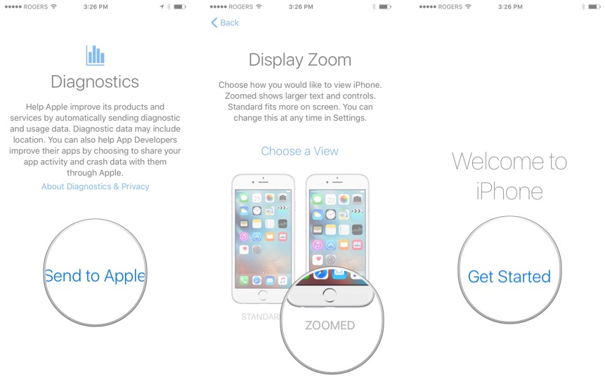
Having every feature and option up in your face can reduce usability and make simple tasks harder for the average user. Apple wants a product that's easy for anyone to use and that often means keeping non-essential features out of the way.
I’d be more interesting in seeing feedback for Apple on how to improve the situation without compromising on ease of use.
(Regarding the WiFi thing...I agree this is a very annoying default setting, but I think a worse outcome is when a user shows up in their friend’s house and has no idea how to connect to the WiFi. Making the user go to Settings -> WiFi to disable this prompt means they’ve demonstrated they’ll be able to go back to that page to manually connect to a network in the future. If you turn this setting off on a friend's phone, be sure they still know how to connect manually.
(Though I do think iOS could be smarter and not prompt you to connect to intermittent networks while you’re driving around a city...))