Image stacking to remove noise and optical artifacts, careful use of color filters to enhance contrast and pull out detail. The press release says it used Red: F444W, Orange: F335M, Yellow: F470N, Green: F200W, Cyan: F187N, Blue: F090W. The N filters are narrowband. F470N is only 54 nanometers wide: https://jwst-docs.stsci.edu/jwst-near-infrared-camera/nircam...
Almost all the light in this image is way off the red end of the human visual spectrum, of course. The shortest wavelength filter is F090W which has a center wavelength of 902nm, about the same color as the light coming out of a TV remote infrared LED, which is barely visible in pure darkness.
This is what it looks like through a film SLR, without the detail enhancing filters: http://www.phys.ttu.edu/~ozprof/3372f.htm Here's a 20 minute exposure through a telescope: http://www.phys.ttu.edu/~ozprof/3372fk.jpg Maybe what you would see with your own eyes through binoculars at a dark site well away from city lights. A dim red smudge, hints of finer detail.
While the JWST uses the red end of the human visual spectrum and narrow filters these objects are still broadband and can be imaged as such. Adam did an excellent job on widefield https://www.adamblockphotos.com/ngc-3372-carina-nebula.html and there are lots of deep field images in RGB on Astro imaging sites. The detail is phenomenal with JWST but a lot of people are saying one wouldn't see this with their eyes or with a color cam - and they're "wrong" (its complex). Your eyes just don't "collect" photons like a camera, but a color camera would see this nebula beautifully... We use NB in hobby Astro imaging a lot just to reduce the impact of light pollution.
NGC3372 is inside our galaxy, just 8500 light years away. It's not redshifted by metric expansion to any appreciable degree, (A calculator I just checked gave me a z of 0.000000617) and radial velocity is a sedate ~34 km/s. (z = 0.000000115)
The redshift on the other JWST images is because most of them are of objects that are much, much, much farther away. Infrared telescopes are great for observing those, but that's not the only thing they're used for.
Maybe my question would be better asked for other objects images then, but I can just google how far things are redshifted at extreme distances as well.
Redshift refers to how the wavelength of a photon can change if the observer is moving relative to it, (Doppler shift, redshift if you're moving away from the photon, blueshift if you're moving towards it) or cosmological redshift. (The fabric of the universe expanding, reducing photon energy)
NGC3372 is a cloud of (relatively) hot gas and dust. It's emitting broad spectrum blackbody radiation: it's emitting on all wavelengths. You can look at the same cloud at different wavelengths and see different things, telling you what parts of the cloud are at what temperature, or relative chemical composition, or what parts are ionized: http://legacy.spitzer.caltech.edu/uploaded_files/graphics/fu... Nothing here is redshifted, Spitzer is just capturing different light entirely.
Ok, disclaimer: I am not an astronomer and this might all be rubbish. I suspect I'm neglecting relativistic effects that might be important, for example.
The NIRCAM instrument on JWST has a wavelength range of about 600 - 5000nm [1]. The human eye is sensitive to around 380nm - 700nm.
To shift blue light (380nm) down to the upper frequency range of NIRCAM (600nm) requires a redshift of:
z = Δλ / λ0 = 0.58
This is related to the velocity of the object by:
z = v / c
and the velocity is related to distance (approximately) by the Hubble constant (H0 ~ 71 km/s / Mpc):
d = v/ H0
So we can rearrange and solve for distance to get:
d = z c / H0 = 8 billion light years.
The southern ring nebula is more like 2000 light years from us, so not even vaguely far enough that NIRCAM would see "originally-visible" light. The deep field image might actually be far enough... the faintest galaxies there might be something like 12 billion light years away [2].
Different wavelengths of light scatter more or less as they pass through gas or dust. This is why the Earth's sky is blue on a clear day, and sunsets are red --- the red light scatters less, blue scatters more.
In smokey or smoggy air, the red light is also scattered.
The "smoke" in a nebula is mostly gas and dust. It's either left-over primordeal matter (hydrogen gas, some helium), or ejecta from novas and supernovas --- star-smoke if you will, though it's created by nuclear fusion rather than chemical combustion.
JWST's IR sensors can cut through that dust more readily than Hubble's optical-range sensors could, and pull out more detail on the dust to boot (based on my own viewing of comparative images).
I'm not sure if the dust is reflecting light or glowing from heat, though my hunch is it's mostly reflecting. Stellar gas that gets hot enough will also glow in infrared (or higher) wavelengths, and that might also be picked up by JWST. I suspect there will be targets demonstrating this in future.
It’s real light, just color shifted as the JWST is designed to look at severely very distant and thus red shifted objects. The nebula is however much closer than that.
how does the scale of color shifting relate to the red-shift present in deep-field subject?
Idly wondering: are the furtherest objects being captured, so red-shifted, that the translation for human viewing done in these images more or less balances that out, so what we see in the translated images for some thickness of distance-bubble, is what we would see from a much closer perspective with the naked eye, akin to "true color." (I.e. so close that the relative red-shift would be insignificant...)
It’s not a 1:1 color mapping to correct for red shifting. Each color represents a wavelength, but the mapping is arbitrary and chosen to maximize contrast.
I'm suspecting that there's no hard rule for what colours are assigned to what frequencies, though "more red" in processed images probably corresponds to "longer wavelengths" in captured imaging data. There's no specific red-shift interpretation, though for viewing of distant objects (and galaxies particularly which have reasonably uniform emission spectra) "redder" -> "more distant, receding faster".
What you'd want to see specifically are the emission spectra showing absorption lines for well-known spectral bands. This shows specifically how red-shifted the light is, and is how red-shift was initially detected.
I doubt that there's an intentional mapping of red-shifted appearance + spectral sensitivity to near-and-unadjusted appearance. Though that might be possible.
In practice, I suspect the bands JWST is receiving don't map well to the RGB sensitivity of the human eye, but insteat JWST's sensitivity is tuned to scientific interests and value.
It's all real, but you would not be able to see it with your bare eyes even if you were relatively close to the nebula. The world around us would look very different if our eyes could perceive more of the infrared and ultraviolet spectrum.
The coloring is usually done to indicate different temperatures or wavelengths detected, so it can be a bit misleading.
I'm waiting for https://en.wikipedia.org/wiki/Pillars_of_Creation made by Webb.
It's not the same object, but similarly awesome. Maybe the article gives you an useful overview of how different telescopes 'see', and how that is translated into pictures for us.
These objects are much too faint to see much of anything with human eyes. We can see them in astrophotography because the exposures are hours long (or weeks even, sometimes), and because telescopes gather more light than the eye per unit time, as well. This is why these nebulae look like billowing clouds - they are huge (light years across), so some light is absorbed as it crosses them, and some of the infrared light emitted by them adds up. And then we enhance the effect by taking very long exposures. If we actually went and stood near or even inside these nebulae, we would still be in pretty hard interstellar vacuum, and we wouldn't see anything.
But that's with a telescope and long exposure & image stacking. But still in RGB as humans would see it.
I guess there would be a point that if you were not so far away, but still far enough away - it would light up the sky. This is emission nebula after all.
BUt if you were in it, it would be so diffuse that you wouldn't know it... perhaps a weird glow if you were near some of the forming stars.
I really wish astronomers would come up (or use) a standard mechanism for indicating the field of view of an image. The scale of this one in the night sky is much larger than the deep field one.
The image details do have the dimensions listed in a standard measure down under the "Fast Facts" section; I assume this will be included for every image release.
The deep field image says it's about 2.4 arcmin across[1], Stephan's Quintet image is about 7.4 arcmin across[2], etc.
Your thumb at arms length is ~2 degrees or ~120 arcminutes wide. The fingernail on your index finger at arm's length is ~1 degree or 60 arcminutes wide.
The moon is about half a degree or 30 arcminutes wide. This doesn't make sense but give it a try tonight if the moon is out.
FWIW many of the galaxies and nebula you see in astrophotography are actually bigger in the night sky than one might guess. Andromeda for example is about 6 times wider than the moon at ~3 degrees across - https://slate.com/technology/2014/01/moon-and-andromeda-rela...
this is so much more digestible than "grain of sand at arm's length", and those two metrics dont feel at all equivalent -- the moon is not ten grains of sand at arm's length wide, right?
The moon is pretty darn small. Half a degree wide. Imagine gluing ten grains of sand together, balancing it on a fingertip, then stretching your arm out. Around a degree wide? Depending on your grain of sand, of course.
hmmm, about the size of an asprin tablet or pea at arm's length, seems to agree with somewhat smaller than thumbnail [1]. maybe i should find and measure some sand now :).
in either case, 1/10 the width of the moon is so much easier to comprehend. when is the last time anyone tried holding a grain of sand at arms length? what a weird comparison to make when everyone on earth already has a stable/familiar reference in the sky.
That's the distance of an object away that has a parallax of 7.3 arcminutes and a baseline of 1AU. The 7.3 arcminutes referenced here is the width of the image on the celestial sphere.
In the Ring Nebula image, the two galaxies just kind of casually hanging out on the left side (just above midline), one square on, the other edge on, is pretty impressive.
There are a few others to be found (I suspect image duration is much shorter than for the Deep Field).
Even as far-from-primary-interest-objects, amazing detail.
Is this image distorted in any way at all? It feels like the galaxies are somehow oriented around a center spot. Not all of them, but enough to give the image a distorted feeling. Probably it's just my mind pattern matching against something that doesn't really exist.
Something missing from this discussion that's worth pointing out:
This image shows profound "gravitational lensing", which you know. But what you might not know is that is precisely _why_ they chose to photograph it.
This galaxy cluster (SMACS 0723) may be the most well known and powerful gravitational lens we have observed. The galaxies shown distorted around the edges are actually behind the lens, but are magnified by it. This means we can see even farther in this region of space than normal, because we compound the power of the JWST with the power of this natural lens.
It all adds up to providing the "deepest" view of the universe yet, allowing us to see galaxies at a distance of more than 13.2B lightyears. This lets us see structures formed in the infancy of the universe, that wouldn't be possible looking at most other points in the sky, or even anywhere else in this deep field besides the perimeter of the lens in the middle.
The mind blowing part is that many of those smeared galaxies are the same galaxy just "smeared" around the curvature of space so it shows up in multiple places as we perceive it since its been warped by the gravitational mass/dark matter so strongly.
The elongated double lensed galaxy to the right of centre shows lots of point sources. These look like globular clusters or maybe satellite galaxies (maybe these are the same thing in the early universe?).
Other features include the prominent arcs in this field. The powerful gravitational field of a galaxy cluster can bend the light rays from more distant galaxies behind it, just as a magnifying glass bends and warps images. Stars are also captured with prominent diffraction spikes, as they appear brighter at shorter wavelengths.
So, would that mean that the gravitational lensing over how-ever-many-light-years is ALSO coupled with the convex/cave aspect of the pico-adjusting of the JWT 'lens' such that even our JWT's pico-adjustments affect the NORMAL of the photons to the image?
Can this be adjusted for?
Wouldnt the pico-arc of the overall array affect the image output due to the distances involved such that we receive "false gravitational lensing, simply based on distance from the sensor"
?
I wonder if a more precise version(s) of the hex lenses could be made such that they can 'normal-ize' on a much more refined basis.
I know that each JWT is already capable of mico-flexes to each cell... but if we can develope an even further refinement (Moores law on the JWTs hex lenses resolution) we will be able to make thousands of images with varying the the normalization to each receiving area and comparing image quality.
Also, I am sure there are folks who know the reflective characteristics of photons from each wavelength that would allow for orientations for each wavelength.
--
Do ALL 'light' wavelengths, particles bounce off the reflector materials in the same way? - meaning do infra waves/photons bounce in the exact same way as some other wavelength with the exact same orientation of the sensor?
---
Do they do any 'anti-gravitational-lensing' correction calcs to 'anti-bend' a photons path to us to 're-normalize' the path that we should have seen?
The gravitational lensing matches exactly how it looked in Hubble's deep field overlay, so I would guess no the JWST lens is not causing any "false" gravitational lensing? If that's what you are asking.
Wouldn't one be able to adjust the perceived path of the photon after time, to adjust for re-normalizing the path of the photon based on the understanding of the gravitational arc imposed on such -- meaning the astro equivalent of "ZOOM. ENHANCE!" :-)
Lets assume you have a 'straight' vector of line of sight pointing your Earthly-Bound-Lens [hubble/jswt/whatever] at the object of interest.
you also have an idea through previous observations of gallaxies on the line of sight, which will have gravitational impact on the trajectory of the photons of interest...
the arrival photon's wiggle represents a wobble in time to get to earth. Meaning it changed phase multiple times between our sensor receiving it, and its origin.
If one could look at the path and the grav-lenses it went through, one may be able to extrapolate a more clear picture at various distances(times)....??? /r/NoStupidQuestions
( I am picturing a straight shot - but the photon traveled between many other celstials - and those
Meaning that no matter waht, when we speak of gravitational lenses, we could, usting JWST account for the "wobble" of a photon, nased on the accurate knowledge of where a body was, via measuring through multiples of JSWT observations... (ideally through actually multiple JWSTs, in differnt locations)
The idea being that if we can triangulate a more precice location between earth [A] and galaxy [N] - set of all galaxies/bodies/whatever,
We may be able to calculate the influence of gravity lens upon phont differentials based on when they came from and how far...
Ultimately making adjustments to the output of an image \based on super deep-field focus which is effectively selecting to the phtons of interest... and we can basically "carbon date" the accuracy of an image with a higher resolution?
What i think is pretty cool is that the gravity lens actually allowed hubble to see galaxies it may have not ever seen had there not been a gravity lens and now that we have JWST we see many more distant galaxies (and more of the same galaxy reflected in more positions)
Producing an "image" of a black holes requires astronomical, ahem, resolution because they're so far away (thankfully). To achieve this kind of resolution you need an aperture of thousand of kilometers.
The EHT images are created using synthetic aperture techniques to create an effective aperture with a diameter of earth's orbit around the sun. But this is only currently possible at radio frequencies due to our ability to capture, store, and coherently combine the phase information. It's essentially SDR beam forming across space and time.
We can also study black holes though visible and IR observations through their effects of the things around them-- lensing from their mass, matter heated up by falling in. Here is an image I took of the relativistic speed matter jet believed to originate from black hole in M87: https://nt4tn.net/astro/#M87jet ... and Webb can do a lot better than I can with a camera lens in my back yard. :)
Aside, there is some controversy about the EHT black hole images. A recent paper claims to be able to reproduce the ring like images using the EHT's imaging process and a simulated point source-- raising the question of the entire image just being a processing artifact. https://telescoper.wordpress.com/2022/05/13/m87-ring-or-arte... Though it's not surprising to see concerns raised around cutting edge signal processing-- LIGO suffered from a bit of that, for example, but confidence there has been improved by a significant number of confirming observations (including optical confirmations of ligo events).
> The EHT images are created using synthetic aperture techniques to create an effective aperture with a diameter of earth's orbit around the sun.
Small correction: The EHT is a synthetic aperture telescope the size of the Earth, not the size of the Earth’s orbit around the Sun.
Synthetic aperture telescopes need both amplitude & phase information from each observing station & have to combine the phase of simultaneous observations in order to create the final image. We can’t do this on the scale of the earth’s orbit, because we don’t have a radio telescope on the far side of the sun!
> "Here is an image I took of the relativistic speed matter jet believed to originate from black hole in M87: https://nt4tn.net/astro/#M87jet ... and Webb can do a lot better than I can with a camera lens in my back yard. :)"
You, sir, have just contributed a prime example of HN comments at their best. Your astrophotography is outstanding. Thank you for sharing! :)
Another question: are they already planning a successor to JWST? Is something better even possible? If it took more than 30 years, we should start sooner than later :)
https://caseyhandmer.wordpress.com/2021/10/28/starship-is-st... is correct. No NASA planning, including for space telescopes, shows any understanding of how much Starship changes the game. Instead of one, we can put up a network of telescopes. And try out crazy ideas.
Here is a concrete example. https://www.researchgate.net/publication/231032662_A_Cryogen... lays out how a 100 meter telescope could be erected on the Moon to study the early universe with several orders of magnitude better resolution than the JWST. The total weight of their design is around 8 tons. With traditional NASA technologies, transport of the material alone is over $30 billion and it had better work. With Starship, transportation is in the neighborhood of $10 million. Suppose that precision equipment added $40 million to the cost. Using Starship, for the cost of the JWST, we can put 200 missions of this complexity in space. Using a variety of different experimental ideas. And if only half of them worked, we'd still be 99 telescopes ahead of the JWST.
So where is Starship? It is on the pad, undergoing testing. They have a list of 75 environmental things to take care of before launch. Which means that they likely launch this month or next. At the planned construction cadence, even if the first 3 blow up, by Christmas it should be a proven technology.
Yes, it is distorted by a gravitational lensing effect of a massive galaxy cluster. Each image has a short discussion at this link, and a longer discussion linked via "Learn more about this image" for even more info: https://www.nasa.gov/webbfirstimages
Thanks for posting these links! It was frustrating that the main NASA PR pages linked photos that were 1280x720. I guess that's to protect their bandwidth costs since much of the general public is probably viewing on mobile anyway and higher res would not only be slower but wasted bits.
I just wish NASA had provided a link at the bottom of their low-res image pages to intermediate sized images (~4k) for desktop viewing.
I believe this page has what you want: https://www.nasa.gov/webbfirstimages Click on the image, twice, to get to a large-but-not-crazy resolution photo.
Mobile is actually a great platform to get Hugh resolution, since you can zoom in really easily and navigate the full image.
However, after spending 10 minutes on mobile this morning, I was unable to find any high resolution images, and many images had that anti-pattern of a BS HTML gallery that severely restricts interacting with the image.
Past a certain resolution, mobile devices automatically scale down images. This is hard to see in real-world images like pictures/galaxies. But try to open a really large image with some text in it and you will surely see how the text has turned blurry
Elements absorb light at certain frequencies. Given a spectral analysis of the light that passes through the atmosphere and another of the light that doesn't pass through the atmosphere, you can take the difference and see what frequencies were absorbed by the atmosphere. This tells you what elements make up the atmosphere. The H2O sections in the graph are the light frequencies that are absorbed by water molecules ("amount of light blocked" on the Y axis), indicating that the atmosphere contains water.
I know nothing about optics. What is the effect that causes the 6 or 8 points of light of come off of bright objects? Does it have to do with the hex-shaped mirrors on JWT?
Yes, and also two of the trusses to the secondary mirror (these are the two additional horizontal lines). The Hubble Space Telescope gets 4 lines because of its 4 trusses.
The simple answer is simply because of the physics of the scope, the support arms cause diffraction spikes. The hubble has them too but is a smaller mirror and different support arrangement. Super common on consumer scopes such as RCs, Newts and big tube scopes that aren't RASAs
Watching the livestream i was more than surprised, that color correction actually happens in Photoshop.
Also, there seem to be multiple layer-masks involved for specific regions and objects.
I get that you can shift and composite color, based on hue, apply filters etc, but: Photoshop?
Curious if anyone can explain, that what we see is actual science or some touched up version of objects in our universe.
p.s.: What struck me the most is the absence of noise, especially for the deep field photo. Hubble took many exposures over weeks, which normally would allow for reliable reduction of noise, webb took some shots over the course of hours and there’s hardly any noise to see. Weirdest part is seeing them just “healing brushing” away some dots - how is the decision process on altering images like that?
The difference between 'actual science' and 'some touched up version of objects in our universe' is smaller than you might think: no matter how good your eyes, if there was no frequency shift involved you would not be able to perceive the image, other than as an array of numbers. To facilitate your consumption of the data it has to be frequency shifted and the easiest way to do this is to map the IR intensity to a range of colors that are graded the same way we grade false color images from other sources: higher intensities get brighter colors and lower intensities darker colors. Because not all of these are equally pleasing to the eye and/or enlightening Photoshop is actually a pretty good choice because it allows for dynamic experimentation what brings out the various details in the best way.
If you would rather stare at an array of numbers or a non colorized version (black-and-white) it would be much harder to make out the various features.
So think of it as a visual aid, rather than an arts project or a way to falsify the data: the colorization is part of the science, specifically: how to present the data best.
I get that the aquired data needs to be transformed in a way so we get an image that depicts a reality we can visually process.
I honestly thought there’s some tools in Nasa’s imaging group that, based on scientific rules, pumps out an image that is correct - seeing Photoshop in use left me wonder…
I get that the investment needs to be “sold” too, would be sad though if we reached fashion-ad conduct for science…
And don’t get me wrong: I am in awe and more than happy this thing finally gets put to use.
There is no "correct" when you are shifting images from infrared to visible. But the "real science" part is probably done with a perceptually uniform color map. Or in the many cases where the image we see is actually a composite of many images taken with the narrow-band IR filter at different central wavelengths, the image might be presented with gaussians of different color corresponding to the different wavelength images. Or each wavelength is considered separately.
As others have hinted, the real science is going to be less pretty.
For example, some algorithm might filter the raw images and extract objects matching some properties, fit them, and then run every reasonable manipulation of that filter to give the fit an error bar. Or they will compare spectra from many galaxies to understand their composition, again running every reasonable variation of the calculation to get some kind of uncertainty.
The end science result will be a graph of some kind in a paper, but it costs very little extra to make these beautiful images on the side.
Photoshop is literally just a matrix transformation engine for data that is highly optimized for ease of use, extensibility, and making visual representations of that data.
I can't tell you because I wasn't looking over the shoulder of whoever made the image, but at a guess they started off from a black and white image, then turned it into an RGB image and change the various hues until relevant details became easier to see. The reason that that works is because a large scale structure has areas that emit at roughly the same intensity so you can bring these out by colorizing such a range with a gradient around a single hue.
This is not an automated process because a computer would not know what we humans find 'interesting structures', if you could put that into some form of definition then you might be able to automate the process in the same way that black-and-white images are automatically colorized (which works, but which is sometimes hilariously wrong).
As for the sausage, how it is made is interesting, how it tastes is from a PR perspective probably more interesting. And regardless you could argue that anything that differs from an utterly black square is 'not truthful'.
Which makes me wonder how all these galaxies and nebulas would look like in real life. Would they look similar to how they colored it? Are those images maybe potraying a completely wrong reality?
If you use an optical telescope to look at the Orion Nebula, you'll see it, but it'll appear pretty much grey. (No scope and it'll be what looks like a bright star, with perhaps a little bit of a blobby nature.) Hook a standard SLR camera up to the telescope and do a long exposure, though, and the reds and blues become readily apparent.
You can see different images of the Horsehead nebula and the differences in how colors are presented. They vary substantially, but not in any way that matters, at least to me on an aesthetic level. It's more like the difference between different white balances (which are, to some extent and in some contexts, arbitrary) in a terrestrial image.
Maybe one or another of them is more "true to life" but since human eyes never evolved to view this stuff, there's no reason to think that the best and most informative view of an astronomical object is the visible light one.
If you were to fly into these nebula in some kind of spaceship they wouldn't be any brighter than they appear in the night sky from Earth. They would just look way way bigger.
The frustrating thing is that our eyes start to respond differently to colours when the light is really really faint.
So we would probably perceive them as a grayish green haze.
If the image was brightened artificiallythen we would see it as mostly red, with some browns and blues.
There is no "in real life." The size, sensitivity, and spectral response of human eyes is a response to the radiation conditions on Earth, as enhanced by evolution.
If the Sun had been redder or bluer and your eyes were the size of your head or much smaller, everything would look very different.
The Webb images are infrared so "in real life" you'd never see them as shown here. You'd see whatever was visible in optical wavelengths.
This isn't just a quantitative difference. Those science fiction imagined alien worlds covered in little tiny technological lights - just like Earth - are a fantasy. Aliens might see UV instead of optical frequencies, and Earth would look like Venus to them - an opaque planet covered by a thick haze. They might light their spaces with UV, which we wouldn't be able to see so their planet would look dark to us.
It's the wrong question to ask because a 'human observer' would see absolutely nothing. The age of the objects you are looking at is such that you are looking into the past not at something the is still there in the present, so if we were to transport you there you would not recognize the various objects in visible light at all, too much time has passed.
This isn't true at all, many of the objects are not far away.
The Carina Nebula (imaged) is 7,500 light years away. It is still there.
It seems like people are going through mental gymnastics to avoid answering the question. If someone asked what a famous black and white photo like raising the flag would look like in person, would people give the same nonsense answers? e.g. "There is no "in real life", "the past cant be seen"
For the Carina Nebula[2] :
"Several filters were used to sample narrow and broad wavelength ranges. The color results from assigning different hues (colors) to each monochromatic (grayscale) image associated with an individual filter. In this case, the assigned colors are: Red: F444W, Orange: F335M, Yellow: F470N, Green: F200W, Cyan: F187N, Blue: F090W"
This is in comparison to the human eye, which sees 630 nm for red, 532 nm for green, and 465 nm for blue light.
That is not to say the Nebula isn't also observable in visible light, you would just be seeing different colors and perhaps features. probably something like this visible spectrum imagine of a different part of the nebula
For the other images, what you would see in person ranges from very similar to nothing depending on the image, and pixel in the image.
Yes, you're right, for that particular nebula. Of course there are other nearby objects that are interesting in that spectral range. But MIRI really shines when it comes to distant galaxies whose light is so far redshifted that it shows up as deep infrared.
Although the accuracy of infrared, or other non-visible spectrum digital representations, could be disputed you would definitely see something similar in visible spectrum as compared to infrared, but with much more dust. Most objects that are emitting energy are doing so in many portions of the spectrum.
> if we were to transport you there you would not recognize the various objects in visible light at all, too much time has passed.
I think this is an old interpretation of the speed of light and spacetime, since it describes travelling very far through space and also time. So it's more of a statement about the realities of space travel than what it would be like to be there now.
As you said, distance = time, so saying that too much time has passed is the same as saying that it's too distant to see, which is kind of beside the point.
I would say that what we see in the pictures really is the nebula as it exists now, but if you tried to travel there at near the speed of light, your speed through time would increase so much that you would see it rapidly change.
The real question is, what would you see if you were there now (at the time during which the shape of the nebula matches the photo).
Responses to this question are really interesting. I usually take these kinds of evasive non answers in bad faith, thinking that people are refusing to acknowledge the validity of the question.
After some thought, I wonder if it is more an issue of neurodiversity. Perhaps some people cant imagine themselves viewing a celestial object, or can't imagine the desire to do so.
These are Webb's first science images, so published papers will come out of them. Of course, those papers will have additional data and analysis to go alongside it, but they absolutely are looking at details resolved in these specific images, processed in this specific way.
So I'm not sure where the sentiment that these are just images for the public is coming from. That's certainly part of why these observations were made and processed this way, but there is science too.
"but they absolutely are looking at details resolved in these specific images, processed in this specific way."
I don't think you're correct. PR images from telescopes aren't new, so if you are correct then surely you'll be able to find papers based on older photoshopped images from Hubble.
There are countless examples. The reason they composite the sensor layers in the first place is because they are trying to color code gases and dust for use by scientists. In some cases they are trying to highlight features that would be too dim otherwise.
Here is an example of color-coded images from Hubble being used - https://iopscience.iop.org/article/10.1086/345911/pdf - The same beautiful image used to get the public excited about space is used in Fig2 to locate where helium, nitrogen, and oxygen are in a planetary nebula. Even the 'Pillars of Creation' image was used for this sort of analysis, though it was less interesting than most images.
"Beautiful" just happens to overlap with "highest contrast and most useful for study". JWST has more sensors than ever before, so it will be more colorful than ever before.
I like to think that these cosmological structures are inherently beautiful the same way abstract mathematics is, and colorizing it is just a way to convey a sense of that beauty to most people who don't speak the language.
Because light red shifts over time/expansion, you could color these towards blue until they cover parts of the human vision space to what they would look like on earth a billion years ago or so.
In that case you could render the image differently depending on how many millions of years in the past you were interested in.
I.e these used to be human “visible” on earth, but eventually their colors shifted beyond what we can perceive with our eyes.
This is manly a demonstration of the imaging capabilities of JWST. Making actual sausage is a way longer, way more boring process.
It depends on the science of course, but generally the sausage is made with specialized software that produces contour plots with error bars and what-have-you. The actual calculations will be done using just numbers, fitting models to data without any pretty pictures at all.
This likely wouldn't have made #1 on HN without "pretty pictures" (this is what astronomers calls them). Photoshop is made for pretty pictures so it would be silly _not_ to use it. :)
They do have some custom tools that are publicly available. I saw some videos in the past showing how they use those tools along with Photoshop to process images.
> actual science or some touched up version of objects in our universe.
Here's a mental model that I found particularly beneficial:
All electromagnetic radiation is the same. In the sense that every proton/neutron is the same. But adding a few more protons/neutrons creates an entirely new element, with entirely new chemical properties. From something simple come incredibly new powerful behaviours. So just as Iron is massively different from Plutonium, Microwaves are massively different from Gamma rays.
What we call "visible light" is not particularly special, except to us, and our specific human biology. It feels more real because it's visible to us, but it's not on the grand scale of the universe.
What we're observing through these telescopes isn't a dog chasing a ball. We're seeing stuff billions of light years away, millions of light years in size, billions of years ago. Passing by trillions of other stars and planets on the way.
These objects are emitting a gargantuan amount of information. Why should we only present the information that happens to be in the same subset as what our primitive primate vision cones can process?
So, no, if you were to teleport to the nebula/galaxy that we're showing images for, it wouldn't look exactly like that to your human eyes. Instead, what you're seeing is what a god with perfect vision of the universe would see. You're seeing the universe for what it is, not just the part of it that is presented to humans.
1. photoshop is really good at composing different (spectral) layers together. There is alternatives to this like pixinight that are more geared toward deep sky astronomy work but I'm sure it's easier to hire people that can just take a Photoshop class.
there are many layers/masks involved for different filters. the filters accept or reject certain wavelengths of light and may be designed for specific elements on the periodic table. people often talk about hydrogen filters or oxygen filters, sulfer filters etc. the color distinction you see is actually indicating elemental composition much of the time. I'm not sure what filters webb is using.
2. modern telescopes clean up their images by taking a "master dark frame" that is a stacked frame of many frames taken with the lens cap on. The goal there is to compute the noise profile of the sensor. I'm sure before launch the darks for the sensors were determined and are at the ready to correct and calibrate images coming from the telescope. think of it as applying a bespoke noise filter for that sensor. It's a fast process to apply it, but not to generate it. If they really make the raws available I'm sure we'll see more noise there.
3. the touch up you see them doing is the removal of a hot pixel which survived the calibration process with the dark frame. no doubt on space telescopes they still get errant hot pixel of some kind of particle or cosmic ray they don't want makes it to the sensor and flips a bit (and is therefore not account for in the master dark). happens all the time. they're probably keeping a map of where they're getting hot pixels.
But they are doctoring it to make it more artistic/presentable. I have no doubt that real astronomy presentations/papers want to see the undoctored data at some point.
Did you mean you thought they were adjusting the content and not just fixing noise?
I think you've answered your own question there, it's just PR images touched up by the media team without regard for anything. If there's any science being done it'll be done by matlab scripts using raw data as input.
I’m confused.. why would we expect some other image processing software to be better than Photoshop - a software package which has been the top of its class for ~30 years?
The filters used are just simple compositions -- making monochrome images colored and adding them together, so that scientists can distinguish different types of gas and dust via color coding.
(And have been eagerly waiting for this moment for ages)
It just seems “unscientific” to just use Photoshop and above all curious about the set of rules and algorithms, that enables them to decide which hue to pick for which region, levels, etc.
While Photoshop is widely used in artistic and creative imaging, it also contains a powerful suite of tools for image processing in arbitrary color spaces. I'm not even a serious user and across various hobby projects I've used it for stuff like manipulating 3D depth data and deriving logical bit masks.
Photoshop can do just about anything with spatial image data and if it's not built-in, you can probably find a plug-in to do what you want or write a script. The trade-off is the software can be very complex because over the decades it's grown to support an incredible number of use cases.
Over the years I've also seen PS used in unexpected ways at work. If you need to do something programmatic to image or spatial data, PS is a good host platform for custom code because it will handle importing file formats, color space conversion, bit plane manipulation, alignment, scaling, cropping, perspective correction and masking before your custom processing and then it'll export the output in whatever sizes and formats you need. And it will do it on gigapixel data sets under script control. That's a lot of grunt work you don't have to implement. I've even seen it wired up to Matlab.
Not just in astronomy but also in biology, pretty much anyone working with images uses photoshop at least for the final layout. In biology where the rgb overlay is paramount for result interpretation, generally it’s frowned upon to play with channels too much.
But when you have 10k x 5k pixel images and channels that don’t directly correlate with visual spectrum I don’t see why using photoshop extensively is wrong especially for images to be released to the general public. I’m even sure some local touch up is acceptable for me.
NumPy or Matlab. And it's possible the "original image" is multispectral (more than 3 channels), so you need to choose an arbitrary 3-channel projection.
The person seen photoshopping very briefly talked about how he picks different colours for different region/light-frequency. But yes, more details will definitely be helpful. Also I guess they could open-source the untouched photos for other artists and photoshop experts to play around?
There's a bit on the data policy on wikipedia [1] but basically the operations costs are funded (in part) by people paying for telescope time. The project that is currently paying for the telescope gets exclusive access for a 1 year "embargo" period, after which the data becomes public.
Small correction, no one will be able to pay for time on JWST. But if you put in a proposal for time and it's accepted, they will pay you. That's to make sure there is sufficient funds available to properly make use of the data you proposed for.
Actually that's sort of a large correction, thanks for pointing that out. Isn't it a bit of an inversion of the norm in astrophysics? I'd thought many grants included money for telescope time.
They aren't "untouched photos" in any traditional sense, but rather raw data. To visualize astronomical phenomena always requires processing/compositing. For that matter, traditional cameras on earth automate many of the same tasks being done here in Photoshop via debayering.
This article goes through processing a Hubble image of one of the same objects that Webb did today and includes an example of what it looks like before adjusting for contrast and tone.
You'd have a tough time defining "there" in images like this, and your eyes are not evolved to see faint, diffuse, glowing gas structures in the infrared.
I had always assumed they were doing it completely mathematically though. Like collating spectrometry readings to know what elements were present where and figuring out the temperature for blackbody emission or something, or even just linearly transforming the raw data from the spectrum the telescope can receive to the visible spectrum.
Kinda disappointing if it's really just a paint by numbers Photoshop to look nice
Terrestrial cameras don't behave that way. They apply tone curves from the beginning. They have to pick a white balance. They have to cram an HDR signal into an 8-bit image. They have to decide exactly how to process the color- every film stock and digital camera renders color a bit differently, even when ones that are all trying to produce true-color images and there are humans around who can compare it with their own subjective perceptions. The simplest, linearest way to do it is probably wrong, due to mismatches between human color perception and the camera's sensor / film stock. Eg, human rods and cones almost certainly don't have the same frequency response as the color filters inside your camera, and that's just the beginning.
Anyway, this post shows an example comparing a "flat" color composite and one that's been tonemapped etc. This is using Hubble data but it's the same subject as one of the JWST images.
I am not doing astronomy but Photoshop is useful to analyze any kind of image. You can manipulate contrast, apply all sorts of filters, map a color palette, etc... All that using a user-friendly interface. It is very mature software used by millions of people, for general purpose image work, no custom tool will come close.
I guess that scientists will also use specialized software for fine analysis, but it doesn't make Photoshop useless.
I use PixInsight myself, but you can do a lot on photoshop and a lot of people will take the output of PixInsight to touch up in photoshop.
Modern sensors are amazingly low noise. 10 years ago, I used to have to calibrate out darks, bias and flats just to remove my sensor noise. Now with modern CMOS sensors, people still do that but it isn't as necessary and you can overcome much of the sensor noise by capturing enough data - and that's where JWST just dominates. THere is nothing impeeding the data causing noise.
Shot noise is easily removed by integration, Read noise on modern sensors is almost non existent and easily calibrated out, dark current is extremely low, bias, hot and cold pixels are all things that can be removed with calibration and integration and with space telescopes cosmic rays are probably the most annoying thing but if you stack enough images they integrate right out.
But back to photoshop, the final images are just publishing art. I use pixinsight myself for all the heavy lifting, pixel math, integration and calibration but sometimes go out to photoshop for cleanup - especially for web/print.
I read a detailed interview with the person who does the enhancements a couple of days ago (can’t recall where a grrr).
He said:
A) there are two of them in the team doing the imaging
B) it doesn’t start with an image - it’s literally heaps of binary data that the scientists stitch together
C) he then does the colour overlay based on agreed norms (one colour per input frequency for consistency)
D) most of his “touch up” work is getting the colour gradient right between the brightest and dimmer objects - without this a lot of resolution would be lost (brights too bright, or dim not visible).
I work with images on the other end of the scale regularly, and amongst scientists it's probably 50:50 Photoshop or ImageJ for editing images like that.
Unfortunately the NASA stream online was a disaster. Choppy video and it seemed like nobody had prepared anything. Also 720p in 2022...
Don't get me wrong, the images are amazing, but when small startups like Rocket Lab can have uninterrupted streams all the way to the orbit, but NASA stream from a studio looks more amateurish than your average 13-year-old Fortnite player on Twitch, it leaves a pretty bad impression.
Seriously it was such a mess. Lag aside, they had MULTIPLE cases of either someone's mic not being on, or someone with a hot mic after they were done whispering over the stream. Almost every single transition to scientists in other cities failed. This is really unfortunate because they hyped up this event big time. They announced it two weeks in advance, had a countdown, even had scientists do "reaction" videos to seeing the photos for the first time...
People often underestimate how insanely hard it is to put something like this together, but I'm surprised NASA did, It's not like it's the first time NASA does a livecast.
I'm not sure if NASA or the White House directed that stream. I've seen much better-organized streams from NASA. It wasn't just technically flawed. It was late, abrupt, disjointed and the talking points appeared to be delivered by people that had little knowledge in the matter. I can't believe I saw that level of disorganization from our highest executive office.
Existential dread pro-tip: The Wikipedia page on "Ultimate fate of the universe" is a fantastic way to compell the question of why anything ultimately matters.
Coming up with personal answers to this is the ultimate character resolve exercise!
Awesome link, thank you. Nietzsche's career was an exercise in creating and promoting the concept of 'creative nihilism' as an alternative to existential pessimism, which works for me!
“Nothing matters” is an easily disprovable claim. I assure you many things matter to me. Mattering is subjective.
“Everything as a whole does not matter” or “there is no single ultimate purpose to everything as a whole” are more valid claims, but tautological. Something can only matter to some subject by definition, and ‘everything’ is a magic word that includes every thing, so it can’t matter to anything else, by definition, because there is no thing outside everything to which it could matter. This tautology is not well summarised as “nothing matters”.
I used to take solace in the “nothing matters” notion from nihilism, but I now think it’s a false and dangerous comfort. 1) it’s straight up disprovable with a few seconds’ analysis – really just a motivated twisting of the above tautology into something quasi-profound, and 2) it’s burying your head in the sand – it’s avoidant wordplay that will eventually fail you, engendering a dull feeling of narcissistic loneliness over time. I now think it’s better to recognise that each case of something ‘mattering’ requires both an object and a subject. That subject isn’t always you, but you might as well start with the cases where you are the subject. You can notice things that matter to you (just basics like pain, pleasure), and that they do indeed matter to you. Then you can consider that there are other minds, and realise that what matters to them isn’t the same as what matters to you - but the fact that things do matter to them may itself matter to you, and so on and on. Once you start looking for meaning you realise the universe is absolutely teeming with it. Just an unfathomable number of connections of meaning between subjects and objects. In human society there is a combinatorial explosion of matterings.
Life is indeed a cool trip, an adventure, but only so because it is so full of events that absolutely fucking matter along the way. And yes, then you die. That doesn’t mean none of it mattered to you, and it doesn’t mean none of what you did mattered to anyone else. These are just logical errors.
You might think I’m just being pedantic. But I think it’s a very important distinction. “Nothing matters” is not just pedantically different from “There isn’t one single universal reason for everything as a whole”, it’s completely different in its implications. The former is an oversimplification that causes a lot of unnecessary feelings of bleakness, and probably causes a lot of indirect social harm by drawing excellent minds into inaction, springing from a platitude we tell ourselves when things get too much and then repeat as a kind of sad-mantra. The latter correctly reveals itself as tautological wordplay that we may discard as meaningless.
It's important to differentiate between things that matter to my emotional well being and things that matter in a universal sense. Plenty of things matter to my personal monkeybrain - I want to have a stockpile of nutritious, calorie dense foods. I want to feel free of danger from predators and natural hazards, I want members of my tribe to prosper and multiply, etc. All those things might as well be noise on the universal scale.
It doesn't refute anything. The point is rather; what matters to you is part of your personal journey. Ultimately it still doesn't matter in the grander scheme, but that isn't the point of enjoying your adventure while you're around.
Does the cosmos care if I give my Mother a birthday present or not? Unlikely it does. Do I? Yes, I send one every year. Does it matter then? Not really, but I like doing it because I like being nice to my Mother.
I think we nearly agree, but I’d say you’re throwing the baby out with the bathwater.
The bathwater is the notion of a subjective cosmos, some overarching supreme being to whom specific events ought to matter somehow. I’m very happy to throw out that bathwater, along with other theocratic sophistries that still influence our thinking too much. The baby is meaning itself, all of which takes place within the cosmos, and every instance of which is subjectively experienced by some specific subject, by definition. And crucially, these subject–object connections can themselves be observed by third parties as real, objective phenomena through abundant evidence. They are as real as potatoes or sound waves.
This part of your comment feels like a non sequitur:
> Does it matter then? Not really
You just said it matters to you. Then you said it doesn’t ‘really’ matter because it doesn’t matter to…the cosmos as a whole? So what? It doesn’t matter to your toaster either, nor to my cat, but it still matters to you. For something to ‘matter’ there must be some particular object that matters to some particular subject, and in this case the subject is you. Your reason for doing it doesn’t mean it doesn’t matter to you, it’s just an explanation of why it matters to you.
And to me, sure, those things matter. But I also acknowledge that this isn't an objective thing the cosmos put into the world but a personal feeling. My argument is essentially that you've got to do that. Acknowledge that what matters to you is something personal. And to cherish that because the journey is important. I see it as a pathway to positive nihilism.
Yes. By induction, if nothing matters, then they don't matter either.
It helps you relax and put things in perspective. For example, you can focus on achieving high scores just for the sake of it. Have the kids you want, have the life you want, have the things you want, knowing that it's pointless but that you want it and that's enough.
One of my favourite concepts from Douglas Adams was the Total Perspective Vortex, a form of punishment that would drive the victim insane by showing them the entire totality of existence and their place in it.
it's terrifying how alone and ephemeral we truly are, that there are already places in our expanding universe that will never be reachable even via communication with any technology on any time scale (unless universe expansion reverses course). that any communication we may receive today will be from civilizations that have ceased to exist thousands to billions of years ago. and humans will likely never travel outside the solar system.
Why existential dread? We're extremely lucky to be alive. That one sperm hit that one egg and we survived to now. That is extremely unlucky, each of us is one sperm out of hundreds of millions, so savor this existence!!
Indeed, it is truly cause to pause and step back. What's the name of that phenomenon common amongst astronauts when they see the earth from afar? I feel like our society could use more of that.
I made this page (posted in another thread yesterday) because I was rather underwhelmed by the .gif. I think the page shows in much better detail the difference between the telescopes' capabilities.
The reddest objects in the JWST are frequently not even present in the Hubble image, as they were redshifted into a band of light Hubble couldn't even detect. That's my favorite part about this image - those galaxies we can now see which were previously redshifted beyond our capacity to detect. They're the oldest, and receding from us the fastest.
That is incorrect. The famous Hubble Ultra Deep Field image[1] took 11.3 days of imaging spread over four months (because of high demand to use Hubble). However, that is a different part of the sky. The Hubble image shown here was taken as part of RELICS[2], a survey of images to find good candidates for JWST to image, and was only exposed for 1.7 hours (5 orbits at ~20 minutes each), compared to JWST's exposure time of 12.5 hours. So comparisons between between Hubble and JWST for that particular shot are not fair to Hubble.
Ok to be honest I know it's not cool to admit it, but so far it all looks the same.
If someone told me that the Webb picture was taken by Hubble I would not have thought about it for an extra second.
I'm hoping that in the future we see pictures of locations and environments that are mind-blowing to the average person who loves space.
The very rough equivalent in computer terms: a 1997 PC computing something and taking a week or so to do it and returning the answer: 3.
The same by the 2022 version: 3.14159265358979323846 in a few milliseconds.
Both the speed of the computation and the resolution of the result are what makes it impressive, not the fact that the nature of the universe does not change fundamentally when viewed across a longer span of time.
It is mind-blowing, but maybe not to the 'average person who loves space'. But if you stop for a bit longer to understand what it took to create that image and what it is that you are actually looking at (the age of the objects involved, their apparent size and the resolving power and temperature of the telescope required to make it) it becomes a lot more impressive.
Understood, i've been following this forever and am super excited to see where it takes us. I'm just saying we are allowed to admit that to us these pictures look like more of the same despite knowing that they are very much not.
To me they do not and I am probably also an 'average person who loves space', in fact I'm blown away by the results on display here and it is way beyond my expectations. From a tech perspective this is humanity at its peak.
The difference is in a) the details and b) the length of time the telescope has to gather light to get the photo. JWST got the photo in hours when Hubble took weeks, and there's easily 10x as many objects in the JWST shot.
JWST can thus observe much fainter and much more distant objects - galaxies billions of years old, exoplanets, etc., and it can do more of it.
I'm honestly not sure how you someone can look at those two photos side-by-side and think they're the same. Hubble's is like slapping a 360p cam rip on a 4k TV.
Yes, we can admit it for some of the images, like the first one (crisper details and new galaxies notwithstanding). Some of them are pretty stunning in the improvement, though, IMO:
Unless you know what you're looking at, most if not everything looks mundane. It's only with perspective that we can grasp the beauty of things like these, or just other things, like ants.
To most people, ants are just an annoying bug. But to scientists (and curious non-scientists), ants are endlessly fascinating creatures. Together with scientists who speak to "common folk", even they can understand the beauty in how ants work.
That's why outreach and education is so important. And sometimes the beauty doesn't come from the direct thing (like these images, although I'd argue they are beautiful by themselves too) but from the indirect implication of the thing (time to acquire the picture, the data gathered to "draw" the picture, the community for even enabling this picture from being drawn and so on).
If they pointed JWST somewhere for weeks instead of hours, would it pick up even more objects, or is it hitting the limit to what exists in that part of space?
You might be able to see some additional fainter objects, but the deep field shot is looking at 13 billion year old galaxies - some of the first in existence. There's not much older you can look at.
These are just the initial "pretty pictures" processed to look nice and promoted as part of NASA's ongoing fundraising. The more valuable science payload is in the spectral data which will tell us about the composition of these objects. Another exciting aspect of of JWST is the IR instrument (NIRCAM) which can see red shifted wavelengths revealing much older objects from the early universe.
To me, the real 'shock and awe' will be when scientific papers are published which reveal new knowledge and deeper understanding of our universe. This will take some time although I'm sure the first papers are already racing toward pre-print.
I kind of agree with you, these pictures do look like more of the same. But that's okay, the real exciting stuff isn't going to be pretty pictures, it's going to be what astronomers and physicists are able to learn by peering deep into the origins of the universe. The pictures of galaxies are nice to look at, but the real ramifications of JWST will take years to play out.
This makes the Hubble telescope even more impressive in my eyes. Built 50 years ago with presumably 60 year old tech.
> Hubble telescope was funded and built in the 1970s by the United States space agency NASA with contributions from the European Space Agency. Its intended launch was 1983, but the project was beset by technical delays, budget problems, and the 1986 Challenger disaster. Hubble was finally launched in 1990.
The exoplanet analysis is what I'm most intrigued by. They're getting much more data than in the past on these.
Of course they went for an easy gas giant target first (it has lots of water, which is great), but those Earth-like planets in the Goldilocks zone are gonna be some of the most exciting stuff that comes out of this. Looking forward to it.
I don't know about Proxima Centauri b, but they'll be spending around 25% of "Cycle 1" (the first 6,000 hours of science) working on exoplanets, don't worry:
"Over the coming year, researchers will use spectroscopy to analyze the surfaces and atmospheres of several dozen exoplanets, from small rocky planets to gas- and ice-rich giants. Nearly one-quarter of Webb’s Cycle 1 observation time is allocated to studying exoplanets and the materials that form them." - https://www.nasa.gov/image-feature/goddard/2022/nasa-s-webb-...
Prox c. has a screamin' hot proper motion, as you'd expect from it's proximity, so it's moving across the celestial sphere at a pretty good clip.
The real problem is that Prox c. b is only 0.04 AU out from its host star. So the absorption spectra for a star lined up with the planet is going to be pretty well contaminated with light from Prox c. You could imagine various schemes for moving around the observer for the best angle or big occultation disks, but at a certain point it's going to be easier to just fly a probe over and sample the atmosphere directly.
1150 light years away! Imagine how much more details can be detected for stuff within 50 light years.
Really, they should be already building 2nd James Webb. I am sure even 10 of them would get 100% utilization for their whole lifetime. I can only imagine what kind of needless political game is happening around prioritization of time slots for it.
Or start working on next-gen, bigger, more resilient etc. It costs peanuts compared to any significant CERN upgrade and we have so much room to progress in astronomy (aka understanding our home, this universe) just by getting more data and resolution.
I fear there won't be any more JWSTs at all. People are already bitching about how much it cost and that all it does is make pretty pictures right here in this thread and there were many times that it came within a hair of having its budget slashed.
Super happy we have one JWST, and I hope fervently that it will outlast its original mission by a large fraction, every sign right now points in that direction.
A lot of the pictures have some bright stars with 6 long lens flare like points coming out of them in a consistent pattern. Is that because of the hexagonal shape of JWT's lenses/mirrors?
That's quite exhaustive, but it makes me wonder why isn't anything done to correct for that. Like for example instead of taking one 15h exposure, why not take three 5h exposures and roll the telescope 5 degrees in between, then median filter out the artefacts?
Mainly because it doesn't matter. They're not looking at the stars in the foreground, they're looking at the background which is much further away. The diffraction pattern is actually super dim -- those foreground stars are just very bright due to the exposure.
It took like 5 months to cool web to operational temperatures rolling the telescope would create so much heat all new images would be useless until it cools down again.
That makes no sense, they have to rotate it every time they take a picture otherwise they'd be looking at the same spot all the time. Motors don't emit that much heat and neither do torque wheels.
Though I suppose now that I think of it, it's possible the main mirror assembly actually has no built in roll control but only pitch, since the yaw part could be done by moving the entire telescope while remaining shaded. I've never seen any videos showing the full movement, but the previews for LUVIOR show it having full 3 degree articulation relative to the heatsink segment, so I assumed the Webb also has it given that they're extremely similar designs.
> otherwise they'd be looking at the same spot all the time
It's in an orbit around L2, so it's not statically positioned in space. L2 also moves with the earth around the Sun, so it's not statically limited to any one region of the sky.
LUVIOR is not web. Web doesn't have articulation like LUVIOR its fixed only the mirror segements move. also they don't rorate everytime they take a picture there's limitations beacuse its an infered telescope. https://jwst-docs.stsci.edu/jwst-observatory-characteristics.... Web also has a field of view 15x hubble
I think you also had a similar comment and linked the same article under the previous topic about JWST's first image?
The article is very informative, but my read of it is different: the three major "spikes" are in fact due to the hexagonal shape of the mirrors and how they're laid out. The struts also add three spikes, but: two of them coincide with the mirror spikes, while one of them (from the vertical strut) is visible on its own, and causes the smaller perfectly horizontal spike.
The image I'm basing this on is in your article with a caption starting from "The point spread function for the James Webb Space Telescope" [1]
From the other comments, I understand why it's there, but i wish they would photoshop them out.
The images take on a more synthetic and fake quality when the technical physical man-made constraints of our telescope get projected out onto the natural very much NON-man-made universe.
Yeah, it's the hexagonal shape. The objects with the 6 diffraction spikes are overexposed compared to the rest of the objects in the picture, so they're generally brighter and/or closer objects.
I really appreciate the work of the US Air Force Cambridge Research Laboratories for creating HITRAN. HITRAN is a molecular spectroscopic database used to look molecules in gas and atmosphere. They are the standard archive for transmission and radiance calculations. Without their groundwork we would not be as good at understanding planetary atmospheres.
Disclaimer: IANA scientist of any sort, just a huge nerd.
I've been interested in astronomy since I learned to read, and JWST has been planned for most of my life(all but 2 years if you count all explorations of ideas for a post-hubble telescope since about 95). I've been waiting for this my whole life, so this feels like a strangely personal event to me even though I had nothing to do with it myself. It's so hard to even put into words the tremendousness of this technological and scientific achievement, so I won't try.
Anyway, enough sap.
I'm super stoked that they've already started taking spectra of exoplanets. This one was sort of an "easier" one but the detail was unprecedented as with all the other observations. I can't wait to see some results on some of these smaller rocky planets in their star's "goldilocks zone".
These are the planets that have simply been out of reach until now, and are the most interesting in terms of searching for signs of life.
This kind of stuff is really awe-inspiring. I have a couple of questions for anyone who is knowledgeable on the subject:
1. Looking at the light from the tiny red-shifted galaxies that are ~13 billion years old... would the Milky Way appear the same to an observer ~13 billion ly from us?
2. What is the cause of the star pointed artifacts (specifically, having 6 major "points") for particularly bright objects? If you zoom in closely on any one of the points, you can almost make out a hex grid, as if the shape of the telescope's mirrors is the cause. Is that correct?
2. Yes the artifact shape is related to the mirror shape, and the support arms which block some light. this is called a Diffraction spike. There are a bunch of fake web telescope image videos on YouTube with 4pointed diffraction spikes so you can tell they are taken from a different telescope.
When I was observing the 2017 total solar eclipse, my attention was interrupted for a few seconds by someone who was driving a car. Their headlights turned on as they kept driving, not stopping for a minute to see something that for a given place on earth happens once every four centuries. The few people dismissing this reminded me of that experience.
I know people who care greatly about the JWST but will go around the company slack belittling people for wishing happy new year, wielding a cosmic cudgel of unimportance on the day.
But everything humans find important are only that due to human and sociological constructs, whether calendrical or cosmological. Nothing matters, except what matters to you. The unthinking matter of nature is utterly indifferent (as far as we know or think).
– someone who drove a long, long way to see the same solar eclipse, no regrets!
I remember reading something in the lines of: we know this nebula to be composed of gasses X and Y, which have colors A and B. As a layman it was unclear to me if this statement means they are applying a color palette to a monochrome image(s) using some educated guesses or something else.
Is infrared the only (or the most convenient, most useful etc) spectrum visible given the great distance? If we could get close enough, I suppose we would see things in clearer visible light. Without any enhancements, long exposures etc, would they be anywhere as colorful as the nebula images? Would they be visible to us at all, or are the emissions too weak even up close to make any impression to our eyes?
They have dozens filters on the telescope so they take multiple pictures at different wavelength and assign colors to them and combine them.
The galaxies from the early universe would not be visible in the visible spectrum since due to red shift, its become infrared spectrum. Also infrared spectrum can see through stellar dust so some things become more transparent in the photos.
As you may be aware, all digital images are composed of a color palette applied to monochrome images, it just so happens that we usually pick a color palette of red, green, and blue, which ideally correspond as closely as possible to the three wavelengths of light to which the imaging sensors in our cameras (and also our eyes) are sensitive, thus reproducing what our eyes would see in person.
In the case of JWST, mid- and far-infrared sensors were chosen for several reasons, the first being that due to the accelerating expansion of the universe, light from further away (equivalently, light from further back in time) has been stretched out along its path of travel, causing its wavelength to be shifted further into the infrared spectrum. Another possible reason is that infrared wavelengths penetrate the interstellar dust clouds much better than visible or ultraviolet light, allowing us to see stars and galaxies that were previously hidden by dust.
Since JWST captures wavelengths of light that we can't see, we have to apply some sort of visible-light palette to the monochrome images it sends back. At the bottom of this image, you can see which wavelengths were mapped to which visible-light colors: https://stsci-opo.org/STScI-01G7N9A6934R1WRWBJY1ZXB98B.png
One key aspect of this mapping is that the order of wavelengths has been preserved; shorter IR wavelengths are colored blue while longer ones are colored red. It's likely that this mapping is non-linear though, so the relative distances between IR wavelengths are not the same as the distances between the hues in the image, and this mapping was chosen to maximize the visible detail in the resulting image, as well as to highlight scientifically relevant information such as dust clouds and areas of star formation, so it's not totally arbitrary.
In addition, the dynamic range of JWST is much much larger than the pixels in any display. The raw data values probably range from 0 to some hundreds of thousands, while your display's pixel brightness can only go from 0 to 255 (or maybe 1023, if you have a 10-bit HDR display). While we could simply map the maximum pixel value to 255 and compress everything else in between, this would lose nearly all of the detail present in the darker regions of the images, compressing them to 0. Instead, a non-linear brightness mapping is applied, to best represent all the information present in darker regions without blowing out the bright stars and galaxies.
So to answer your questions, the colors shown in the images are not what you would see in person. Without any enhancements you probably wouldn't be able to see much if any of the dust clouds, and many of the redder galaxies would not be visible to you at all, while all the rest would be different hues than the ones shown (probably mostly whites, yellows, and reds).
The science performance report of JWST is a fascinating read. Some of the highlights that sent me down a rabbit-hole
- On Predicted lifetime of consumables - Before launch, JWST was required to carry propellant for at least 10.5 years of mission lifetime. Now that JWST is in orbit around L2, it is clear that the remaining propellant will last for more than 20 years of mission lifetime.
- On Orbit - Orbit around L2 is maintained through regular station-keeping burns, which are scheduled every three weeks
- On observatory lifetime - At present, the largest source of uncertainty is long term effects of micrometeoroid impacts that slowly degrade the primary mirror.
- On Other spacecraft performance - JWST is now generating 1.5 kW to match the power load, with a capability of > 2 kW
- On Fault management - Of the 344 single point failures at launch, almost all of them related to deployments, only 49 remain; these are common to most science missions (for example, only one set of propellant tanks, only one high gain antenna)
The section on "Pointing and guiding" which mentions how complex sub-systems interact to achieve "line-of-sight stabilization" and how its not possible to test those systems together in an end-to-end fashion on the ground is interesting.
Yes, they are frequency shifted. Many telescope images are in false color. I can understand that we are interested in visible light since that’s most within our experience, but the human eye was not evolved for the astronomical and universal so we need some help. Frequency shifting is a tool just like a lens.
As others have said: there is frequency shifting done. However, it is important to know that distant galaxies are red shifted making the visible spectrum be in IR. In the case of JWST the frequency shifted images may be close to the non-redshifted visible spectrum.
When Hubble looked at Pluto, it was a low-detail blur ("The Hubble raw images are a few pixels wide"), and that's within our solar system. https://esahubble.org/images/opo1006h/
Remember, the first exoplanet was detected in 1992, and not by imaging; prior to that we didn't even know if they existed at all. JWST's planning started in 1996.
There is a fundamental physics limit at play here: the diffraction limit is linear with the aperture diameter and gives an upper bound on the resolution of a telescope. Having a longer exposure doesn't help - that's for resolving very faint objects (more light collected -> higher signal-to-noise). To resolve a building-sized object on an exoplanet, regardless of its intensity, we'd need a telescope the size of the solar system. There are some proposals to use the gravitational lensing of our sun to create such a telescope, but those projects are decades at least from implementation.
Need a really big mirror, like size of planet to start with.
Another neat idea is to use the Sun as a gravitational lens. But you you would need it put it way past Pluto to get proper focus. So maybe another hundred years to get tech and resources to that point.
Yes, and if we do a spectral analysis on a small rocky exoplanet and find a bunch of oxygen, that tells us a lot more exciting information than the 2x2 pixels you might get from an image of it.
How much details we can see if based on the wavelength of light and the diameter of the telescope. And if you worked it out, the telescope diameter would have to be enormous.
However gravity can bend light so there is some thought of using the sun as a lens. However the observation would have to be pretty far away from our sun so its just wishful thinking in our lifetime.
It’s because those planets are incredibly far away. The distance is so huge, there is no way to even picture it. It would be a single pixel on any telescope we could conceivably build. What we can do though is measure the chemical composition of their atmospheres. This could be very interesting if we found some hallmarks of life on a rocky planet.
If you're not inspired by these images and the accompanying detail on why they are being taken (especially the exoplanet spectroscopic surveys) then you just aren't thinking hard enough about them.
Yeah, that's not very good implementation. PetaPixel usually have good content, but using a GIF to compare these two images? Come on! You can see the compression artifacts very easily.
This is a great way to show all the new distant details. Amazing to think that so many of the artifacts in Hubble's total darkness are galaxies upon galaxies.
Umm.. not compression artifacts. GIF uses lossless LZW. Maybe color palette artifacts since GIFs are usually palettized and not true color (although with a tortured use of local color tables they can even be true color)
Choosing a limited palette in order to save bytes, some might say is compression. If said compression hurts the image quality, some might call that "compression artifacts".
The point stands, GIF was a poor choice for the format here.
You could call those lens flares I guess, but commonly known as diffraction spikes when it comes to telescopes. In this case they appear because of the supporting struts in the James Webb telescope.
Absolutely, these objects would be completely invisible when using visible light so it is all false color, just like a FLIR would show you an image of the infra red light emitted by an object by shifting it to a spectrum that you can directly perceive.
All electromagnetic radiation is the same. In the sense that every proton/neutron is the same. But adding a few more protons/neutrons creates an entirely new element, with entirely new chemical properties. From something simple come incredibly new powerful behaviours. So just as Iron is massively different from Plutonium, Microwaves are massively different from Gamma rays.
What we call "colors", or "visible light" is not particularly special, except to us, and our specific human biology. It feels more real because it's visible to us, but it's not on the grand scale of the universe.
What we're observing through these telescopes isn't a dog chasing a ball. We're seeing stuff billions of light years away, millions of light years in size, billions of years ago. Passing by trillions of other stars and planets on the way.
These objects are emitting a gargantuan amount of information. Why should we only present the information that happens to be in the same subset as what our primitive primate vision cones can process?
So, no, if you were to teleport to the nebula/galaxy that we're showing images for, it wouldn't look exactly like that to your human eyes. Instead, what you're seeing is what a god with perfect vision of the universe would see. You're seeing the universe for what it is, not just the part of it that is presented to humans.
Give it some time, and NASA will definitely get a gallery where imagery can be viewed in a more friendly browsing experience. These are the astro-imagery equivalent of "hot off the presses". They just haven't had time, nor enough content, to get a full gallery up yet. All of the other platforms have these types of galleries, so just a bit more patience is needed from all of us while the JWST gets to work! (I'm sitting on my hands trying to be patient myself)
I kinda love this comment. It highlights the absurd dichotomy between what "experts" see and what "lay people" see when they look at the same thing.
Parent just wants to see some cool images from Earth's latest and greatest space telescope, preferably in a convenient way.
Astrophysicists from NASA, ESA, et al. are hanging off the data and details from every last photon collected - each one having traveled billions of years from their origin deep in the past of our universe.
With every point of light in the images, the instruments on Webb and associated computer analysis here on earth analyze each facet of the spectra, inferring the chemical composition of galaxies we may have never even seen before as a species - calculating how much spacetime expanded in the long and lonely journey of those photons hurtling through our universe for billions of years, path bent by warping gravity fields, colliding and remitting from galactic dust to finally arrive at a superchilled mirror segment more than a million miles from earth.
But hey, can we just get a scrollable feed of these in a web-optimized image format?
[ edit: I guess it wasn't clear -- I genuinely love the question. I'm not being sarcastic. YES obviously people want to look at the images and get excited from press release - YES obviously scientists are using a different data stream and not the press release site. What's really cool is that the same origin (12.5 hours of observing a tiny spec of sky) can be used for both. And genuinely the absurd dichotomy is funny, and cool. I guess there's so much sneering elitism on HN that it's easy to get lumped into the same boat. ]
This is a press release website. The scientists interested in every individual photon aren’t browsing this site or anything like it to find their data. The entire point of this site is to look cool and generate excitement, so yes, it should be scrollable and web-optimized.
Would highly recommend spending time gazing at each one in full resolution. The deep field in particular is underwhelming until you look at it as closely as possible. Then it becomes extraordinarily spectacular.
It's easy to lose sight of this in the amazing images:
> In a dream come true for exoplaneteers, NASA’s James Webb Space Telescope has demonstrated its unprecedented ability to analyze the atmosphere of a planet more than 1,000 light-years away. With the combined forces of its 270-square-foot mirror, precision spectrographs, and sensitive detectors, Webb has – in a single observation – revealed the unambiguous signature of water, indications of haze, and evidence for clouds that were thought not to exist based on prior observations. The transmission spectrum of the hot gas giant WASP-96 b, made using Webb’s Near-Infrared Imager and Slitless Spectrograph, provides just a glimpse into the brilliant future of exoplanet research with Webb.
and later:
> WASP-96 b is one of more than 5,000 confirmed exoplanets in the Milky Way. Located roughly 1,150 light-years away in the southern-sky constellation Phoenix, it represents a type of gas giant that has no direct analog in our solar system. With a mass less than half that of Jupiter and a diameter 1.2 times greater, WASP-96 b is much puffier than any planet orbiting our Sun. And with a temperature greater than 1000°F, it is significantly hotter. WASP-96 b orbits extremely close to its Sun-like star, just one-ninth of the distance between Mercury and the Sun, completing one circuit every 3½ Earth-days.
Hey! How about 1.4 Gigapixel image of the galaxy? The new photos are stunning. Let's Enhance's AI made them super high res for you to enjoy the clearest view of the Universe.
Need to get new Phil Mosbey prints of this on hex prints.
(Phil mosbey is the astro-photographer who made the hex print of JWT which nasa bought and placed in lobby (if you havent seen his space calandar, its amazing.)
he grew up with my younger brother, and I have some art/prints in my house of his.
-
Although, I agree with some other folks ; Why cant we point Hubble or JWT at the planets in our solar system, or the closest objects to us.
The deep-field view of both hubble and JWT are wonderful, but whats the diff on pointing it to closer objects.
--
Further, /noStupidQuestions: Why at out level of tech and the fact that all of these projects are funded by tax money (as a portion) can we not have live streaming (even if high latency) from all such projects?
What is the national security preventing us from having a space (or any other) telescope funded by public taxes from having the ability to see what it sees, even if with reasonable delay...
Wouldn't it be interesting to bounty analysis from such ;
Basically, allow for arm-chair amateur space-folks-ham-radio-style to do submit findings for bounties on discoveries?
All the additional detail in the nebulae shots in particular!
What's resonating with me today: As a web dev, I cannot imagine the feeling of so much dedication and effort from so many people finally unfolding to release after 30 years. One moonshot longer than full careers. Some of those responsible (hundreds? thousands?) retired or no longer with us. What a sacrifice, and what an achievement.
I hope someone from NASA will read this or perhaps someone can forward this message, but all we want (mere mortal humans) is quick access to the direct links to the highest resolution images.
From what I can tell it takes anywhere from 5 (if you know what you're doing) to 10 clicks (once you understand the UI) to find all the links for a -singular- image.
Somewhere in one of those distant galaxies, a modestly advanced life form has deployed their first infrared telescope into orbit around their star system and captured a deep field image that happens to contain our Milky Way. Discussions in their hive brain include speculation on life existing beyond their star system.
It always blows my mind that when you look at the night sky, aside from 7 planets and only 2 galaxies, every point of light you see is a star; but when these space telescopes point at a patch of nothingness, we see a starry night where every point of light is a (freaking) galaxy.
“Space is big. You just won't believe how vastly, hugely, mind-bogglingly big it is. I mean, you may think it's a long way down the road to the chemist's, but that's just peanuts to space.” -D.A....R.I.P.
Not only is the universe big, really big. Unimaginably big. You are also by comparison, small, unimaginably small. Infinitesimally small. Be that as it may, do the best you can.
Less flippantly, the number of galaxies in the images is just mind boggling. I'm looking forward to seeing 3d explorable map of the galaxies someday. I know it will happen if it hasn't already.
So if they point this thing at an exoplanet and it has advanced life will we see a picture much the same as when we see a photo of earth taken from the space station? i.e. city lights etc?
Unsure what you want to explain or what your nine year old already knows, but generally I would start by explaining to him/her/them that these are pictures of very far away and enormous objects taken from a telescope that is located further away than the moon.
The telescope takes pictures in a different frequency band, like an infrared camera. These pictures are then color mapped to blue, green yellow and other colors that you normally see because just black and white image are boring to look at.
It's the effect of the wavelength of far infrared light being quite a bit longer.
Think of a reduction to extremes: if you have a sensor that is a centimeter square and you're trying to 'catch' a wave that is a meter long there is a fair chance the sensor will be bypassed entirely, but if you are trying to catch millimeter waves your sensor will be easily able to capture the photons.
The most practical example of this effect is the size of radio antennae, they get longer as the wavelength gets longer.
MIRI works at longer wavelengths than NIRCam, so its angular resolution is lower (longer wavelengths mean more diffraction). It also has a smaller field of view.
Those two factors mean that it has fewer pixels per image.
This was an image of a relatively "empty" portion of sky (no stars nearby), so anything you can see has to be pretty bright by itself, which means galaxy, not star.
Does that also include the very tiny little dots? I have the same question as OP, and I thought the tiny dots were single stars, and the little bigger ones (brighter) were galaxies.
If you read the details, the fact that JWST can resolve much dimmer light sources much more quickly than Hubble ever had a hope of should be fairly compelling from a "how much science can we do?" standpoint.
Hubbles pictures were probably new to you, so in a sense this is "just" an iteration.
I think you just had the perspective/expectation that this will be new as well. Maybe a bit much for the very first public results of a scientific experiment.
Compared to what? They surely blow away my astrophotos! :P
Things like looking for IR spectra of water vapor in the atmosphere of planets outside of our solar system we can't even do from earth, since our own atmosphere is not transparent at those wavelengths due to the water in it. (ditto for oxygen).
A thing they mentioned in the presentation today but mostly only in passing, was that images like that deep field image were captured with only something like a dozen hours of data collection and had better resolution and much better SNR and many more far redshift objects visible at all than an image of the same scene that took Hubble weeks of data collection to make.
I guess what I would like to get is some quick analysis showing how much further away Webb has been able to peek in the abyss close to the big bang. I assume from that POV the interesting part will be the red-shift measurement of the reddest galaxies in the deep field. So the pictures are "beautiful" per se, it's the accompanying data that is still missing
I agree, not only pictures are amazing, but the idea that is actually works, just crazy.
I ment more in the context of images taken by Hubble telescope - you know, all the hype. 25 years of work, 40mln hours worked, billions spent. Pictures are better than hubbles, but not by orders of magnitude, which is what I expected. That's why underwhelming.
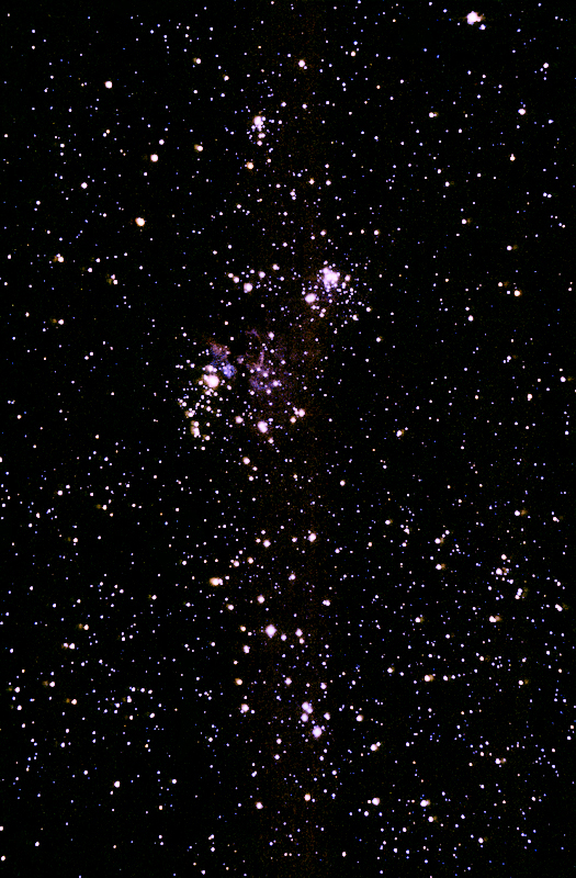
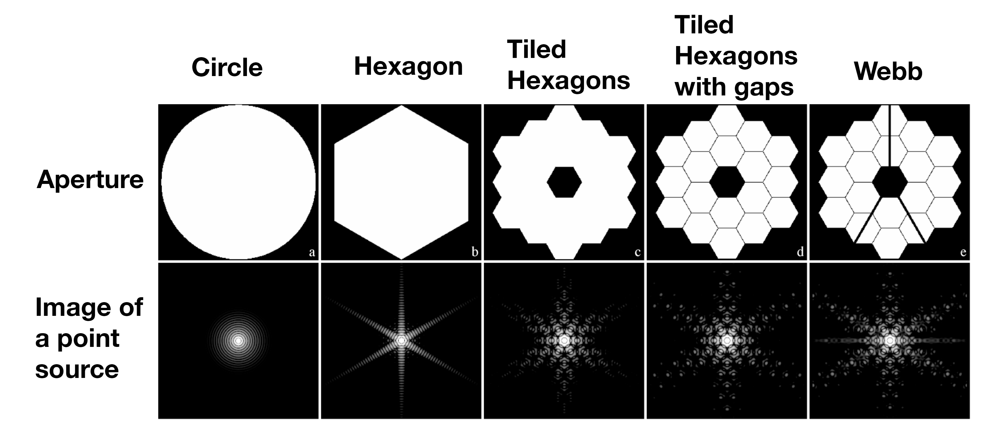
Stephan's Quintet (NIRCam and MIRI Composite Image):
https://stsci-opo.org/STScI-01G7DB1FHPMJCCY59CQGZC1YJQ.png
Southern Ring Nebula (NIRCam and MIRI Images Side by Side):
https://stsci-opo.org/STScI-01G79R28V7S4AXDN8NG5QCPGE3.png
“Cosmic Cliffs” in the Carina Nebula (NIRCam Image):
https://stsci-opo.org/STScI-01G7ETPF7DVBJAC42JR5N6EQRH.png
Webb's First Deep Field (NIRCam Image):
https://stsci-opo.org/STScI-01G7DDBW5NNXTJV8PGHB0465QP.png
Exoplanet WASP-96 b (NIRISS Transmission Spectrum):
https://stsci-opo.org/STScI-01G7NBXDHYYSVBP2M476PRGG3A.png