As a USAian and an Old, I learned the Zaner-Bloser script in school - a cursive script that tries to minimize pen lifts, but still has "backtracks" as this article calls them, for j, i, and x. It uses a lot of the same kind of loops that this script uses, just for the simpler problem of joins. The downside of the Zaner-Bloser system, as well as Palmer and anything that derives from Spencerian cursive, is that when written quickly, the loops can make several letters only distinguishable by context (is that a short 'l', or a long 'e'?), and the handwriting of adults becomes pretty unreadable after leaving school.
Since then, I re-taught myself to write with an Italic hand, which has more "backtracks" (for instance, 'e' is two strokes) and fewer joins (you never join from e, o, r, or any letter with a descender), and while my speed has suffered somewhat, everyone who sees my handwriting compliments it.
If your hand cramps while writing, it is because you are holding the pen too tightly, possibly in order to apply too much pressure. This is something that writing with ball-point pens will cause you to do. If you don't want to use a fountain pen, at least try a liquid ink rollerball.
Interestingly I had the opposite journey, I am a Young so they didn't bother to teach me cursive in school, so in high school when I got into fountain pens I taught myself italic hand so that my handwriting would be more legible and easier to write with it -- but just recently I got tired of the two-stroke 'e' and taught myself Zaner-Bloser instead, lol. I do definitely see the drawbacks you mentioned though, after I started getting more casual with my writing I noticed 'l's and 'e's becoming quickly indistinguishable
It's hard to describe what it's like using something like the STABILO worker after using ball-point pens for years. Compared to a ball-point it feels like the ink is jumping out of the pen, and I was accidentally joining words together for about a week. They are also much less fussy to care for than a cheap fountain pen, and much cheaper than a good fountain pen.
It's a fascinating innovation, and I enjoyed the creativity on display in the article. That said, I have never minded the backtracking. For me, it is a feature. Having learned it from childhood, the backtracks happen unconsciously, and in fact, I enjoy how my muscle memory instinctively sends my hand dancing back over the word to supply all the missing dots and crossbars.
This is the kind of thing that makes cursive painful to read. The `i` and `j` in this script are harder to quickly lex, and the `t` (especially in the `tt` ligature) with the added loop flourish diverges sufficiently from a standard `t` to make it hard to decipher in running text.
In text, as in code, I prefer to optimize for easy reading rather than faster writing.
> In text, as in code, I prefer to optimize for easy reading rather than faster writing.
Author here!
It really depends on what you write.
When I write something for others to read, I type it or (on special occasions) write it one letter at a time with a calligraphy pen.
I’m the only intended reader for almost all of my handwriting (personal journal, article drafts, exercises, and notes). In this setting, it’s much more natural to optimize the script for enjoyment, convenience, and speed. But even then, I think my script is still quite legible.
Easy reading is achieved by typesetting later if needed. Writing by hand is painful and slow and it makes sense to optimize for the write operation as much as possible
Might as well go with shorthand, then. I'm not even joking. I guess it's harder to learn an additional script used only when writing and transcribing, but I wonder if it would make writing by hand less of a dying thing.
It also makes writing more difficult --- the doubled-up pen movements help get ink flowing, esp. on certain letters at certain angles, esp. w/ a fountain pen.
This reminds me of build-time optimizations increasing compile times for faster performance at runtime. A tradeoff I could make without a sweat in prod, but not so much during development, at a certain scale. It feels like a dichotomy almost unavoidable in life.
I wonder to what extent this is just habituation to styles that do not do what they are doing.
If I might, modern people tend to find cursive difficult to read. This depends somewhat on culture (nastaliq is the default in Iran) but is a kind of generalized trend that holds for most modern developed countries (see gyousho and sousho almost disappearing in daily use in Japan outside of menus and signage and - increasingly rarely - formal letters). It's not as if, I think, that when these older forms were more common that people struggled to read them (at least, not anymore than individual handwriting typically causes problems).
People who grew up writing cursive also often struggle with older scribal hand (though less so than someone who did not grow up with cursive), say from 1500s-1700s. Again, I think it's unlikely that the writers of those hands were so constrained by medium and technology (or cultural norms) that they chose to write in a way that was deemed inaccessible. (One might, if not attenuated to it, say that sousho is akin to deliberate cultural obfuscation, but my experience suggests that you quickly learn to recognize the patterns in kuzushiji.)
In the case of CJK scripts, brush pens haven't changed. Fountain pens are perfectly adequate for cursive (though some nibs were developed that differ specifically to make them even more suitable). For nastaliq, as for naskh, a reed pen is fine for both. (Modern pencils, ballpoints, and typical modern Western-tipped FPs do struggle to give nastaliq the line variation needed for a legible result). For Western scripts, pens and their tipping simply hasn't changed much beyond a decrease in the flexibility of nibs in FPs. (Something which also varied historically - pens oriented at most shorthand styles always had hard tips, excluding those shorthand styles that incorporate line-width variation which was meant to be achieved with a flexible tip.)
So my thinking is this is mostly something that comes down to 'are you used to it' and shifts in this area have a lot mroe to do with culture than anything else.
There are of course two other matters.
First, how easy something is to learn - I think the only place this is a consideration is sousho of the scripts I've mentioned (even with nastaliq's hundreds of thousands of possible ligatures).
Second, are the people around you accustomed (culturally) to the hand you are writing in, and how hard is it for them to adapt if they are not. Broadly speaking, people are not accustomed to reading much cursive in general these days, let alone one that varies from the recent hands of the area. So generally if one is writing for coworkers say, one would do well to simply write in print or at most a semi-cursive style.
In that regard the more that something deviates from its print form, the harder it will be to read for them. This ultimately comes down to interpersonal consideration - if you're writing for yourself or people who are regularly reading/writing cursive, I don't think the author's changes will be a significant issue beyond a short acclimatization phase that does not extend far beyond the phase that would be needed to adapt to an individual's personal quirks in a hand that has had some recent sway in the local area (and those hands do differ by country/area, quite a lot). (As a tangent, some of these tricks of the author's are commonplace in specific historical European hands.)
Huh, I just indirectly learned from this article that the way I write a lower-case "t" in cursive is a Dutch way of doing so (edit: sollniss' comment implies it was a common style in Germany too). A quick search suggests it has been replaced with an English style of "t" in the last decades too.
I wonder if that makes my handwriting harder to read for anyone who isn't Dutch and over 40 years old.
Anyway, just bringing it up because you don't need to lift up your pen to write that kind of "t".
Search for "koordschrift" on https://primarium.info/countries/the-netherlands/ to find the illustration showing how I was taught to write it in the late 80s. It's the letter vaguely shaped like a pine tree.
I've learned to write x the way this post says (two mirrored c's) but I don't understand what you mean by "independence days". We don't have one in France anyway.
Well I understood that much, but I'm not sure what link it could have with the shape of the x, especially since the English don't do it the same way as India.
Latin Sütterlin (https://de.wikipedia.org/wiki/Ausgangsschrift#/media/Datei:S...) has an x without backtracking. At first it looks a bit weird with the two loops, but I think they are exaggerated for didactical reasons. If you train a bit you can make it look like an x by making the loops thinner. Put differently, this is the "opposing c's"-method, without lifting the pen between the two c's.
That's how I was taught to do it, and I always found it weird because it looks like an S and a C, while in my language it's pronounced in exactly the opposite way. We don't have many words with Xs in Italian, so I probably never "simplified" it in my hand writing and I still draw it that way in the rare occasions I write in cursive.
Wondering how many people are like me and hate writing in cursive.
I stopped using it right after graduating high school (where it was required), never used in drafts after elementary school, and only ever used normal print letters in the university (and also included TeX commands because I was typesetting lecture notes later and was figuring out the optimal command set on the fly).
I’m surprised, as the whole points of it are speed and duration (less cramping, less energy when moving the wrist). Discrete lettering is simply slower because it requires more motion.
The point of cursive was make writing efficient with a quill pen. With a quill pen you run the risk of ink dropping off the tip if you lift it from the paper. Therefore cursive tries to keep the pen in contact with the paper most of the time. I've never thought of cursive as a speed tool. My printing has always been much faster than my cursive.
I find I get significantly more cramping with cursive since there are fewer "rest" periods between the letters than with engineering block gothic lettering. Gothic lettering is much slower than cursive, but much more readable and (IMO) easier to write.
I'm dysgraphic, which probably plays some part in this.
I’m with andreyvit on this one. Maybe I’d feel differently if I had read a subject involving a lot more essay-writing at university. In subjects like the mathematics and computer science that I studied, where you need to be very clear about legibility and you are often writing intricate notations and using a wide variety of symbols, I’ve seen little evidence that not using cursive for the longer text blocks has ever slowed me down. On the other hand, I’ve seen a great deal of evidence that cursive is harder to read generally and can lead to significant mistakes as a result.
Personally, I’m content being a dinosaur who writes one letter at a time (in handwriting that has been praised for its neatness and clarity ever since I was at school myself) or uses computers to render the text for me (where I have long had an interest in typography and quite enjoy making pretty text using elaborate cursive fonts, but for special effects and interest, not for body text and legibility).
If I need to take notes by hand, I definitely prefer cursive writing (though I have my own variations & preferences, for example I write almost all capital letters in the print versions). I never saw a reason to learn to draw a more type-like font by hand, so that definitely feels much worse whenever I decide to do it (e.g. for filling in certain forms).
I don't hate writing in cursive, It's simply that I do it so badly that I use printing for almost everything except my signature. I deeply admire people who write cursive well. It is a beautiful form of communication.
I had a penmanship teacher in high school advise me to use printing because at least she could read it. I suspect that it pained her to give me that advice, but for me it was a gift.
Same story, except that I could stop writing in cursive after middle school as nobody in high school could be bothered to demand it. The only remnants of my cursive writing days are as part of my signature.
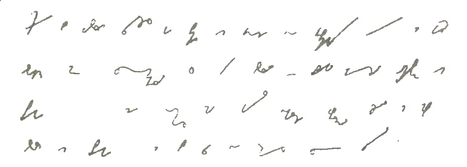
For anyone interested in optimising this further, orthographic (letter-based) cursive shorthand systems are the answer. I personally only know part of the Melin system[1], but there are variants designed for English as the primary language too. (Melin is of course perfectly usable with English also.)
The flow of a cursive shorthand system is unmatched by anything else. I highly recommend learning enougnh to experience it.
(The drawback with more phonetic systems like Gregg is that one has to learn entirely new ways of spelling words. But normal English spelling is so complicated that tradeoff can be worth it for heavy usage. Orthographic systems often also contain phonetic components, but they tend to be optional extensions that improve efficiency, rather than required like with purely phonetic systems.)
What a rabbithole ;) TIL about "Stiefography". I wonder how useful this is. I remember math lectures - typically, our prof used the white^H^H^H^H^Hchalkboard, so I could just write down things fast enough.
There is evidence that typing is actively bad for memory rentention compared to writing things down with a pen. I wonder where Stenography falls in this continuum.
I like writing in cursive, but I don’t see backtracking as a problem. I backtrack quite a lot in Cyrillic, even in Russian, e.g. I always underline ш and write a line over т (which looks like m) to distinguish them (otherwise they look quite similar, see the famous example лишили лилии — you might want to google it if you haven’t seen it yet). I also normally write д as ∂, which breaks the flow.
Belarusian Cyrillic requires more backtracking: we have і, ў, obligatory ё, apostrophes. Never saw it as a problem.
> I always underline ш and write a line over т (which looks like m) to distinguish them
I used to do it as well! But I gave up on it for the same reasons I described in the article: impaired working memory.
> лишили лилии
That’s a tough one, but I think it’s possible to make it legible with careful choice of spacing to indicate the groups: the distance between the strokes within a letter should be noticeably smaller than the distance between letters.
> I also normally write д as ∂, which breaks the flow.
I also like this variant of ∂, though I eventually switched to the version with a descender. It doesn’t annoy me because it introduces only a short pen lift.
Interesting. I think this style completely died out in Russia, I wasn't taught it and never really seen it outside of some old letters and documents. Interesting to hear it survived in Belarus
Our Belarusian teacher actually ш/т wrote it like that, I got it from her. It’s not very common in Belarus, either.
I think the real strongholds of this style are Serbia and [North] Macedonia. They even underline и and write a line over п (they can do this since they use ј instead of й).
>I always underline ш and write a line over т (which looks like m) to distinguish them
Having studied Russian in college, I assumed that all Cyrillic script included a line over the т, because otherwise readability goes to hell. Is my impression here based on (a) an opinion of my Russian prof expressed as a universal rule or (b) a thing that's universal in Russian specifically, but not Belarusian Cyrillic or other similar contexts, or... something else?
I'm inferring from your post that you are a native user of Cyrillic who has also learned English. I'm the reverse (well, at least I took Russian in college; I was never fluent then and remember almost nothing now). Something interesting happened to my cohort of Russian learners back then, and I wonder if it's common for folks going the other way.
After we got comfortable with writing Russian in cursive, we found that Cyrillic letters worked their way into our English script. Often, we wouldn't even notice, even when reviewing our notes later. I discovered I'd done this when I loaned some political science notes to a friend, and he couldn't read them because I'd unconsciously mixed Cyrillic and English script. I could read them fine, and so could my Russian-class friends.
We mentioned this to our Russian prof, and he laughed and said it happened to people every year, but he could never figure out who would be prone to it. Sometimes it was top students; sometimes it was people who were struggling.
(It was in this era that I ended up pretty much abandoning cursive, because Cyrillic never crept into my printed handwriting. 35 years later, my cursive is abysmal.)
Did you end up mixing script in your native handwriting inadvertently?
not op, but from my experience overlined ts are a thing from a bygone era I'm afraid. my parents sometimes do it, but I don't know anybody under 30 who would write it this way. on the other hand I do sometimes see it written like a print т.
what you said about mixing up cursives is really interesting! I think the only case where I mix up mine is when writing a p instead of an р (the russian version typically doesn't have a loop).
The point about interaction with undo in a digital inking app is interesting. Seems like with ML handwriting recognition, we could create a handwriting "text editor" instead of a drawing app that understands the semantic structure of the text and operates at that level instead of the individual stroke level.
I had some friends who worked on this for a while but didn't get far with it. It turns out it's tricky to design a general purpose system that adapts to users' handwriting idiosyncrasies and is fast enough to work in real time with handwriting with sufficient accuracy.
Some of that work is still visible in the ChromeOS virtual keyboard handwriting mode, but it's very limited - one line at a time. https://cursive.apps.chrome/ (the built-in note-taking app on Chromebooks) has some interesting inking gestures for manipulating written words, but doesn't have any semantic-level understanding.
I really like the result. Especially the i and j with the connected dot. I expected them to look off but they really integrate nicely.
That being said I don't think it is about Cyrillic vs Latin but more about traditional cursive vs modern.
The traditional Latin cursives were all pretty much optimized to be written in one running flow. Kurrent and cursive all come from Latin currere which means running.
Admittedly none of them go as far as connecting the i and j dots but otherwise they are pretty much completely connected. But then again I also never seen anyone writing a word and doing the dots afterwards. With traditional cursive you do your upstroke, lift the pen, place the dot (or short short stroke), reverse and do the downstroke. Lifting the pen yes, backtracking no.
With the connected dots OP's Backtrack-Free Cursive still wins here and I really like that because someone found an optimization to something that already has been optimized for centuries.
>But then again I also never seen anyone writing a word and doing the dots afterwards.
Interesting, I'd never really heard of it being done any other way. I suppose it occurred to me that it could be done otherwise, but I'd more or less assumed the "all in a batch at the end of each word" way was all but universal. (When writing at speed -- trying to keep up with an overflowing buffer -- this tends to lead to all the 't's in a word sharing one long crossbar, and the dots floating somewhere high and right of where they should be, depending on how far I'm lagging behind the verbal "point of focus", if that makes any sense.)
You may want to look into Sütterlin script. It's a bit harder to learn than standard cursive, but it's very pretty, and a level-0 encryption since few people can read it nowadays.
Great article! One perspective I'd like to share is that for me, the joy is mostly found in how beautiful the product is. From that standpoint, I don't particularly care how efficient I am at writing cursive. That said, this is a hand I would be interested to learn.
Hey, that's the same one I was taught in the Netherlands in the late 80s! It seems to have been replaced with an English-style in recent decades though, is that the case in Germany as well?
It's fascinating how similar-yet-subtly-different the cursive writing is across Europe. I wonder if you could map them into something similar to language families (or type traditions, I suppose). Would there be any "language gradient" equivalents for cursive writing across the continent? Well, before the industrial revolution I guess, I'd expect that after that you'd see more singular influences of designers backed by the state pushing for standardization of education.
According to the wiki, the Schulausgangsschrift is mandatory in 5 states and optional in 4 states (out of 16) (probably on a school/teacher level). So it still seems to be taught in some places.
After searching a bit more I discovered the situation is similar in the Netherlands too: schools can choose between the two styles (or more like three publishers each with their own styles, really).
I am not sure what country the author is in, because when I learned to write English in school (decades ago, and it was the language of instruction) very few letters required backtrack, pretty much only ‘i’ and ‘j’. I just looked at an image of the US Declaration of Independence and the same is true (the ‘t’ has a wiggle in the middle).
Other languages are similar: for German if you look at either Kurrent or Sütterlin really only i gets special treatment. The umlauts are given as two dots in examples, but when i read letters and other informal documents they usually end up being a bar.
I like the connected dot for i and j! Clever, and i will try to adopt it. Most of my handwritten writing these days is for myself.
I don't cross ts either, I tested out on a piece of paper and what I do is a vertical (slightly curved) stroke, loop to the left, cross the stroke and then a downwards stroke.
I tried the jitter example and instinctively I dotted the j but not the i for some reason. Would love to see some research on this.
I really miss cursive honestly, at least for me I feel a much closer connection to the writing than when typing.
Try writing this sentence on your cell phone keyboard, if you use a "swipe" type keyboard interface. Fun! (All on the top row, so it is just sliding around on the top):
> One way to remove backtracking is to lift the pen immediately instead of waiting until the end of the word, as if doing italic calligraphy. Pen lifts alleviate the mental queue problem and give a chance to readjust the palm, but they break the writing flow.
This is how I learned cursive in school, and it never occurred to me that this may interrupt my writing flow. I agree that doing the backtracks after writing the entire word would add to my mental load, but that's probably because I'm not used to that.
So generally, I'd say that the mental load is basically a matter of how one learned cursive in the first place. Though I agree that the mostly backtrack-free Cyrillic cursive looks more elegant.
Would be interesting to learn about the perspective of people who learned Chinese or Japanese as their first script.
Cursive isn't seen as being fancier than the reference form of a character in China. It's something you do to make writing easier.
I've gotten comments about how neat my Chinese writing is from people surprised that I don't use handwriting. There's a simple reason for that: I've never learned how to do Chinese handwriting.
> Isn't that what everyone is doing, or are we Frenchmen the exception?
> For reference if the author reads this, we write the latin x exactly like the cyrillic х, i.e. reverse c, bottom-left to top-right diagonal, normal c.
I was taught script in the US and Italy as a child, and never learned it like this.
Yes; I learned it that way as well but I was never able to write them smoothly or legibly. I consciously practiced cursive in adulthood and only then discovered the mirrored-c technique, which always looks right and flows far better. There are a lot of problems IMHO with the D'Nealian method that US pupils were prescribed, likely responsible for the huge backlash against cursive in general.
I write it with a descending curve, then go back and cross it with an ascending diagonal line when crossing t's / dotting i's/j's. Like this: https://www.youtube.com/watch?v=Cel3GtSOzow. I think that's pretty standard in English cursives.
An italian influencer started speaking in italics/cursive. It's a silly thing, but the thought of pronouncing words differently because they are on bold or italics is interesting
I have had similar thoughts recently when attending language courses where I write a lot of notes by hand. This problem is exacerbated by umlauts. If the language doesn't have letters like ō (are there any? i only see this letter to represent a sound, never in a word), then the two dots can be replaced with a line and so, I guess, the lowercase T technique from the blog post could be adapted to it. I think I know what I am gonna do after work today
Usually writing small, in all-caps, except code: in lowercase, and the "t" and "i" retain their lower curve. Cursive is difficult; easy to write, but (later) hard to read.
Can see how penmanship there would be appreciated.
What version of Chrome do you use? The images are encoded in .webp for compactness; I hoped that most of the browsers in use support this format, but I might have to go multi-source after all.
Do you start with the top stroke so that the bottom stroke can continue into the rest of the word, or do you start with the bottom stroke and handle the top later?
This is unrelated to the main thesis of the article, but worth pointing out as too many people equate the Cyrillic script with Russian language.
The Cyrillic script was invented in Bulgaria (during the First Bulgarian Empire), and was used to write Bulgarian language, creating a huge literary corpus, long before it began spreading to Kievan Rus. The Russian language itself comes from Old Bulgarian / Old Church Slavonic, as does Serbian and other "Slavic" languages.
And no, Bulgaria was never part of Russia nor the Soviet Union.
> The Russian language itself comes from Old Bulgarian / Old Church Slavonic, as does Serbian and other "Slavic" languages.
Also, Bulgaria used to own all the land in the world, but because Bulgarians are very kind people, they gave some of it to other nations so that they have a place to live too. Thank you, Bulgarians!
You're confusing a language (the way people speak) and a literary tradition (the way people write).
When ancestors of Russians borrowed Church Slavonic writing, they were already speaking another Slavic language, Old East Slavic. For the time being, they were writing in one language (Church Slavonic) and speaking another language (Old East Slavic). Later, they dropped Church Slavonic and started writing what they spoke.
Modern Russian language is a continuation of Old East Slavic, not of Old Church Slavonic.
Church Slavonic is a South Slavic language and so is a cousin of East Slavic language like Russian or Ukrainian. Russian borrowed a lot from Old Church Slavonic but doesn't descend from it. It's like the influence of Latin or Norman French on English.



Since then, I re-taught myself to write with an Italic hand, which has more "backtracks" (for instance, 'e' is two strokes) and fewer joins (you never join from e, o, r, or any letter with a descender), and while my speed has suffered somewhat, everyone who sees my handwriting compliments it.
If your hand cramps while writing, it is because you are holding the pen too tightly, possibly in order to apply too much pressure. This is something that writing with ball-point pens will cause you to do. If you don't want to use a fountain pen, at least try a liquid ink rollerball.
reply