In English anyhow we are used to Positive option first, Negative option second... it's how our language flows and thus how we think. We read Left to Right... we expect the positive option on the Left, i.e. first, and the negative option on the Right, second. Just how I view it anyhow. To me it feels backwards the other way around and I don't feel that's just a learned convention. I will continue to curse Android 4 every time I mis-click on a dialog.
This has nothing to do with English language. As a culminating point of a dialog box, I believe the suggested action should be towards the corner, not hidden between a 'Cancel' button in the right corner and the rest of the dialog box.
This is what I came here to say- one more reason not mentioned for putting the primary action in the corner is that it's easier to find and fix on with your eyes and the mouse.
You don't have to find it. Few people do. People read through the buttons from left to right. The thing is, when dialog buttons use standardized vocabulary (ok, cancel, yes, no) you don't have to read the other button, you just assume it says the opposite of the first button. So I'd like the OP to provide some proof of this three scan pattern. I think that happens on a Mac where the buttons are labeled with verbs. When I was using Windows with the standardized yes/no/ok/cancel, I processed dialog boxes much quicker than on the Mac. I'd simply read the one or two words in the title (usually a verb), read the leftmost button, then decide whether to click it or whether to freak out. It goes like this:
Computer: "Delete?"
Me: Yes.
Computer: "Delete?"
Me: Whoa! Who said anything about delete? Let me read the buttons carefully and find the Cancel button.
The mistakes happen only a small fraction of the time, so the most efficient user flow is "verb?" -> "yes".
    1) Read first couple of words of dialog box
    2) Make decision
    if yes:
    3a) Find OK button
    4a) Click OK button
    if no:
    3b) Find Cancel button
    4b) Click Cancel button
vs.
    1) Read primary action button
    2) Make decision
    if yes:
    3a) Click button
    if no:
    3b) Find Cancel button
    4b) Click Cancel button
If all you're doing is hunting for the verb in the dialog box rather than reading all the text (perfectly legit timesaving tactic) then why not stick that all important verb in a standard position on the dialog box and make it clickable to reduce hunting and scanning?
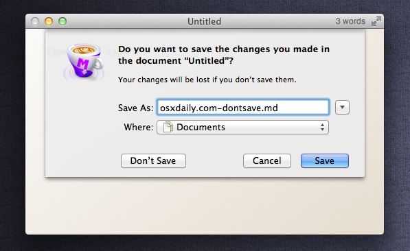
It's not about standardised vocabulary to easily find the primary action and Cancel, it's about standardised positioning. In OS X, far right is the primary action. The one next to it is Cancel. Any other options are placed further over. (http://osxdaily.com/wp-content/uploads/2011/08/dont-save-sho...) Similarly on Windows the left most is the primary action and the right most is Cancel.
Even though people know the primary action is the rightmost button, they can't help but stop on other elements because of that top-down left-right scanning that's ingrained in most people of the world. There's simply no better position that the very top left corner!
Another important distinction here is that I should not receive surprise dialog boxes as often as I currently do! Yet sooooo many apps throw unnecessary dialog boxes at you! Your step 2 "make decision" has happened before the dialog box appeared. It happened when I pressed the delete button on that file.
Whether step 2 is actually step 0 or not doesn't really matter. It has the same impact on both scenarios.
People only read strictly top down left to right (or right to left) if all other things are equal.
I don't know about you, but I've never been able to predict where the top left corner of the dialog will be to start reading. My eye is always instantly drawn to the big blue button that describes what will happen when I press it :)
That just because if you had gas in the middle it would be uncomfortable for long drives.
It's the same reason the clutch is on the side as well, not in them middle.
I suppose you could swap the cluch and gas (leaving brake in the middle) - but clutch comes first, then gas, so the convention of first on the left is realized.
There was a Top Gear episode that looked at the history of the location of the pedals, and tried to find the first auto that laid them out the way we are used to today.
What was shocking is the enormous variety before then. Just about any of our familiar controls (including some others before we really got a good transmission system) could be on any of your 4 limbs.
Possible, but more likely more people are right footed than left so it's more natural to control acceleration with your right foot vs. the more mechanical shift process.
Maybe Android switched it to be "easier" to use for most people. Since most people are right-handed, if they hold the phone one-handed in their dominant hand, putting the positive action puts it closer to the thumb that's being used to navigate.
Yes/No, OK/Cancel, Open/Close, On/Off, Come/Go, Stay/Leave, Buy/Sell, Gas/Brake, Thanks/No Thanks...
In English anyhow we are used to Positive option first, Negative option second... it's how our language flows and thus how we think. We read Left to Right... we expect the positive option on the Left, i.e. first, and the negative option on the Right, second. Just how I view it anyhow. To me it feels backwards the other way around and I don't feel that's just a learned convention. I will continue to curse Android 4 every time I mis-click on a dialog.