This is very well done for a new-to-photography audience. Will be sharing around to people who say all their things look like snapshots, what's up with that.
Great use of examples, except for one: kid on bridge.
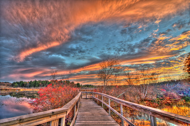
> At the same time, it must be said that color and tone can be what separates a mediocre photograph from a memorable one. To illustrate, let's look at the potential evolution of this vacation shot deliberately chosen for its mediocrity...
Then the dynamism is removed by 'correcting' the dutch angle to horizon, the surprisingly good color balance is skewed off, and the whole thing gets that circa mid-2000s HDR look from Flickr and Shutterfly and the like where every photo got tone-mapped.
Underwhelming of an end result, especially compared to the later color and tone examples (e.g. kitchen superhero).
The angle is a personal choice, though I think I agree that the mirroring angles of the two bridges was more interesting than having the horizon straightened. But the final "Tone Curve Corrected" turned a fairly nice image into a typical HDR-ruined photo, where the eye can't focus anywhere because all the colors have the same value.
To add some praise with the criticism, I thought the explorations of light white the photos of the wife were well done. Pointing the rear light at the subject's back to create that subtle halo is nice and I had not considered it.
For me, the exposure adjusted is the sweet spot, the color balance step is too yellow and loses atmospheric depth, at least on my 14" macbook pro, and then the hdr makes it completely flat. I love the intent, but the results don't look great on my setup. Since it's missing a fill light on the subject, maybe should've selectively edited the shadows only on the kid but left the shadows in the canyon for contrast. All the other examples are excellent.
In the mid-2000s, HDR was all about jacking up local contrast, giving you that unique look of gritty skin and halos cropping up all over the place. I'm talking stuff like this:
Less obnoxious tone mapping that compresses shadows and highlights is a more modern trend, I'd say post-2012. It's basically done by every cell phone today when shooting a high-contrast scene.
At the time, I produced some top ranked HDRs out of annoyance, like, oh, use tone map plugin? Automatic upvotes! Called it the "Flickr craze" and polled on comparison between:
I thought those types of shots were "woah, cool!" when I first saw them. But they got old and overused fast. I'm so glad those days are (mostly) behind us. It's interesting to me how that came and went as a photography "fad" in less than a decade.
Straightened and exposure adjusted is good. They should have stopped there. White balance tweaking is often a bad idea; what you want is to get as natural colors as possible.
Great use of examples, except for one: kid on bridge.
> At the same time, it must be said that color and tone can be what separates a mediocre photograph from a memorable one. To illustrate, let's look at the potential evolution of this vacation shot deliberately chosen for its mediocrity...
Then the dynamism is removed by 'correcting' the dutch angle to horizon, the surprisingly good color balance is skewed off, and the whole thing gets that circa mid-2000s HDR look from Flickr and Shutterfly and the like where every photo got tone-mapped.
Underwhelming of an end result, especially compared to the later color and tone examples (e.g. kitchen superhero).